03
Arcadia, new platform, new design system
Case study:
Burton, leading the brand’s digital transformation >
The Burton App >
See more in System Design >
04
Pentland brands, digital campaigns and website redesign
Case study:
Boxfresh, building the new upon a solid foundation >
See more Digital Design projects >
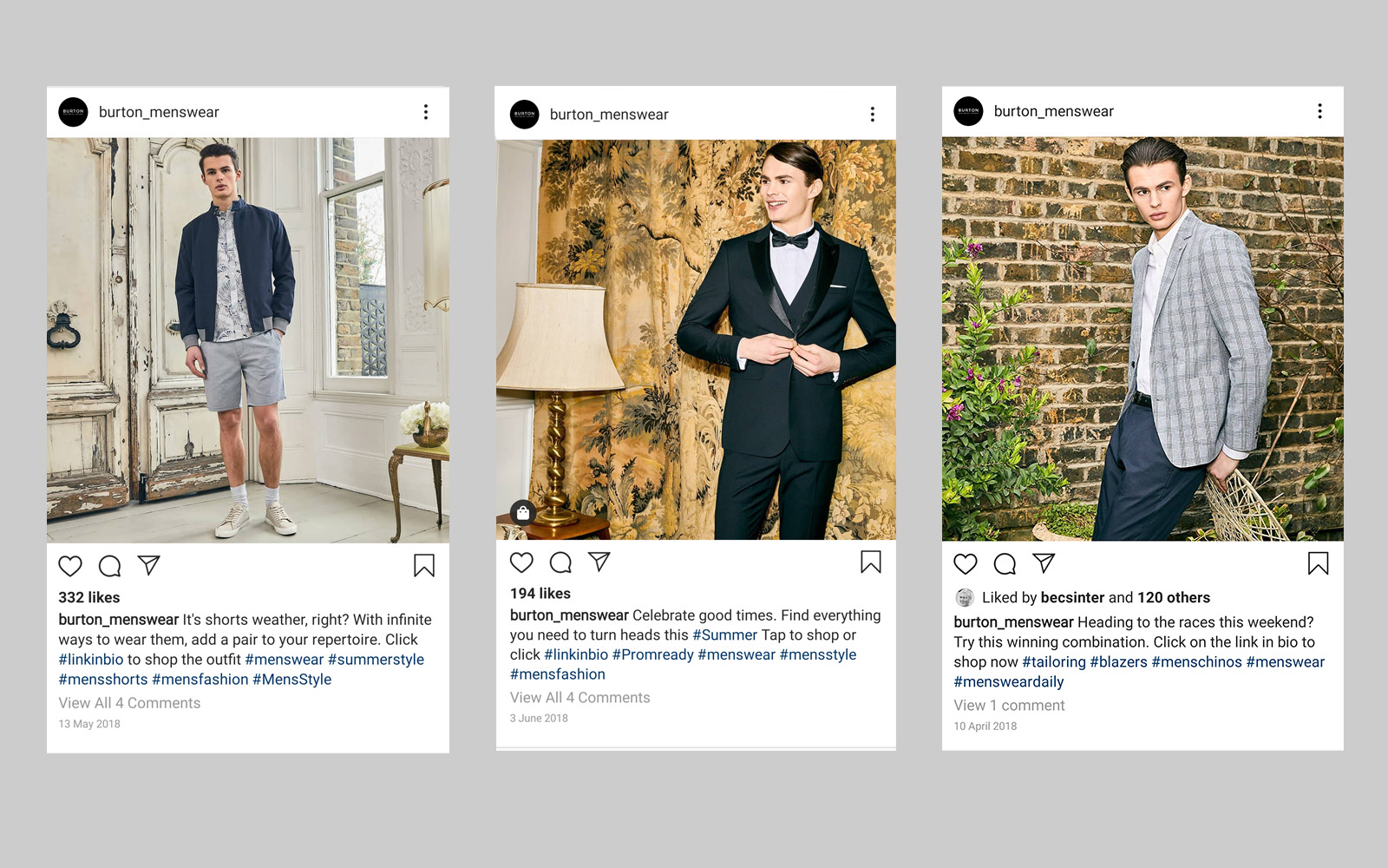
Creating emotional stories
Behind the scenes
New targets
When I joined in, the Burton brand was going through change. The objective was to bring the brand forward; make it competitive within the market, engage with our loyal consumer and target new audiences.
The change was mostly digitally focused and my role as the lead designer was to redesign our digital presence in accordance to the new brand identity.
The plan
To bring the brand refresh to life my main goal was to understand the brand's message and find ways of how to best convey, elevate and enhance its meaning across digital.
In close collaboration with the content strategist, we aimed to interpret the brand's tone of voice into its digital version and find ways to make the best combination of visual imagery and language to express the new face of Burton.
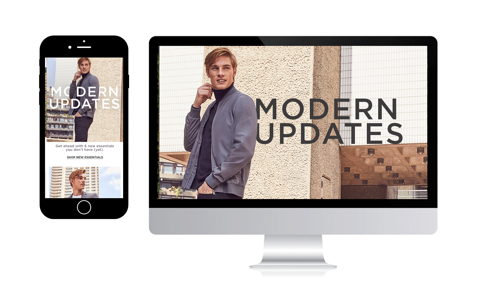
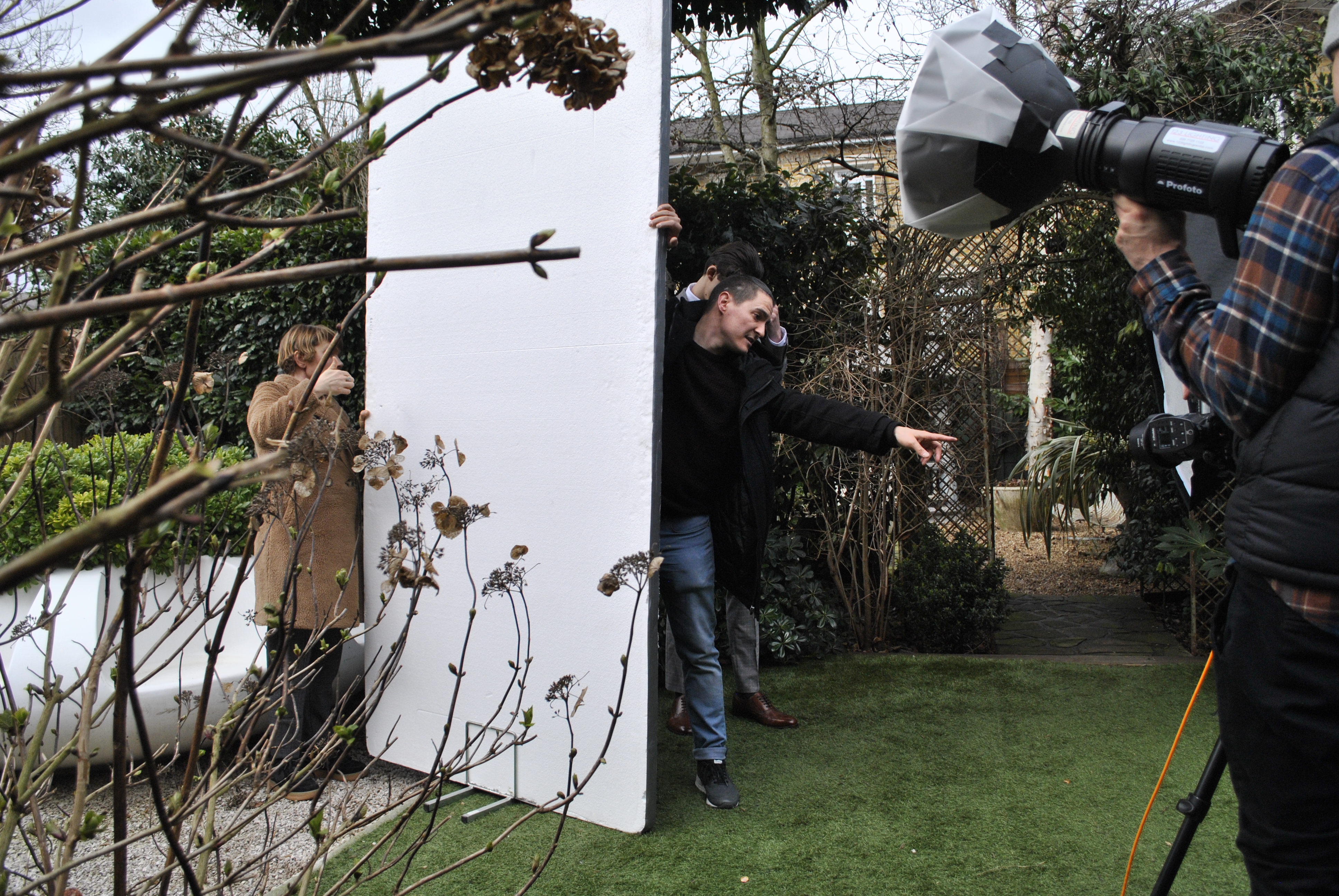
Editorial pages based on photography from the Back to school/work AW18 digital campaign
A new digital approach:
Emphasis on storytelling
![]()
The main idea was that the stories should emotionally engage our consumer.
As the main seasonal campaign imagery assets were not enough to cover our digital needs, it became apparent that we had to invest in creating new imagery, purely for digital purposes.
As the main seasonal campaign imagery assets were not enough to cover our digital needs, it became apparent that we had to invest in creating new imagery, purely for digital purposes.
Evoking the right emotion; creating a connection of what you are seeing and what you are experiencing.
see more on digital campaigns >
see more on digital campaigns >
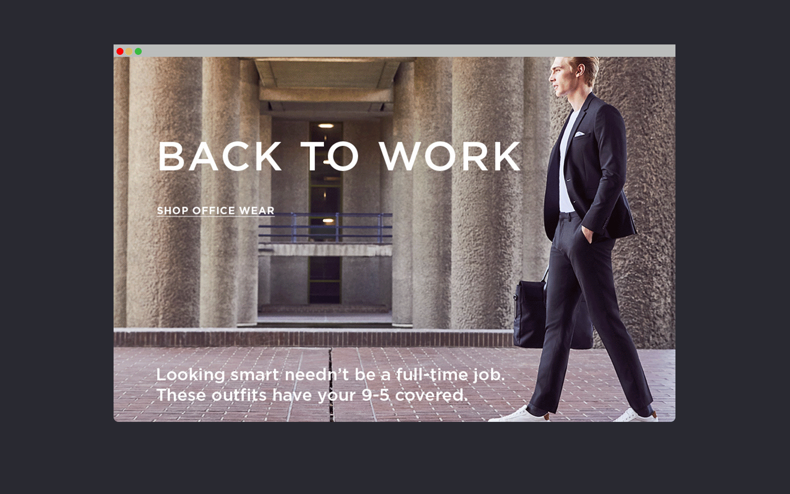
 Photography from the “occasion wear” story digital campaign

Thinking ahead:
Introducing new rules for imagery
![]()
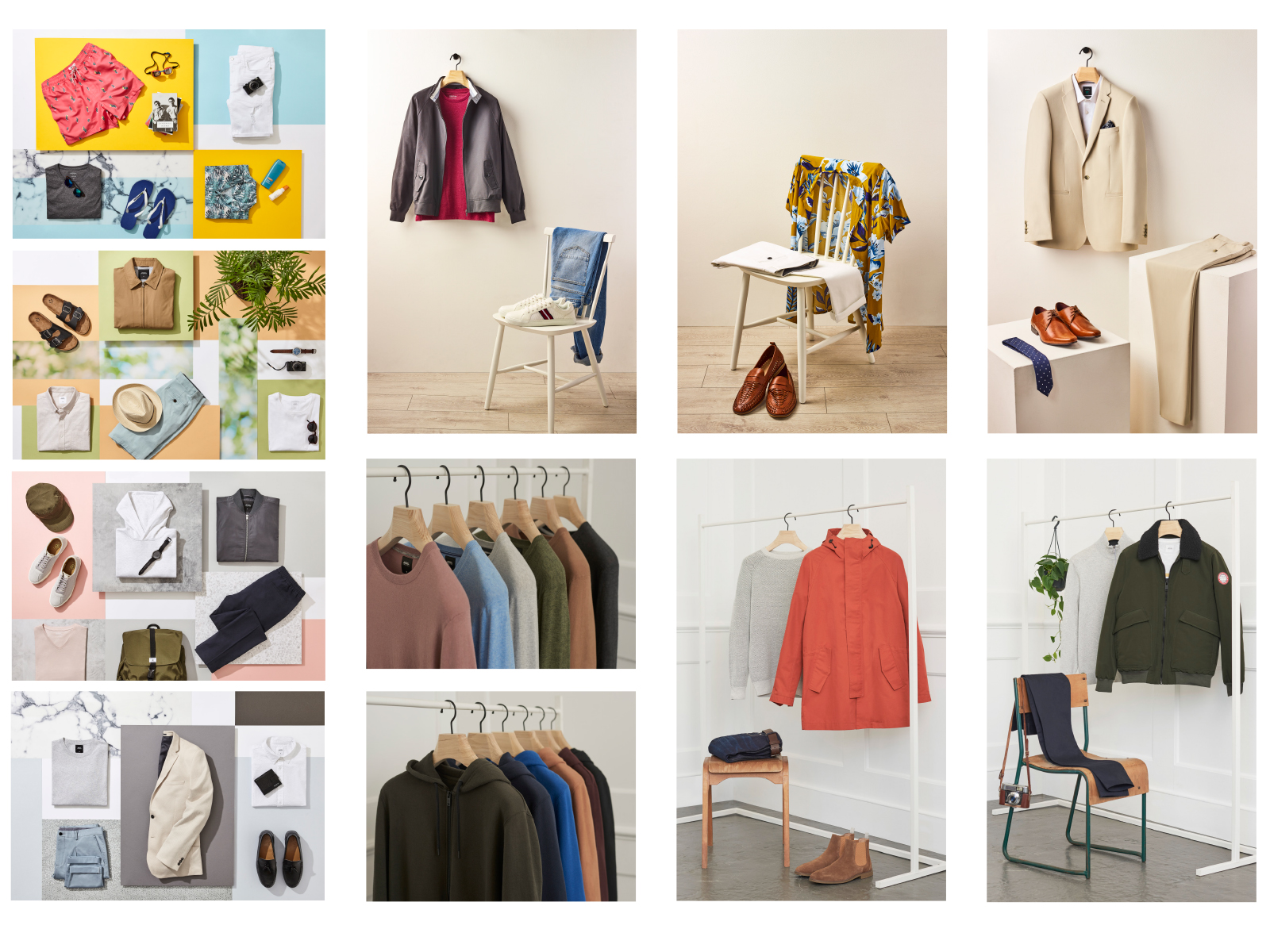
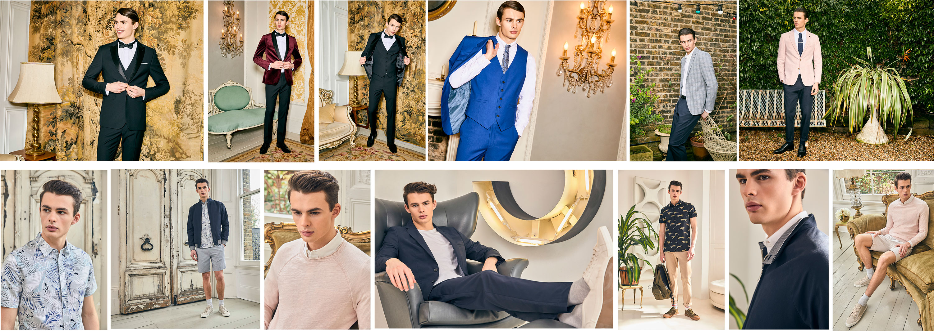
The new emotional way of telling our stories dictated the need of adding an extra element to the imagery used. We wanted to portray our products in a way that they would trigger emotions, create trust and reflect the brand and its values.
The solution was to create more options and volume of imagery, which would be consistent to the main campaign imagery but more adequate to use across the brand's digital channels.
The solution was to create more options and volume of imagery, which would be consistent to the main campaign imagery but more adequate to use across the brand's digital channels.
By focusing on certain product details, putting together inspirational product compositions and using creatively lighting and settings we revisited the Burton product and highlighted in a creative way its values; that in return inspired the editorial team and generated more content options.
see more on creative photography >
see more on creative photography >
The result as a plethora of images which would fuel our stories displayed on the e-commerce site, social media and email marketing channels for the upcoming months.
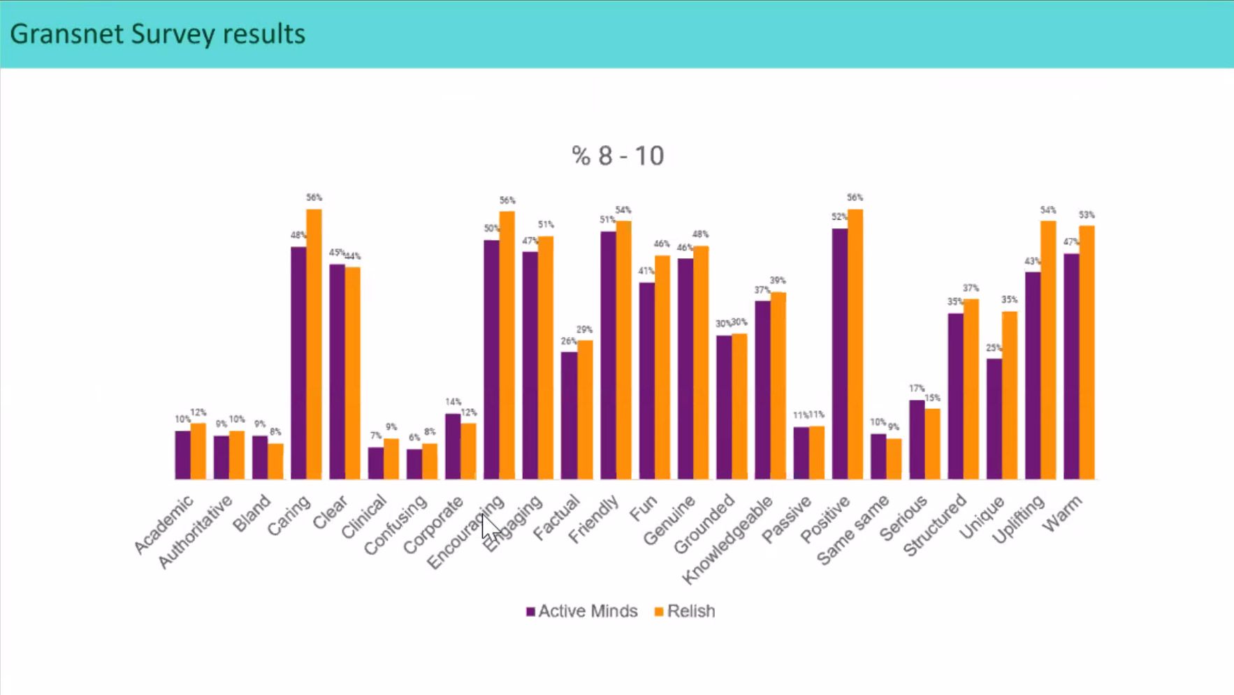
Soon after our efforts paid off
Heat maps and user reviews showed an increased engangment to the new storytelling approach on all channels and increased sales of products were identified, notably the ones portrayed on the new stories.
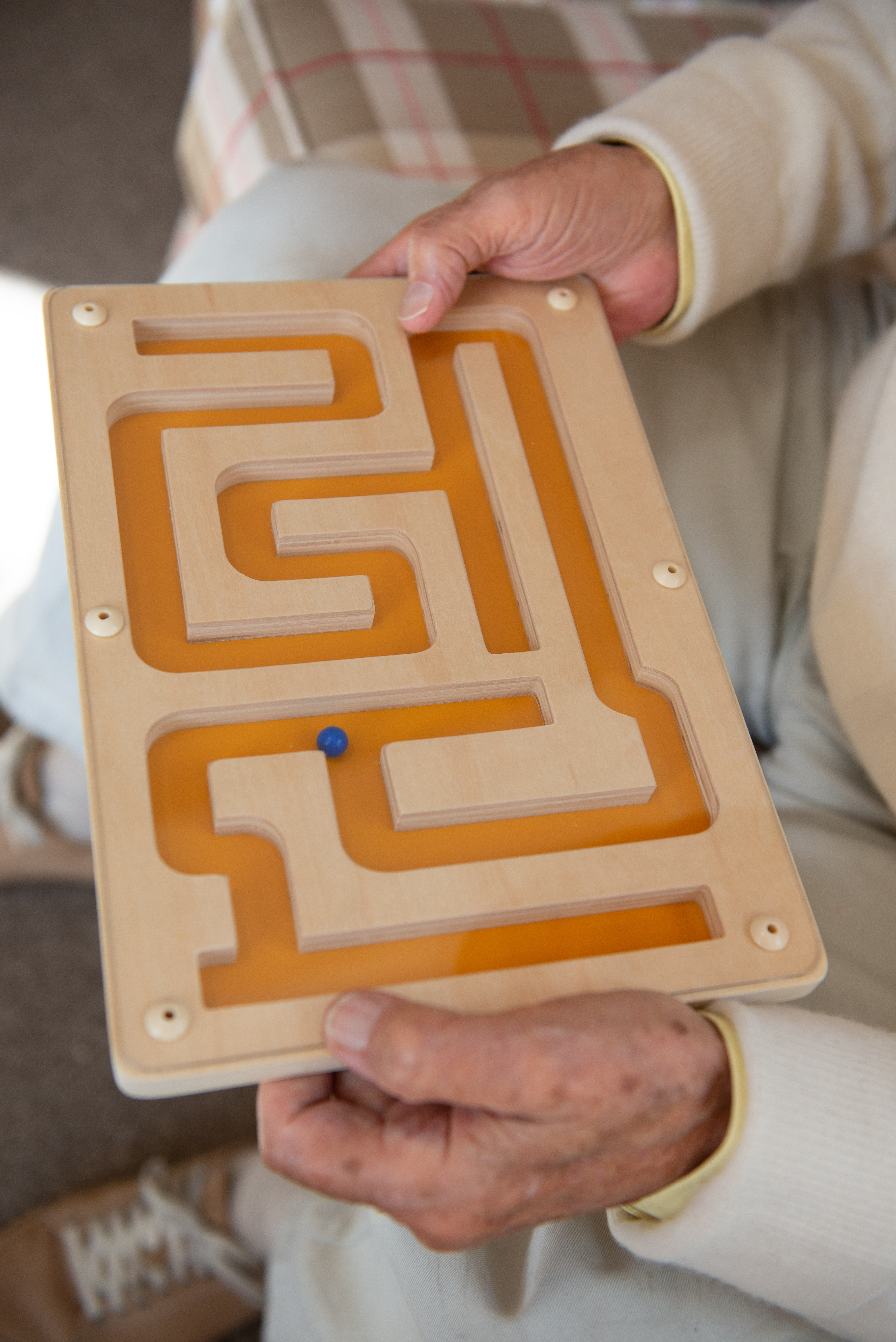
Reframing the narrative about dementia
Active minds is a mental health care company creating innovative products specially designed for people living with dementia.
Summary
“Worldwide, around 55 million people have dementia, with over 60% living in low- and middle-income countries. As the proportion of older people in the population is increasing in nearly every country, this number is expected to rise to 78 million in 2030 and 139 million in 2050”
(WHO, Dementia)
The need for people living with dementia and their carers to be able to find solutions and support has never been greater and part of the solution lies in Active Minds’ commitment to channel shift - giving carers a reason to use a direct online service rather than through more traditional methods of contact.
The new bold new approach to a direct customer service requested a change of startegy and going through a complete rebranding and digital transformation process.
My participation
My role was to build the new Relish website from scratch, redesign the existing wellbeing app and improve its user experience. I was also responsible for translating the Relish core visual language to all digital products and communications and to design their digital content strategy.
We are Relish ( previously Active Minds)
Active minds was an established brand name. We wanted to find a new brand name that would hint to the emotional connection with our audience and distinguish Active Minds in their sector. We were still doing innovative products but, also, helping people with dementia and their carers to cherish their moments together after the diagnosis. The emphasis was put on connecting and sharing positive experiences.
The previous website had an institutional look and feel. There was no clear way-finding and valuable content was difficult to reach.
Bussiness perspective: Are the existing products matching the user’s needs?
Finding our name
Challenge:
Understand the brand
What are the brand’s core values? What changes need to be made to align with the core values? Are the name and design principles represantitive to our new proposition?
Solution:
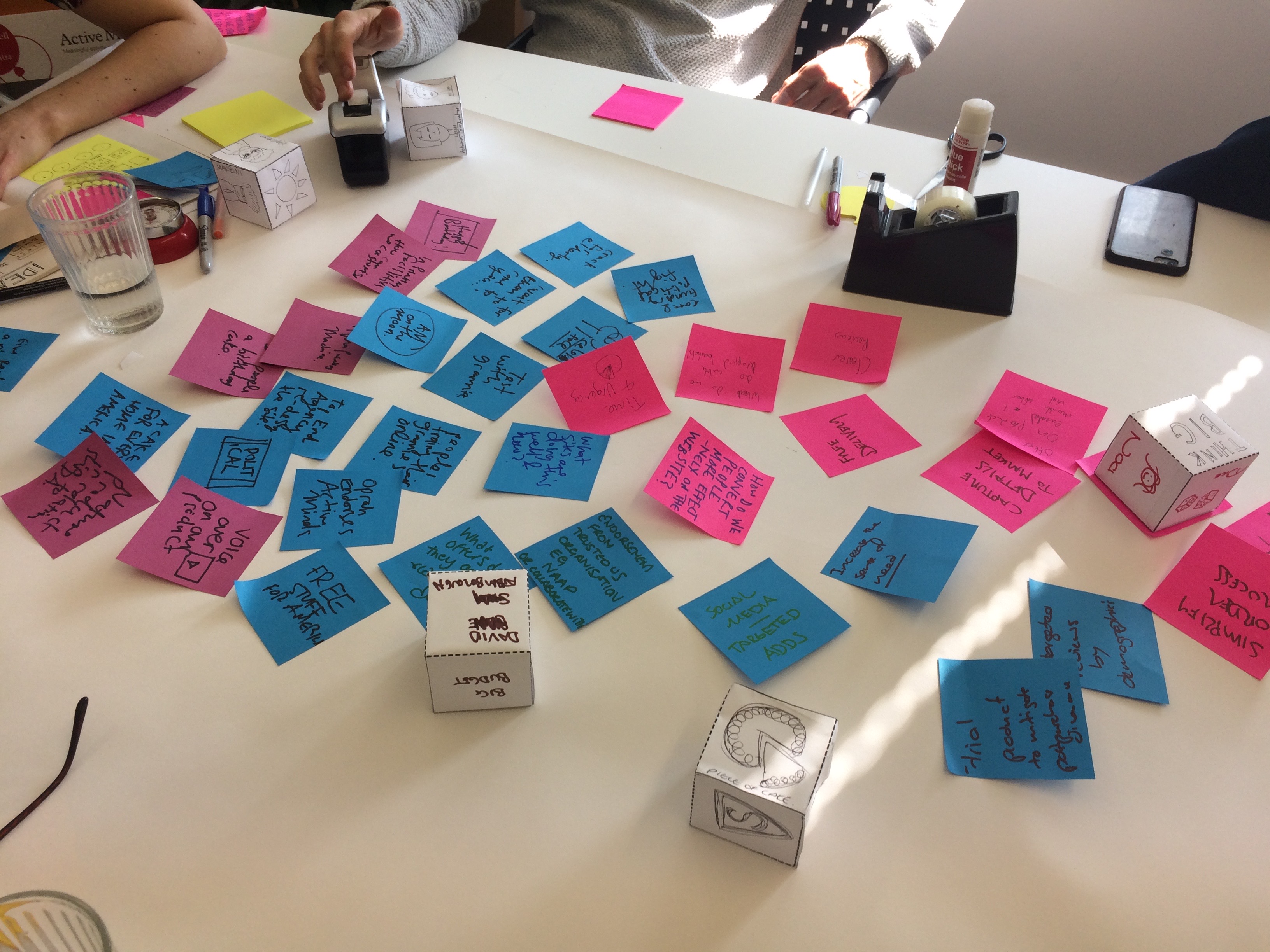
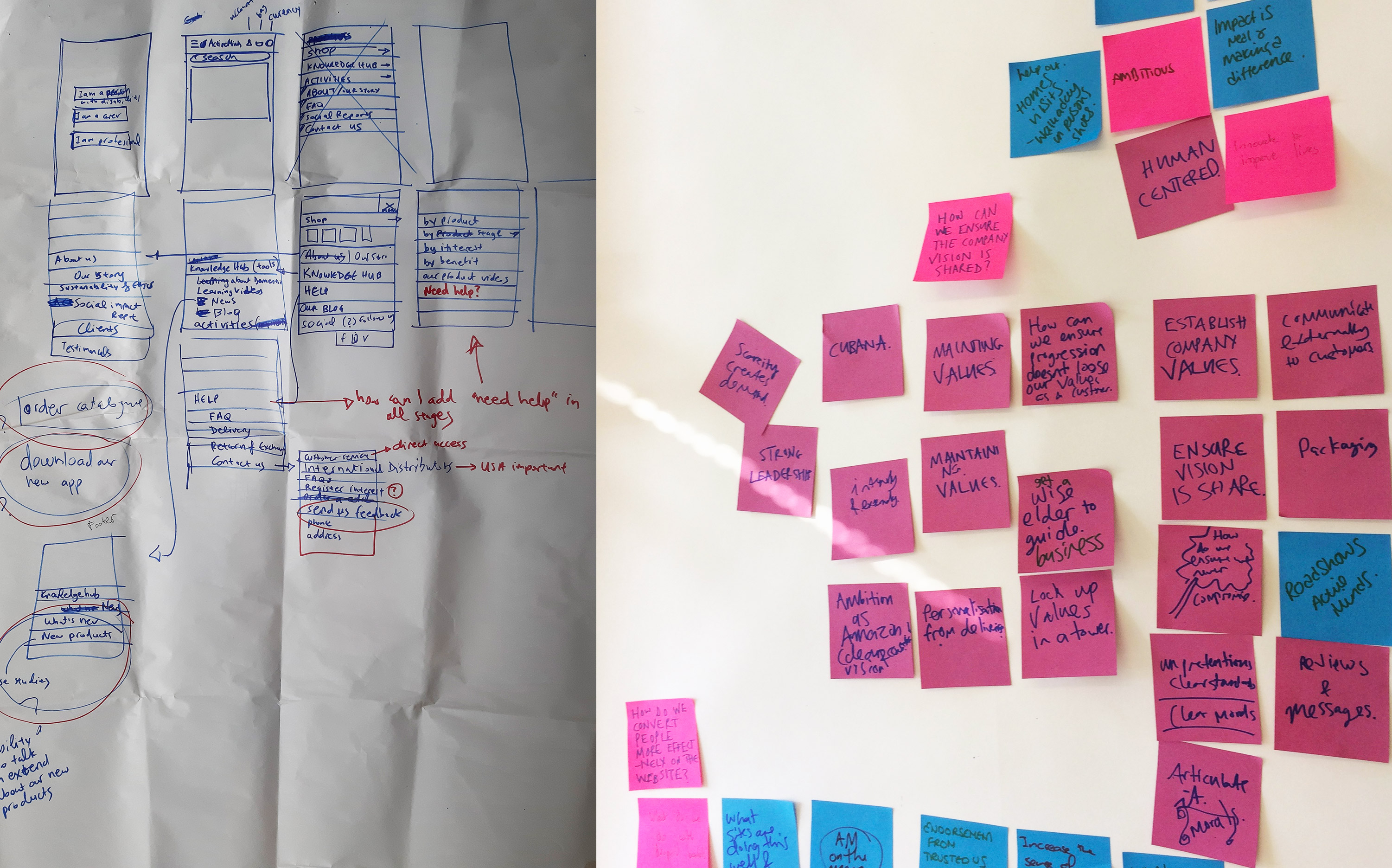
To make sure our values align with the new name and identity a series of workshops were organised with the team; the research insights were presented before brainstorming and come up with ideas.
An external agency was commissioned to help us with rebrand; they conducted their own research additionally to ours and came up with proposals.
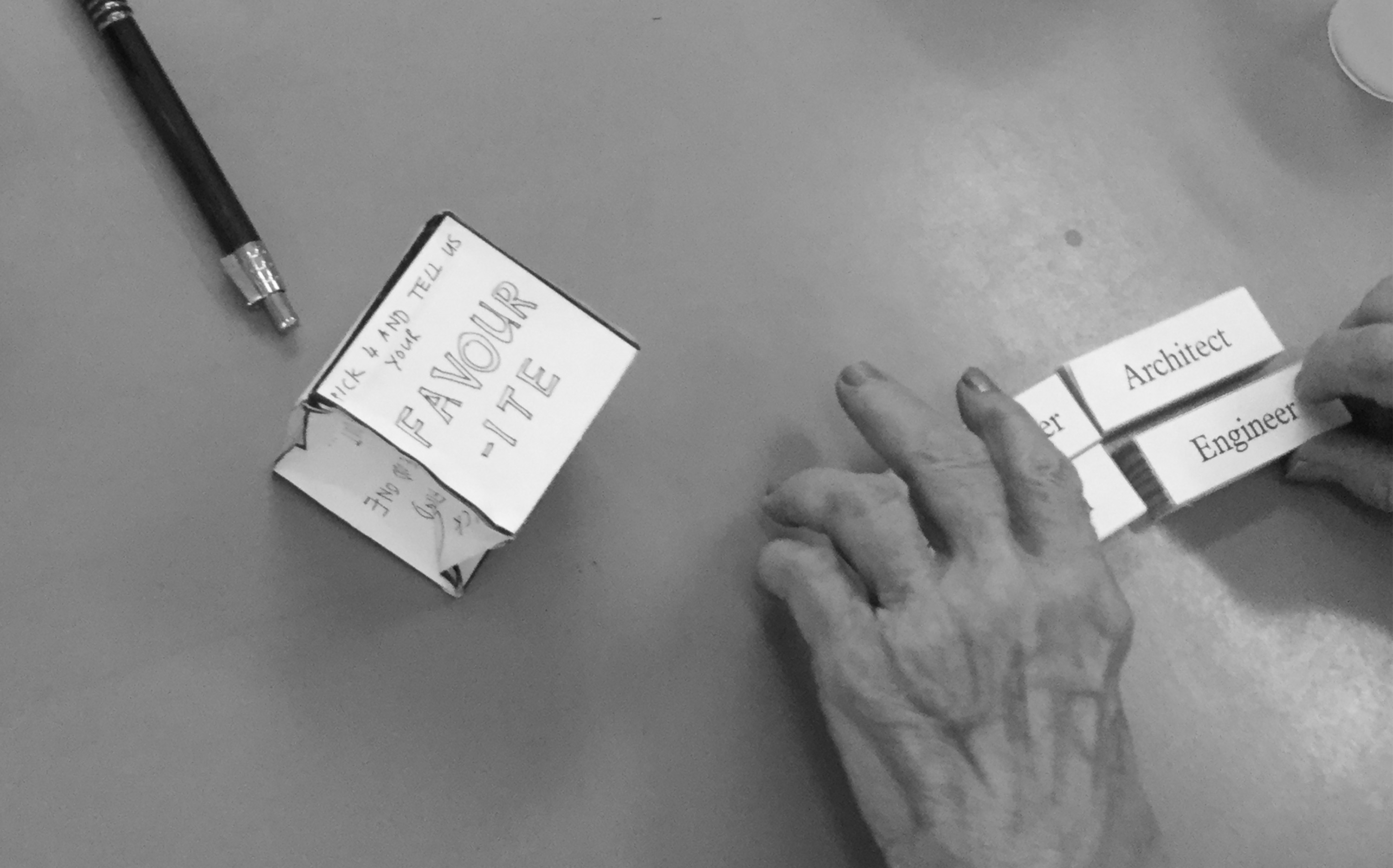
Name finding workshop:
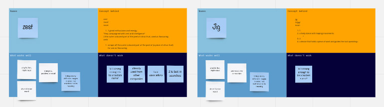
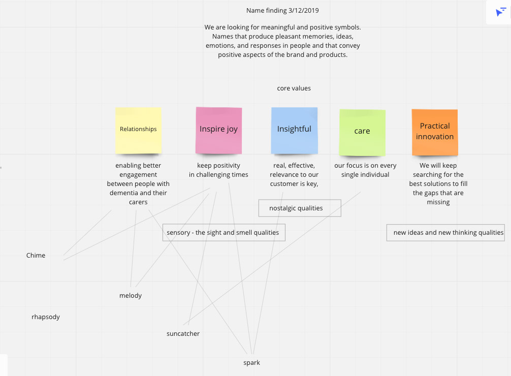
Each function had their own thoughts on who we are. Taking in consideration the feedback from the consumers we came up with words like spark, chime and zest. Finally, it was “relish” that was voted as the best option. Like the new name, the branding was designed to help the company stand out and distinguish its specialized focus in dementia wellbeing and bring a humane joy to an often harsh environment.
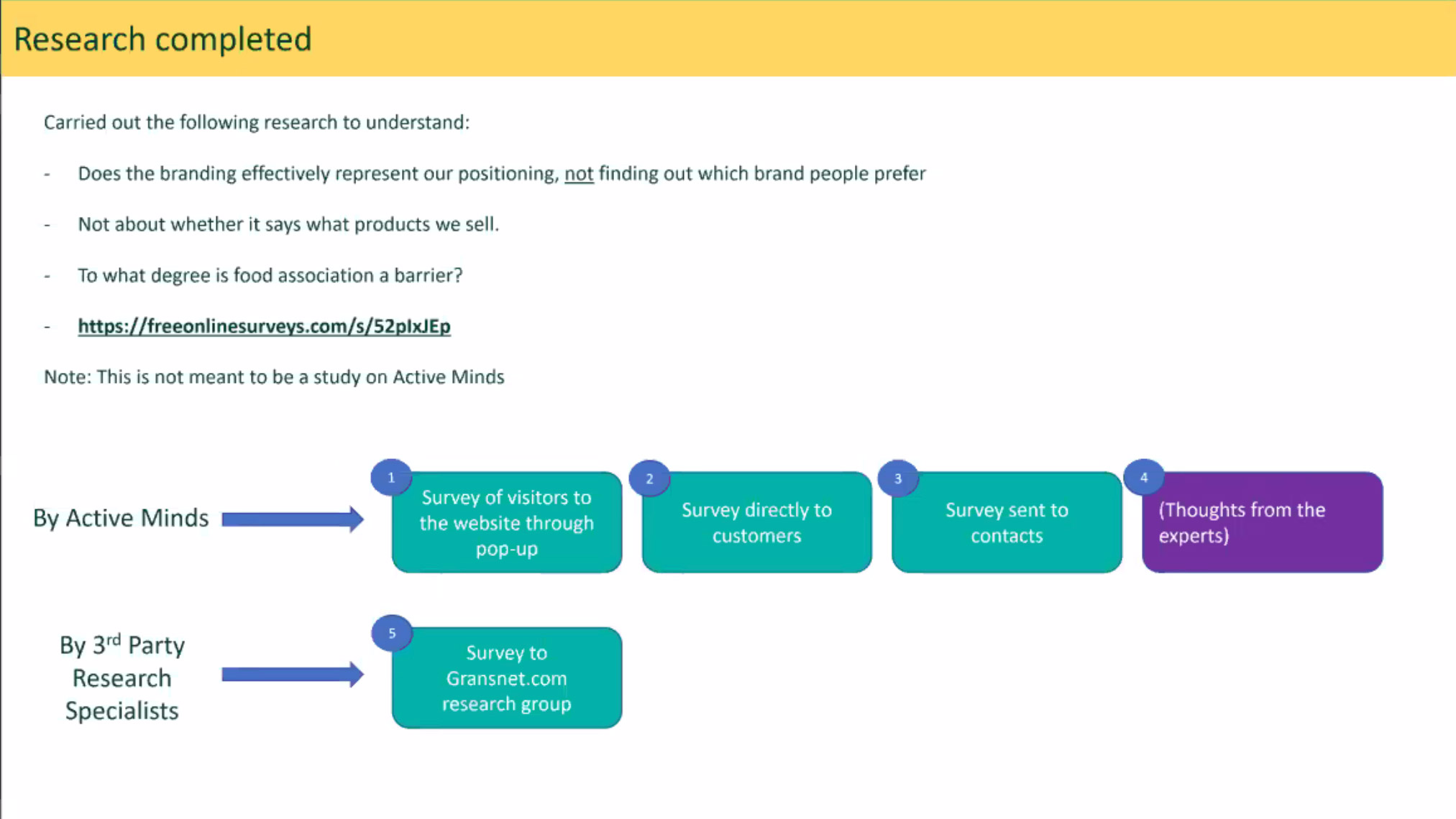
To see how our new name was perceived by the audience we run some tests; we conducted surveys from our own website and through third party research specialists relevant to our audience.
 New brand name and identity
A challenging new audience:
Focusing on the user
The challenges I faced from the start of the project were that the product was niche, targeting a specific section of the health and care industry, there was no real competition and the only research findings I had from previous reports and the AM website analytics were based on care home users and therefore, focusing on the needs of the professionals.
I had to conduct my own research; The first months were spent discovering who is the consumer; where do they come from, what are their needs, desires and habits.
Challenge:
Understand the audience
Who is our audience, what are their goals and desires. What problems are we trying to solve?
Understand the audience
Who is our audience, what are their goals and desires. What problems are we trying to solve?
Solution
Learn users’ needs, desires, demographic info, digital literacy and habits
A UX audit was performed and evaluated. Research methods used: In depth interviews, surveys and task analysis, user recordings, customer log launch, evaluative research.
Learn users’ needs, desires, demographic info, digital literacy and habits
A UX audit was performed and evaluated. Research methods used: In depth interviews, surveys and task analysis, user recordings, customer log launch, evaluative research.
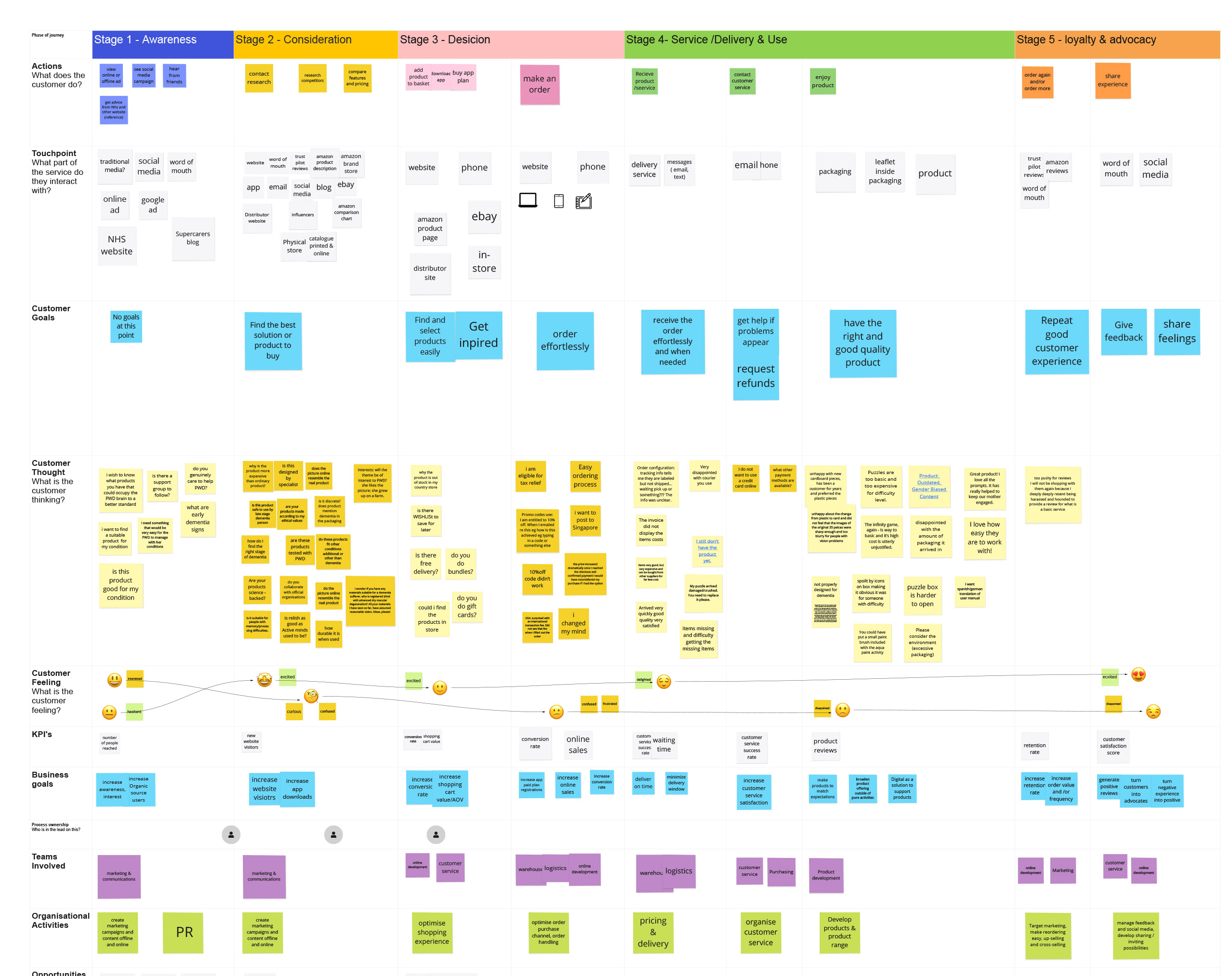
Customer Journey map
Although the classic depiction of the customer journey is a linear funnel, todays reality is not a predictable, progressive path.
When thinking of the Relish costumer journey, it was conceived as a holistic experience, with customer’s exiting and re-entering at various touchpoints- not because they are frustrated or disengaged but because this is the nature of the reality.
Most consumers are not clear about how to get from a problem to a solution. What this suggests is that customers are searching for information. What they need and when they need is content specific.
Customer Journey Plan with empathy mapping
The website structure
![]()
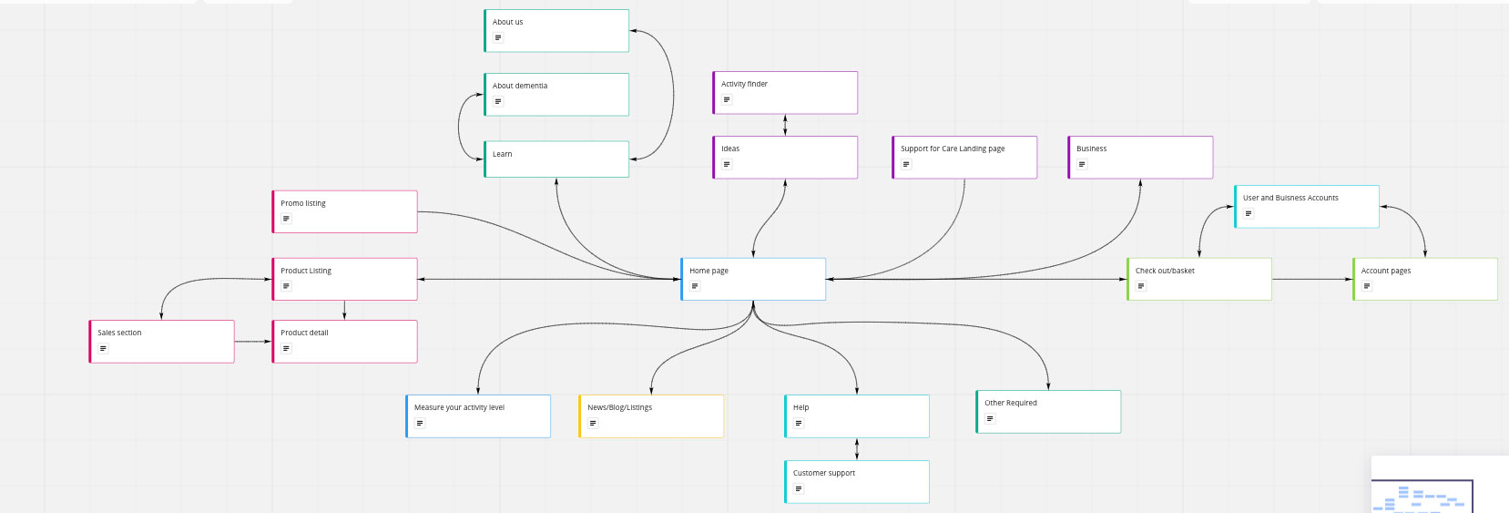
Defining the features:
A description of the functionality of what the site must include was created to meet the user’s needs.
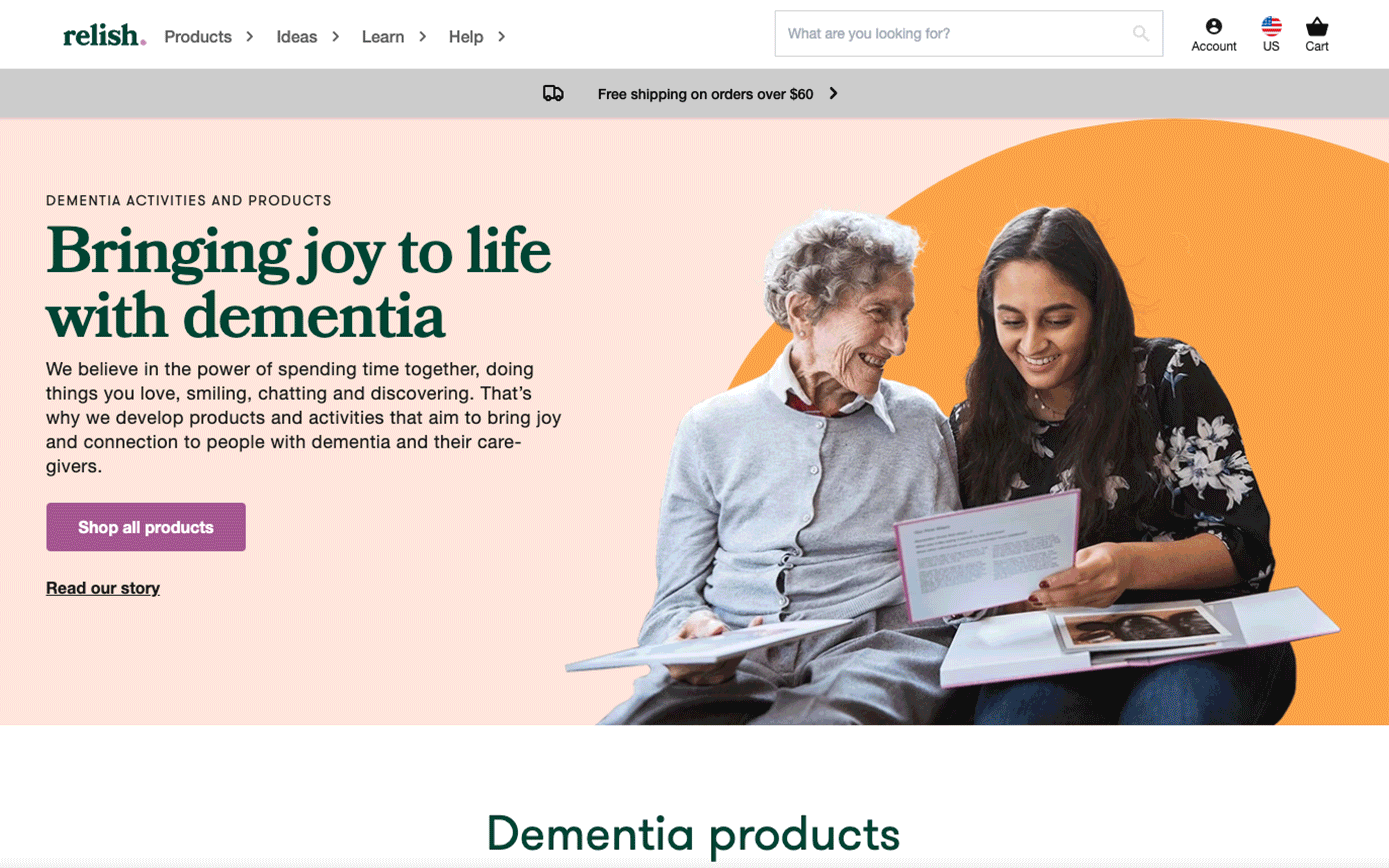
The aim was to build an e-commerce website with a clean structure that could be easily scanned and ranked but, also, to help the user discover and browse easily through all the Relish content.
My goal was to focus on the content; the content would then drive design and structure.
Through user research and by analysing the site metrics I had an understanding of what the user’s needs were and how they think and speak about the subject of dementia. The content would be created and structured based on that. This would also help us later with the SEO.
Content Strategy
The question was what kind of content do we need (topics, types, sources, etc.), and what messages does content need to communicate to our audience? How is content prioritized, organized, formatted, and displayed?From my interviews with family members, carers, care home personnel and people living with dementia I discovered three ongoing themes; the consumer wasn’t always familiar with our products and wasn’t sure of how and what it was helping them with; the majority of users didn’t know much about dementia; the user often came to us for help and support.
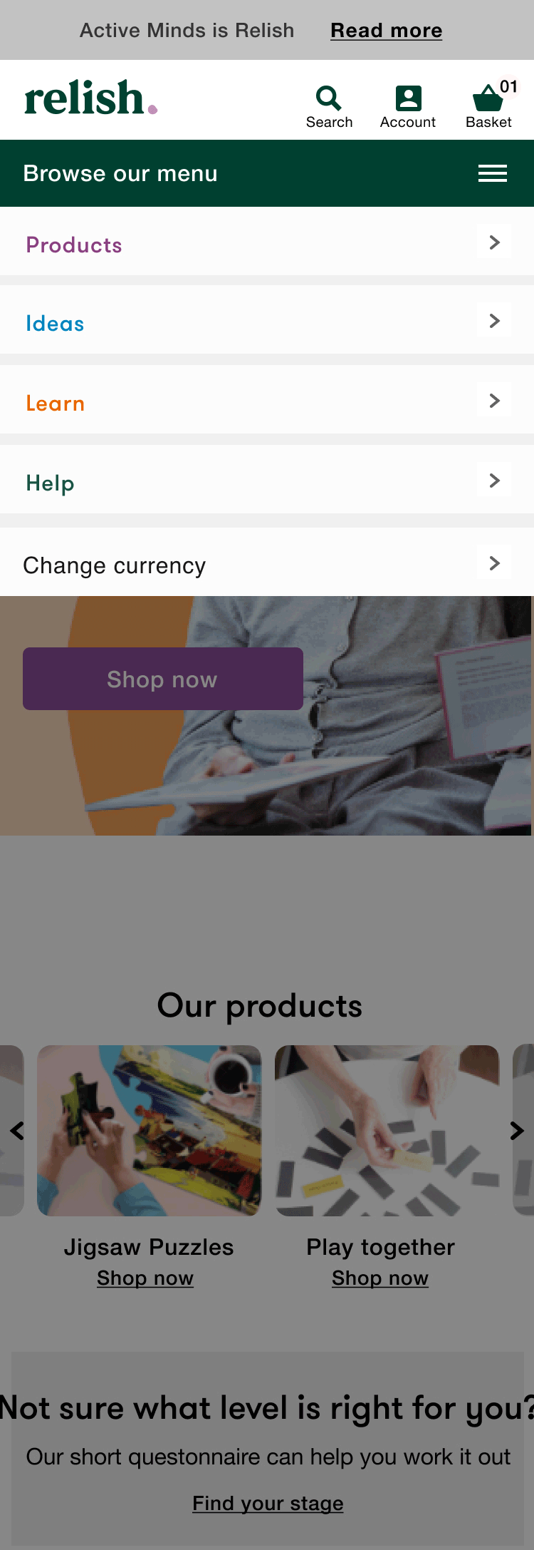
The navigation
Prioritise, organise, categorise
We had the structural design in place, then the quest was how to design the presentation of the information to faciliate understanding.
To address the different users’ needs we separated the content into four pilars; the activities (the shop), ideas (the app), learn (blog, podcasts, learning videos and more) and Help sections.
Whiteboarding sessions with the team helped me formulate a new way of showing the company’s products and services. The taxonomy I created was tested with a variety of users and amended accordingly.
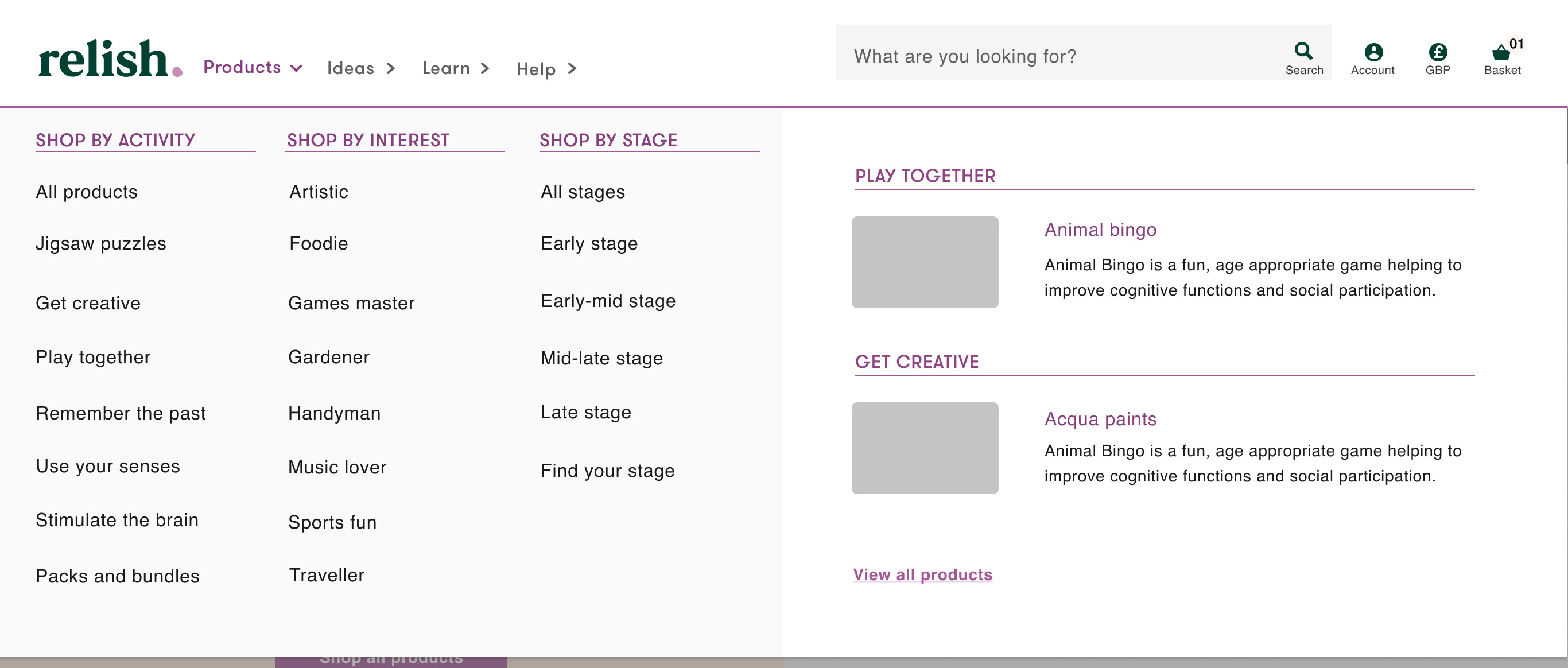
Great attention was paid to the activities section. How
could we help people choose?
The user feedback and recordings from the Active Minds website revealed that the consumer was often confused, didn’t know what product to buy for their condition.
Based on the findings of the research I created two different scenarios of organising the content, which were then tested via card sorting method, with a group of people, that reflected our main consumer segments, to see what makes sense to them. The results gave us great insights on the information architecture.
Accessibility
An important factor when designing the navigation, style guide, content and website features was to make sure that we took in consideration the needs of our audience. Since Relish’ mission was to increase the wellbeing and empower the people living with dementia and their carers, this had to be reflected on our digital products, they should be easy to use by as many people as possible. All design elements, including colour, contrast, type standards and size of buttons, were carefully selected to make sure that the website was meeting the accessibility requirements. The content was created to be presented in many different ways, including
assistive technologies. An accessibility page was created to guide people make the best use of the website.
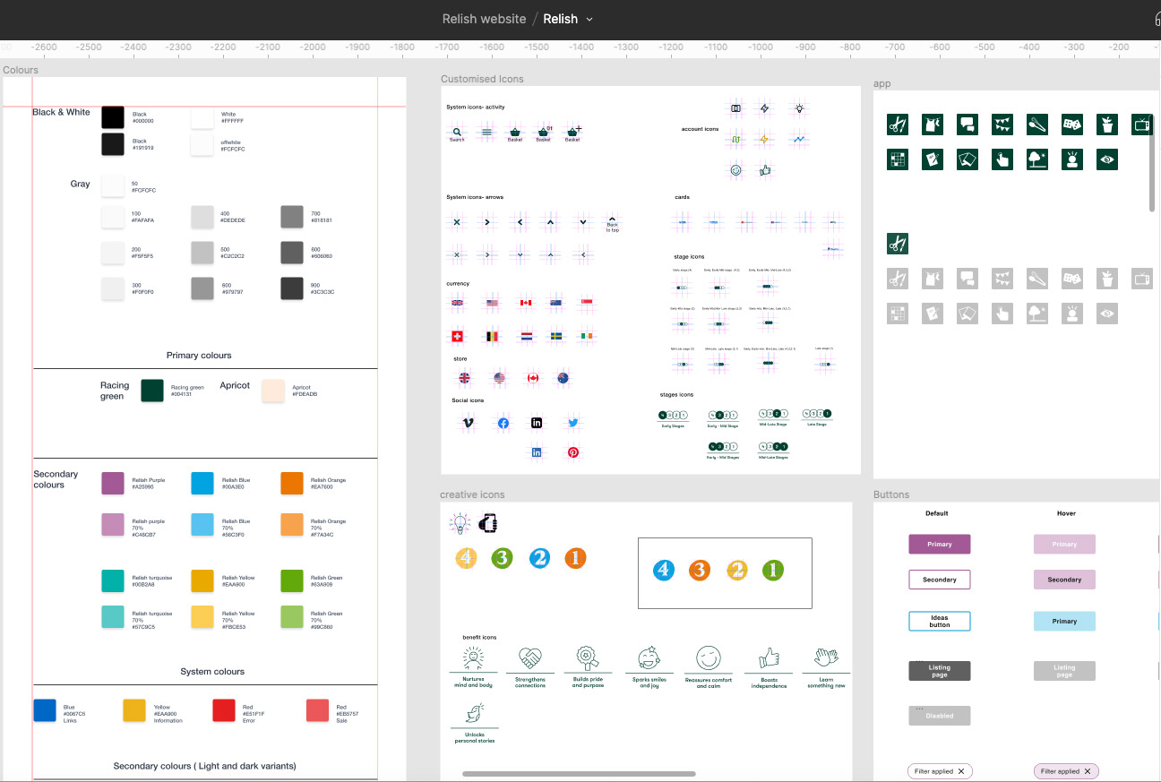
Style guide
All the UI elements were carefully designed and tested with users.
Read more about the Relish design system here
Wireframes- user flows- prototypes
We had a tight deadline to meet. The business goal was to launch the website by September 2020. This meant we had to make sure we work in the most flexible and adaptive way. I proposed to work in sprints with the developers’ team and then run weekly workshops with the Relish team key stakeholders to inform them of the progress, help them understand the process and also get their thoughts on the parts that I needed their input.
Read more about the website product design here
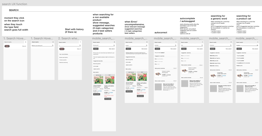
Example: The search function
The website has launched!
Testing, recordings and iterations
The website was launched September 2020, 10 months after I started working on the project. Some features were not completed on time but we decided to go ahead with the launch and continue improving the UX and adding content while it was live. The rest of the features would be implemented in Phase 2.
A few months later we had to redesign the whole checkout process, disable the “choose currency” feature and introduce a choice for store. There was an ongoing conversation with the developers; I would check regularly the users’ recordings, spot any errors and provide solutions to the devs team.
The results
As a result of the new way of showcasing the Relish product and services offering and with the easy-to-use navigation (megamenus, breadcrumbs, labelled navigation on the homepage, shop by stage and interest features made a big difference) the consumer was engaging more and for longer. The conversion rate went up, as did the AOV. There was a jump in user retention and also a better google ranking which helped increase our organic traffic. The “more like this” addition of cross selling products on the product page helped to bring down the drop-offs. The duration and depth of visit increased.
The Relish well being app
![]()
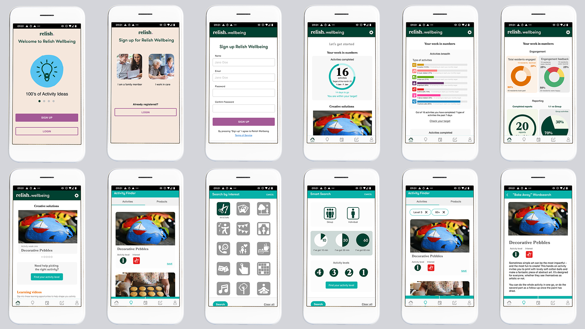
The app was designed to support all the role of the lifestyle and activity coordinators within care settings. I was tasked to rebrand and redesign the App and improve the user experience. A new logo and visual identity were created. After research and test with the app target groups new features were added that will help the carers save time and the managers to easily identify the results.
Read more about the app
Read more about the app
Creating relevant and enganging content:
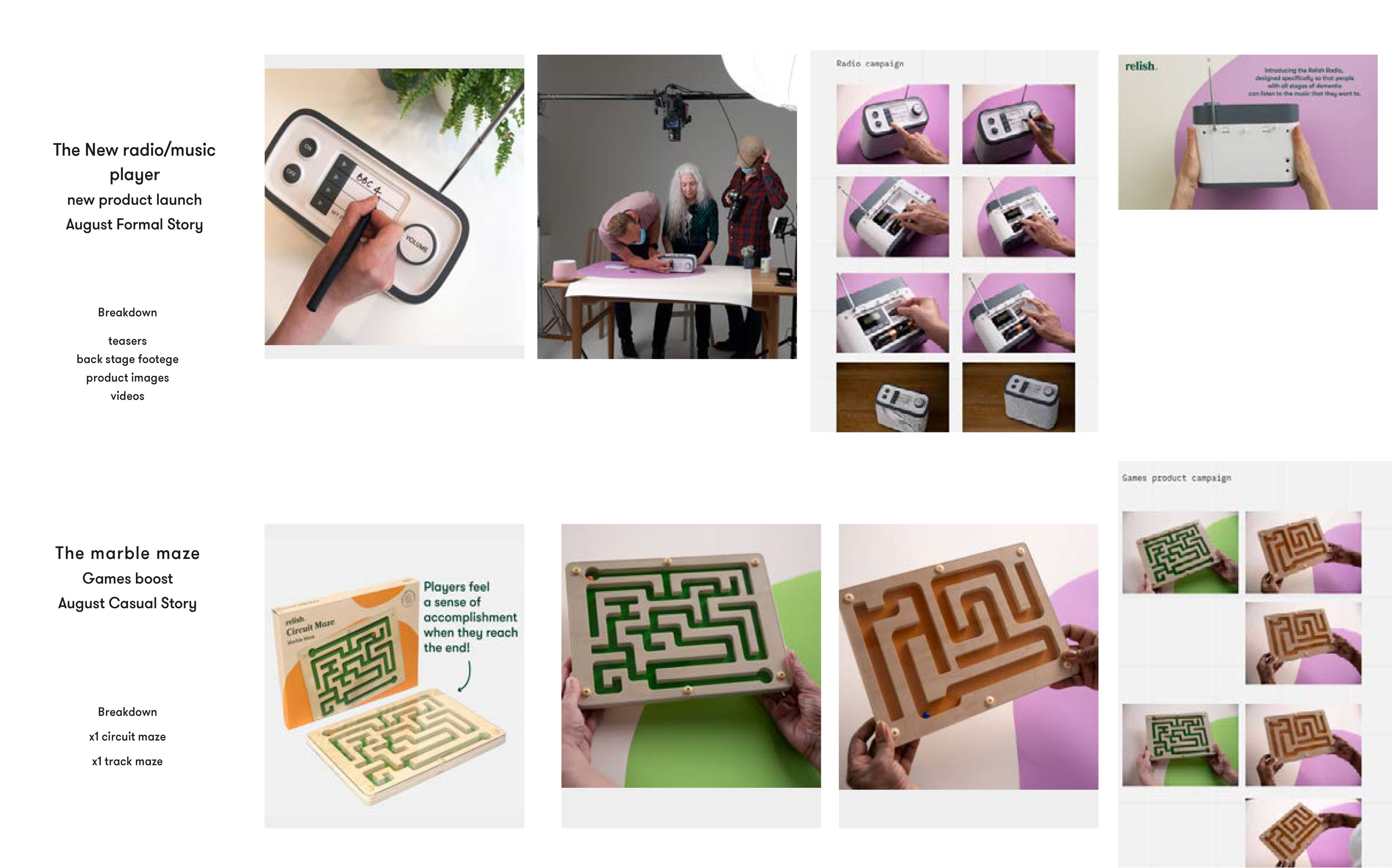
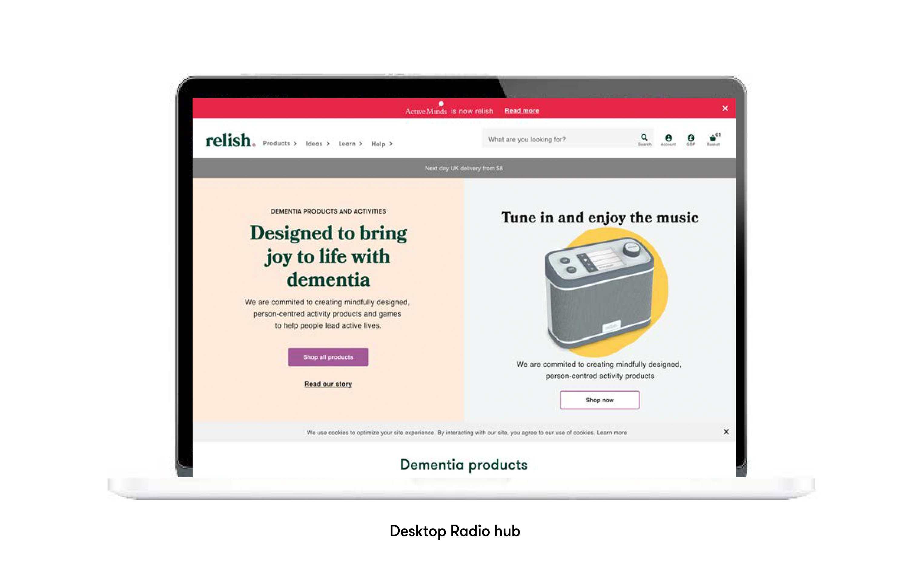
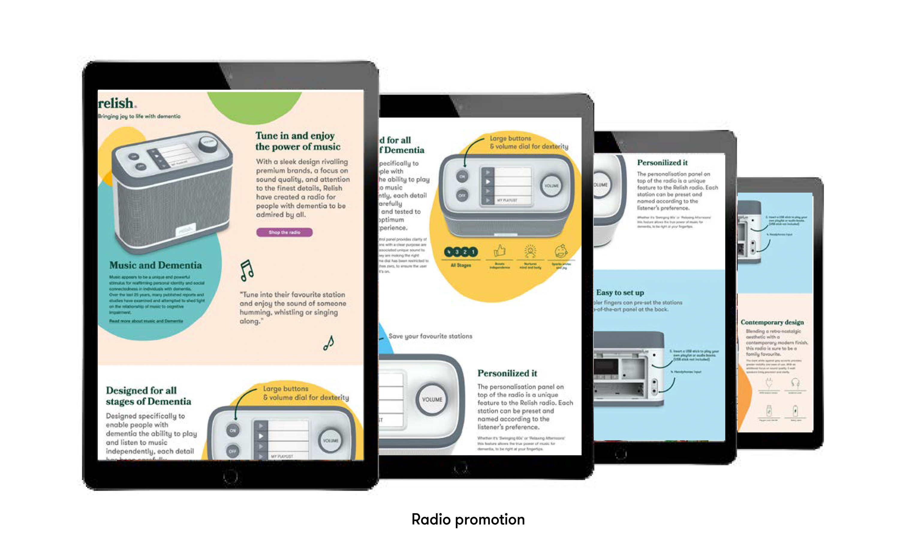
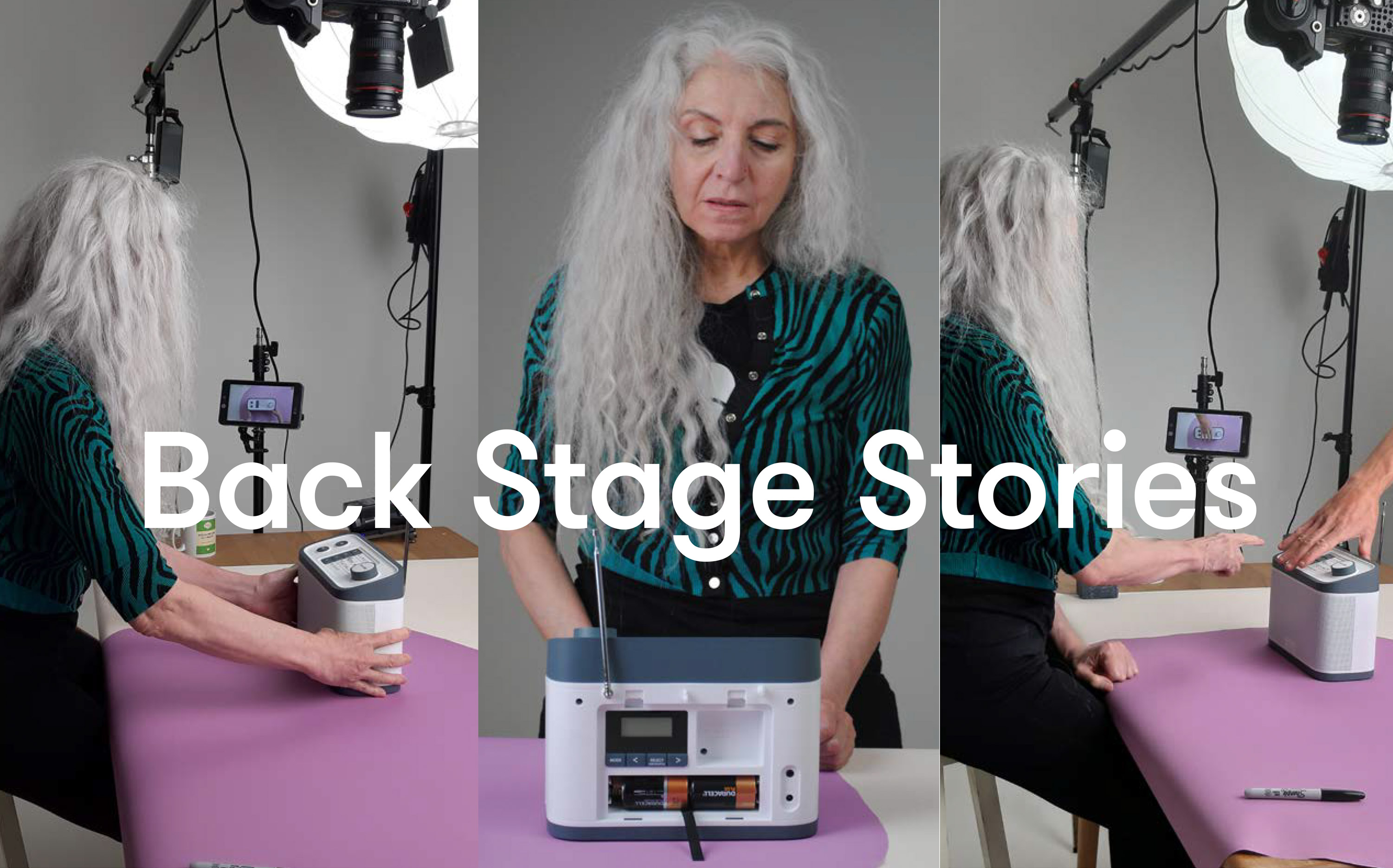
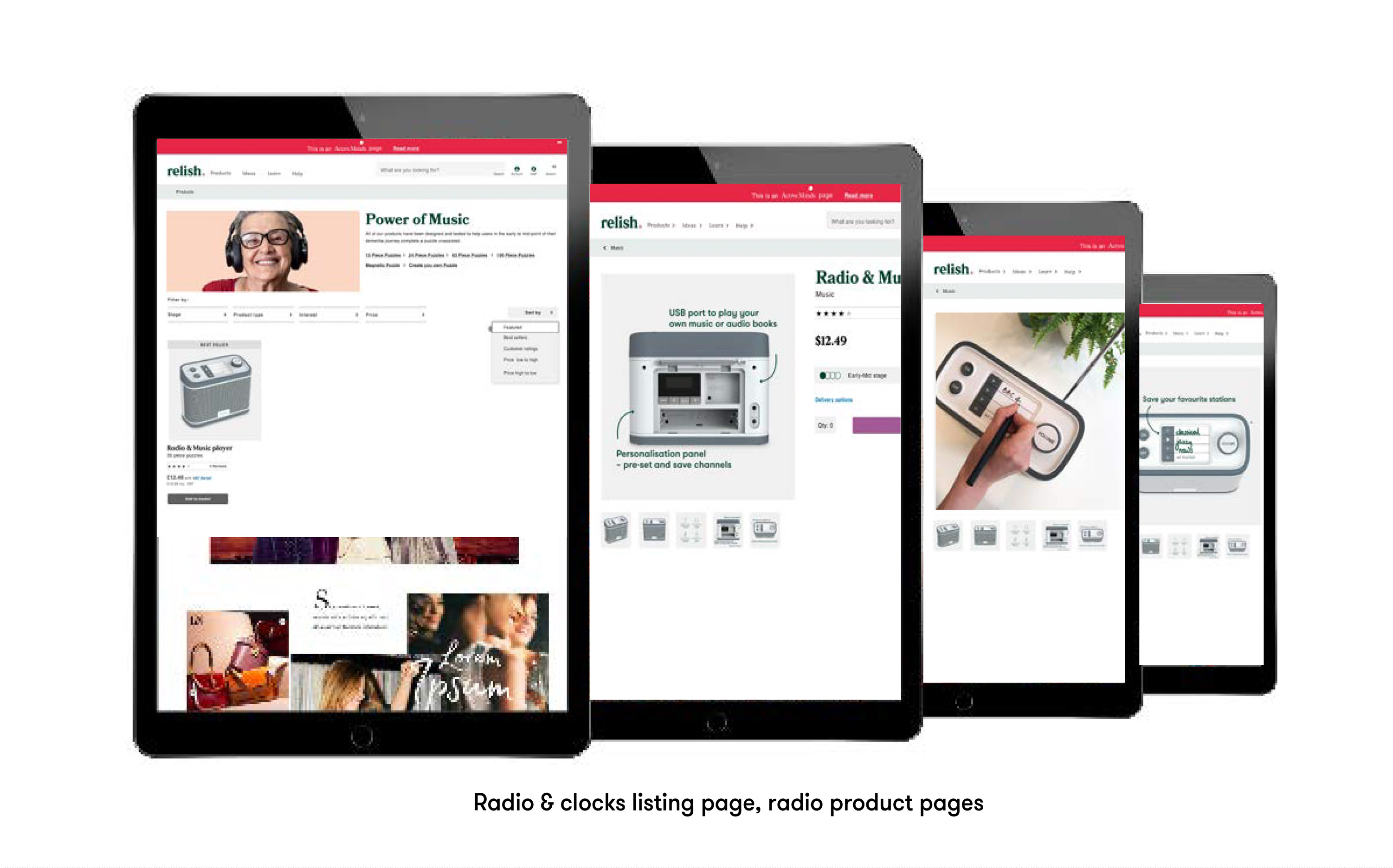
new relish videos and photographyAfter the website launch we decided it was time to invest on creating new content. To celebrate the launch of our new product, the dementia radio, we made a series of videos and studio photography, I was responsible for the concept, planning and art direction of three new product videos and studio photography.
Dementia Radio - Relish from Relish on Vimeo.
Product design:
From a physical to a digital interface
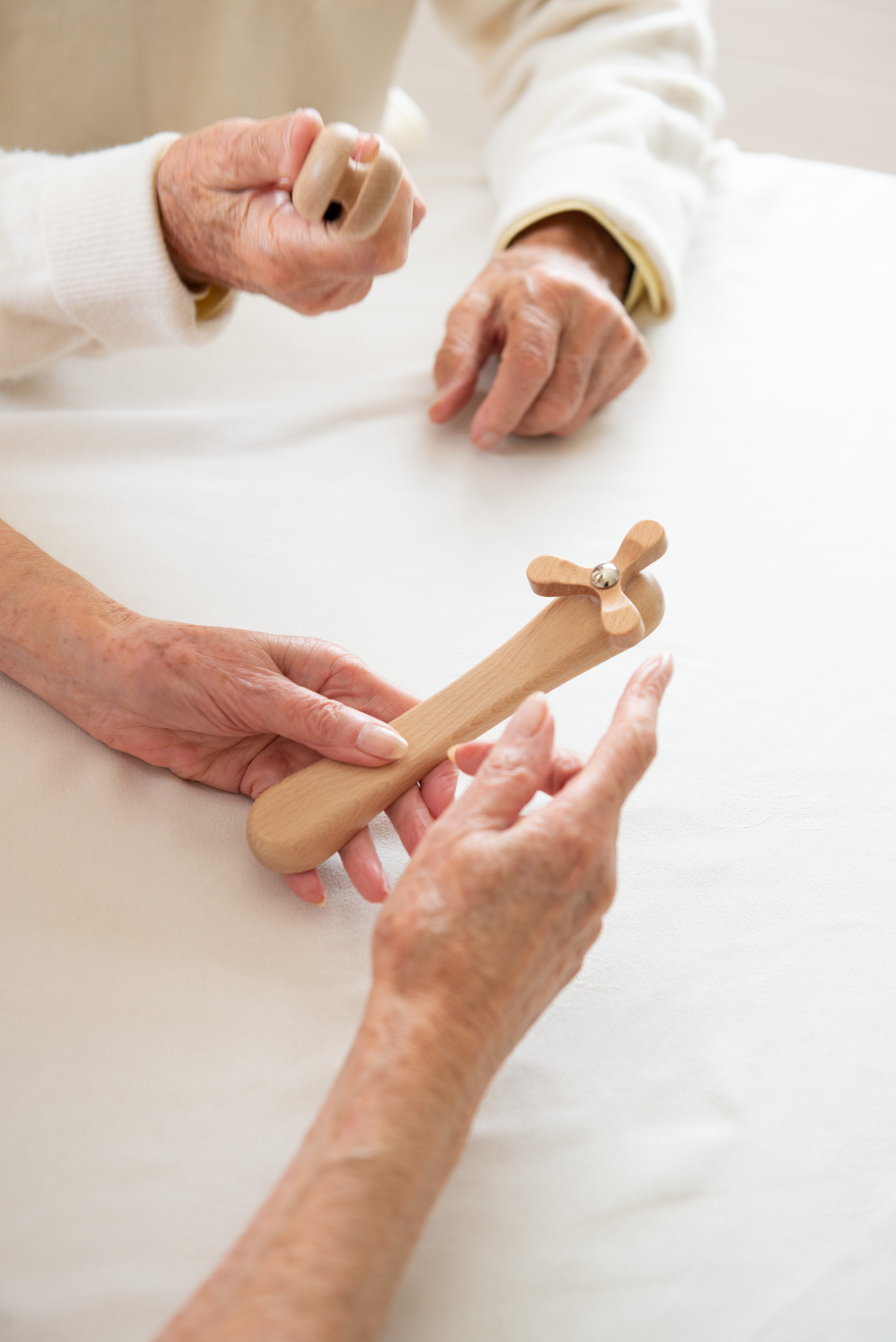
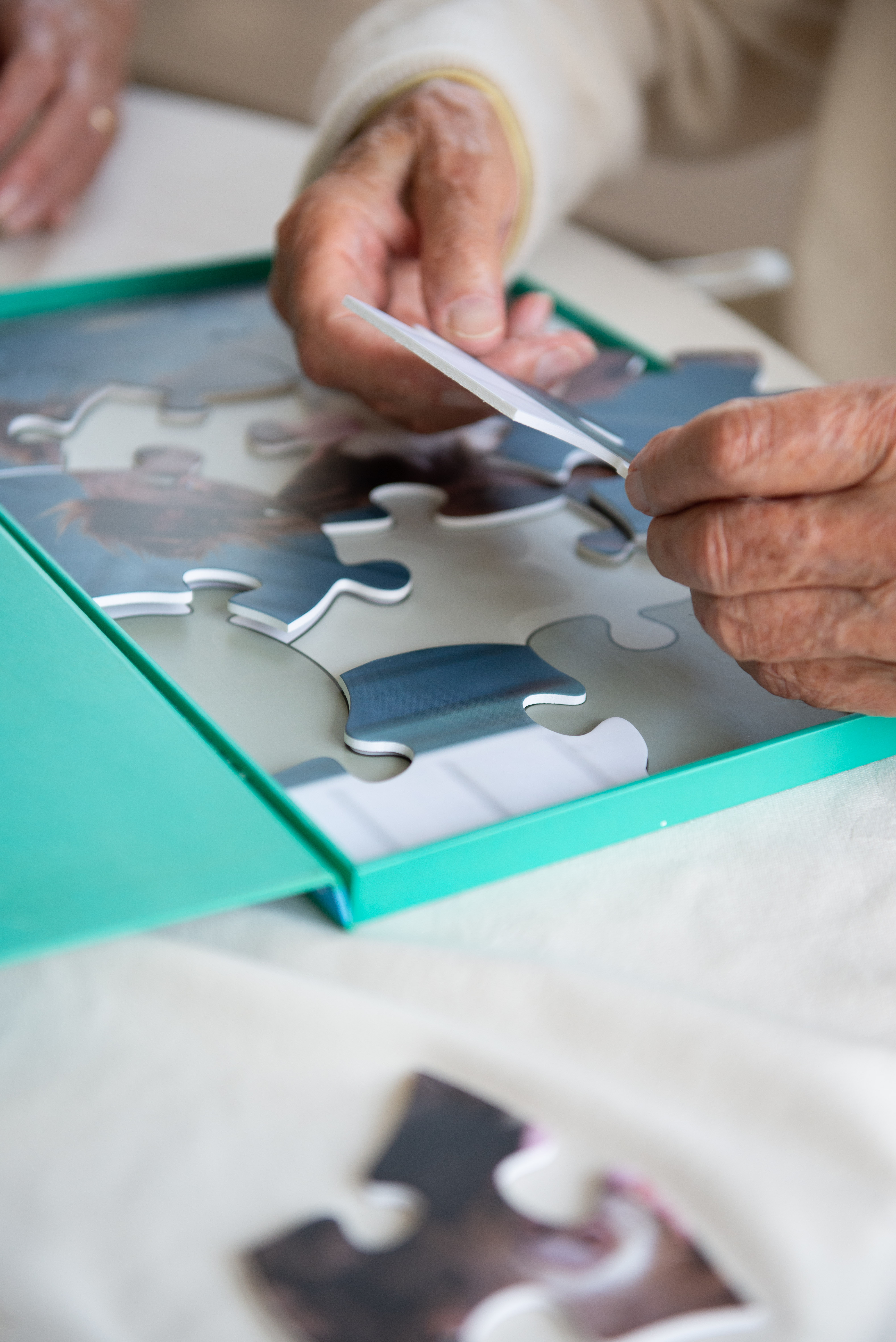
During my stay in Relish I had the opportunity to participate in the discovery and testing phases of some of their physical products’ design.
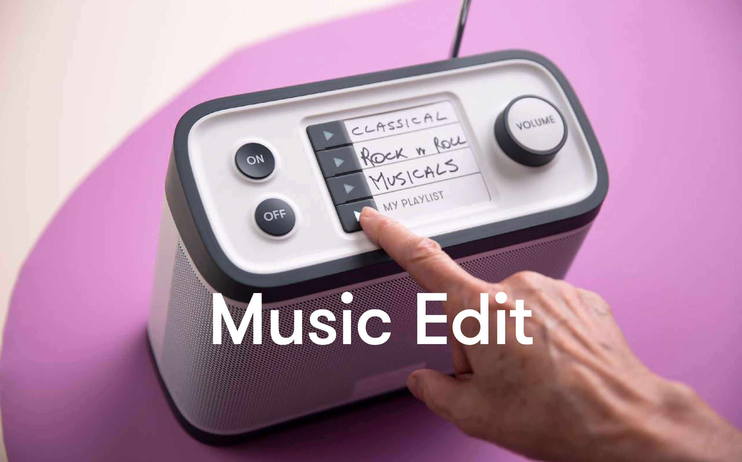
One of these products was the innovative radio for people with dementia. The idea for the radio was formulated during my research; the website search findings indicated that the radio appeared quite oftenas a search item. I had a talk with the CEO and marketing team and they thought it would be a good idea to involve this in their future product development plans.
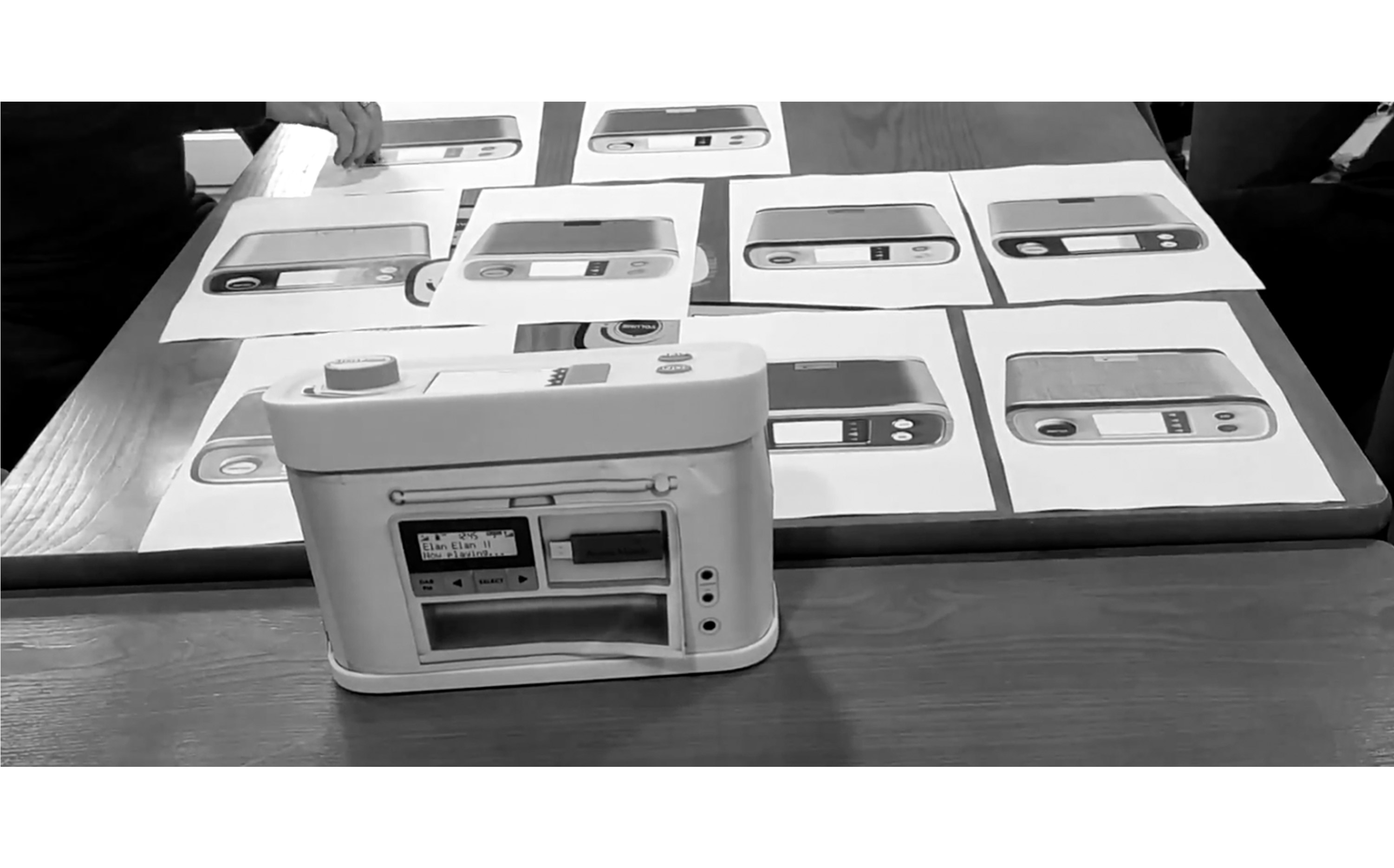
To make sure we communicate in the best light the product’s innovative features, I conducted interviews with the product design team to understand the usability of the product. They had an extended research compiled and the insights helped me form a design strategy. What made it stand out from the competition was the easy-to-use physical interface and the importance of music in the PWD wellbeing.
I created a journey map to find all the relevant touchpoints based on our consumer personas and divided the digital campaign into 4 stages. Each stage had its own content needs with a multichannel apporach to make sure we create relevant content.
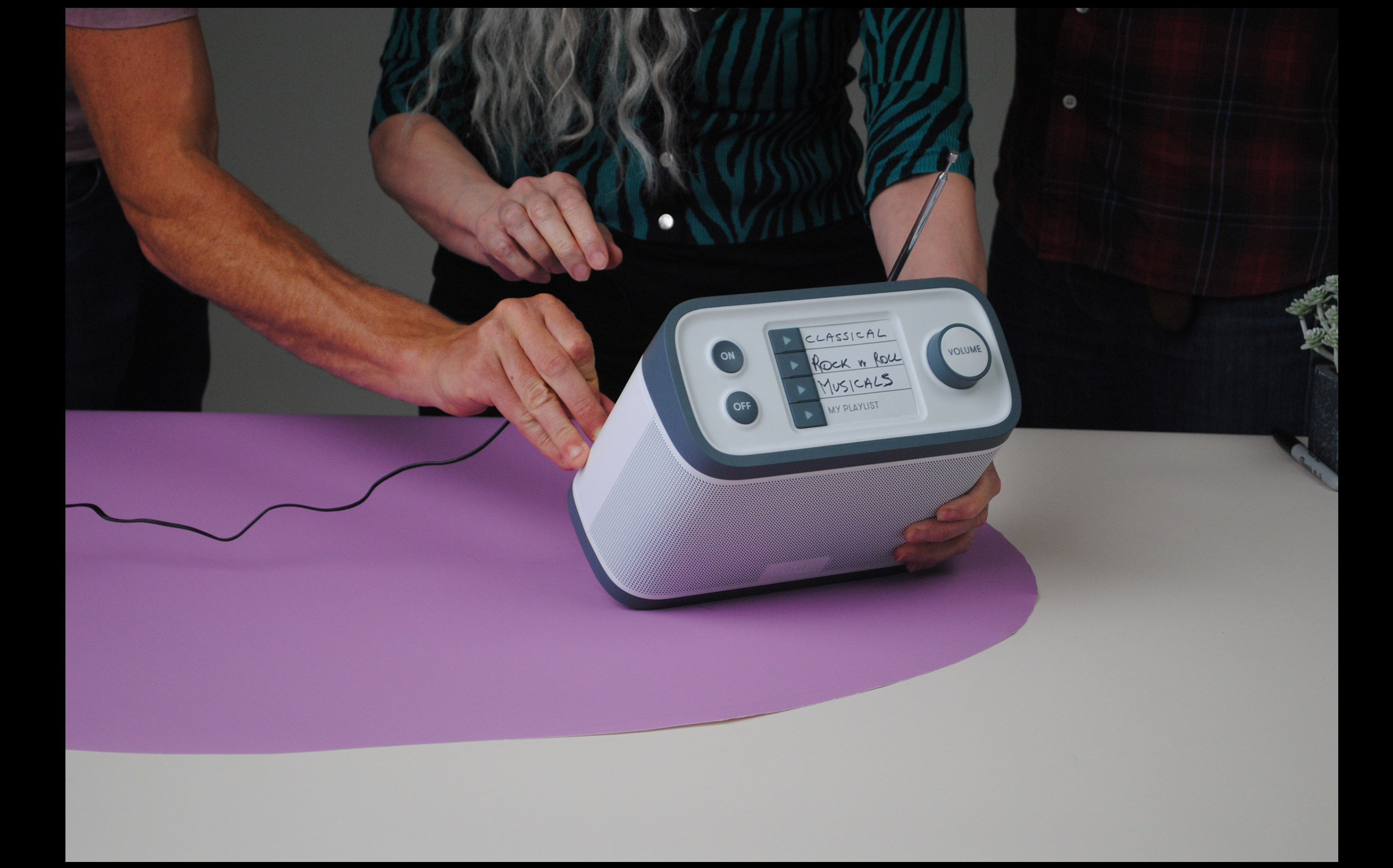
The focus was to explain the importance of music for dementia and the radio specialised features and benefits to the Relish consumers in an engaging visual way across different channels.
The visual concept based on the use of the organic shapes, one of the key elements of the Relish visual identity. The shapes give a playful and joyful look to a specialty product promotion.
The Boxfresh brand transformation
When starting on a big, complicated process, like a brand refresh there is a lot to consider. One needs to be able to step back and see the whole picture and at the same time dive in and focus on the details.
In the case of the Boxfresh refresh, the brand was set to get a whole new approach on how we engage with the consumers across all channels.
In the case of the Boxfresh refresh, the brand was set to get a whole new approach on how we engage with the consumers across all channels.
The main focus was on the digital ones and with a new campaign in place, that served as the foundation, the new site was about to launch.
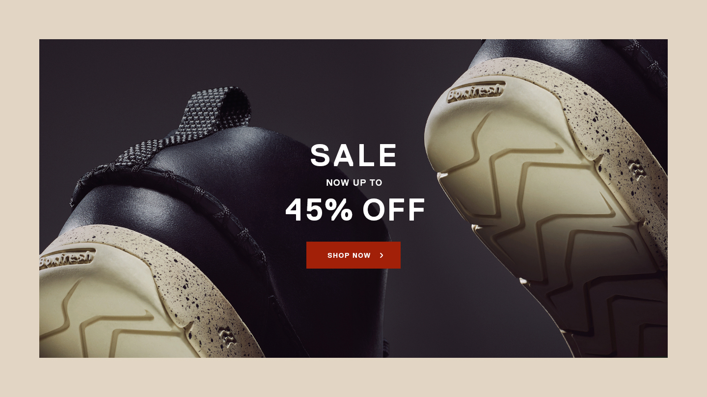
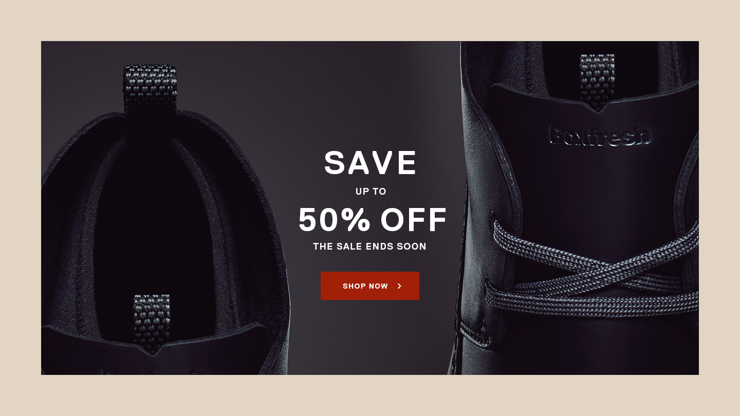
The Boxfresh campaign
Introducing one of the products
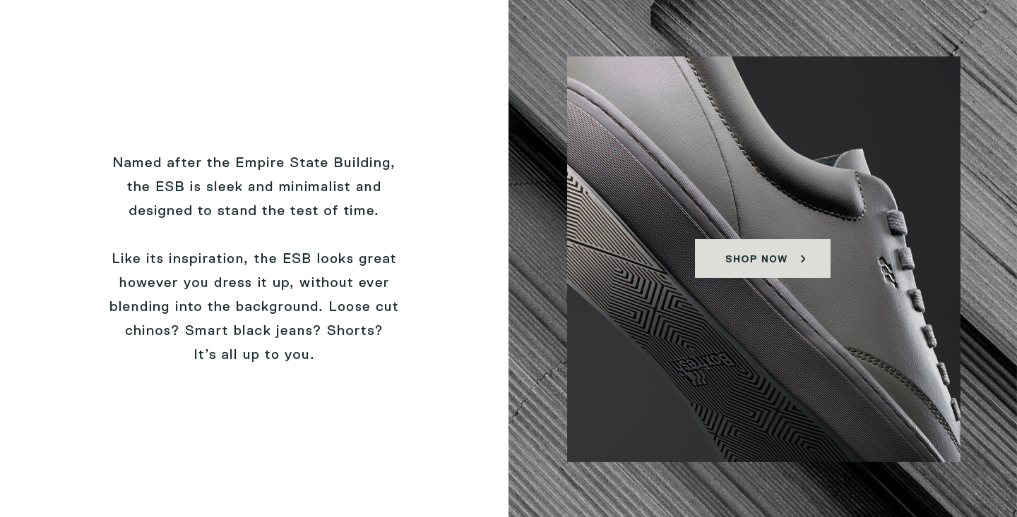
The concept for the new campaign was based on the idea that each product was a hero on itself. Each pair of the new trainers were designed with references from urban architectural styles.
The photography presented each product as the hero, giving them monumental attributes. The colour palette was created based on shades found on a cityscape and we designed patterns referencing concrete, sand and stone materials.
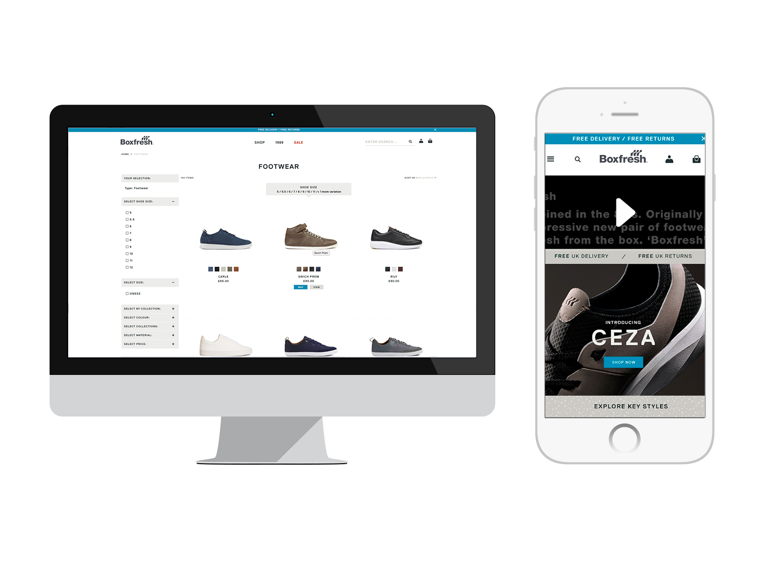
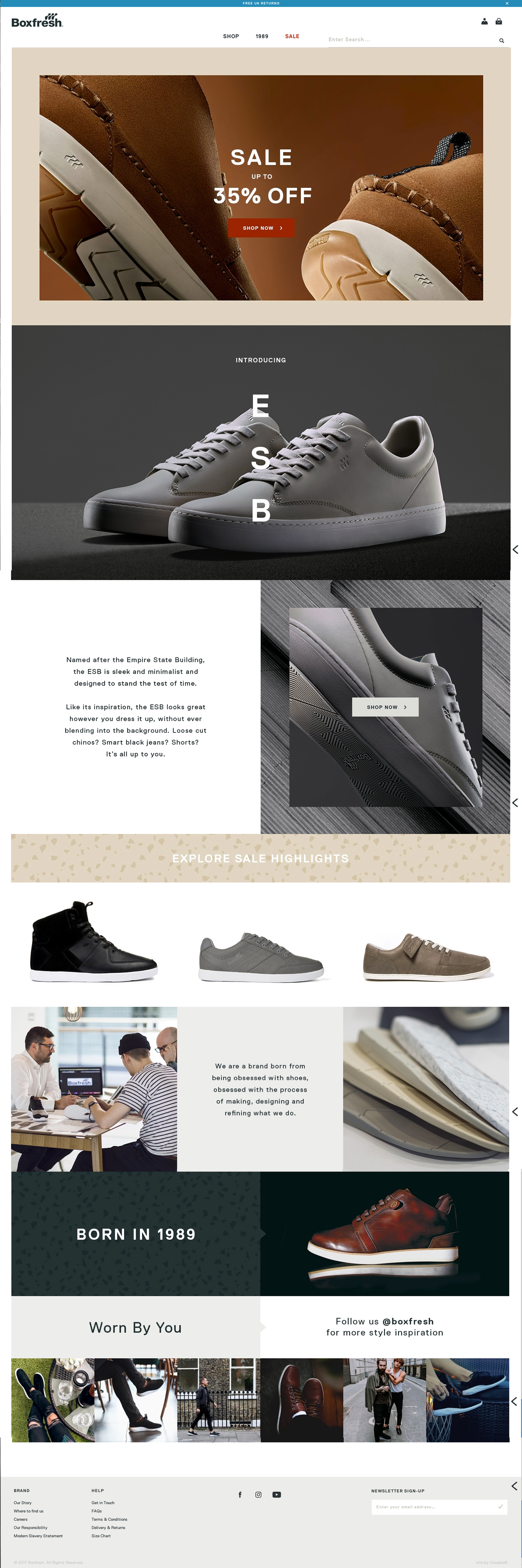
A new e-commerce website was designed from scratch based on this visual identity; in contrast with previous versions where offers and sale was the main focus, now the aim was to make the brand signature more prominent.
There was dedicated space on the new homepage to the origins and history of the Boxfresh brand, the craftsmanship and its social appearance.
There was dedicated space on the new homepage to the origins and history of the Boxfresh brand, the craftsmanship and its social appearance.
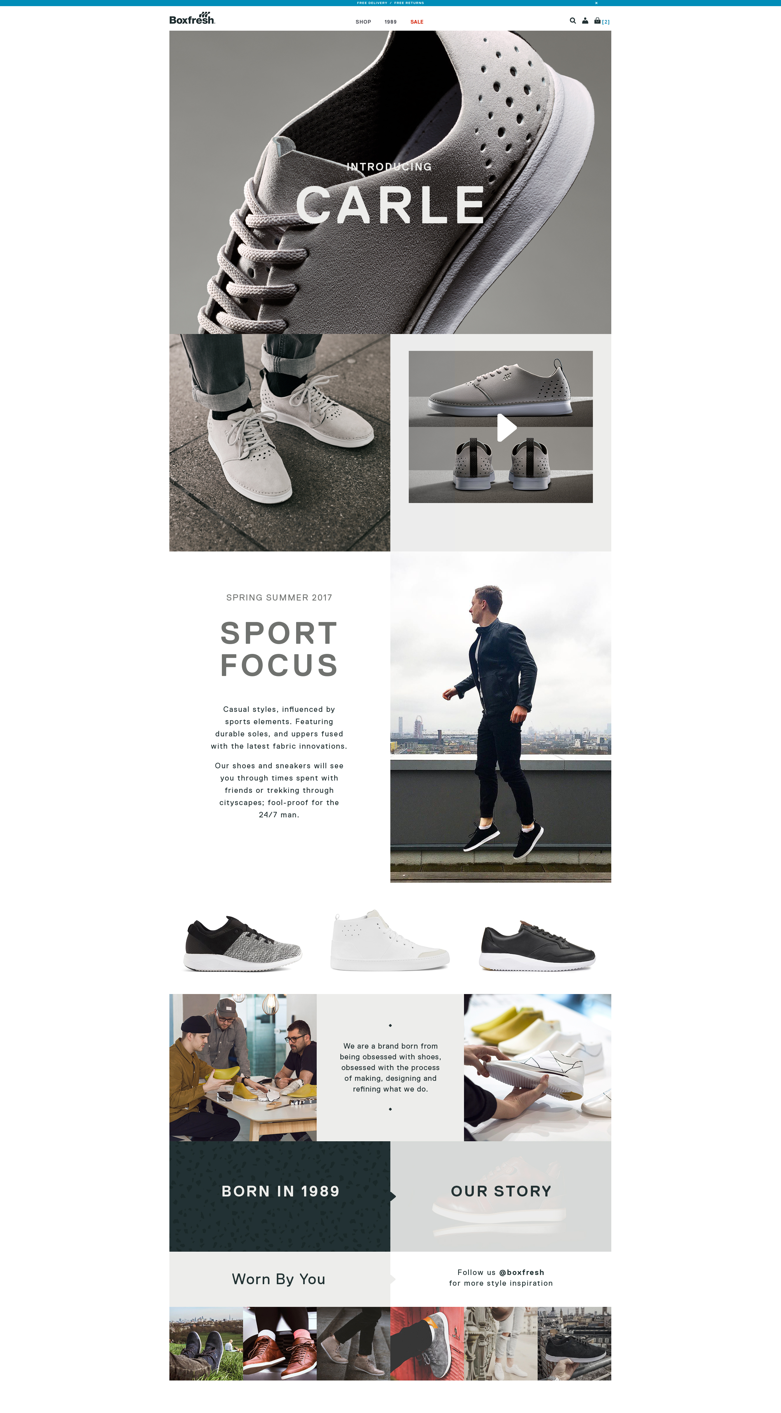
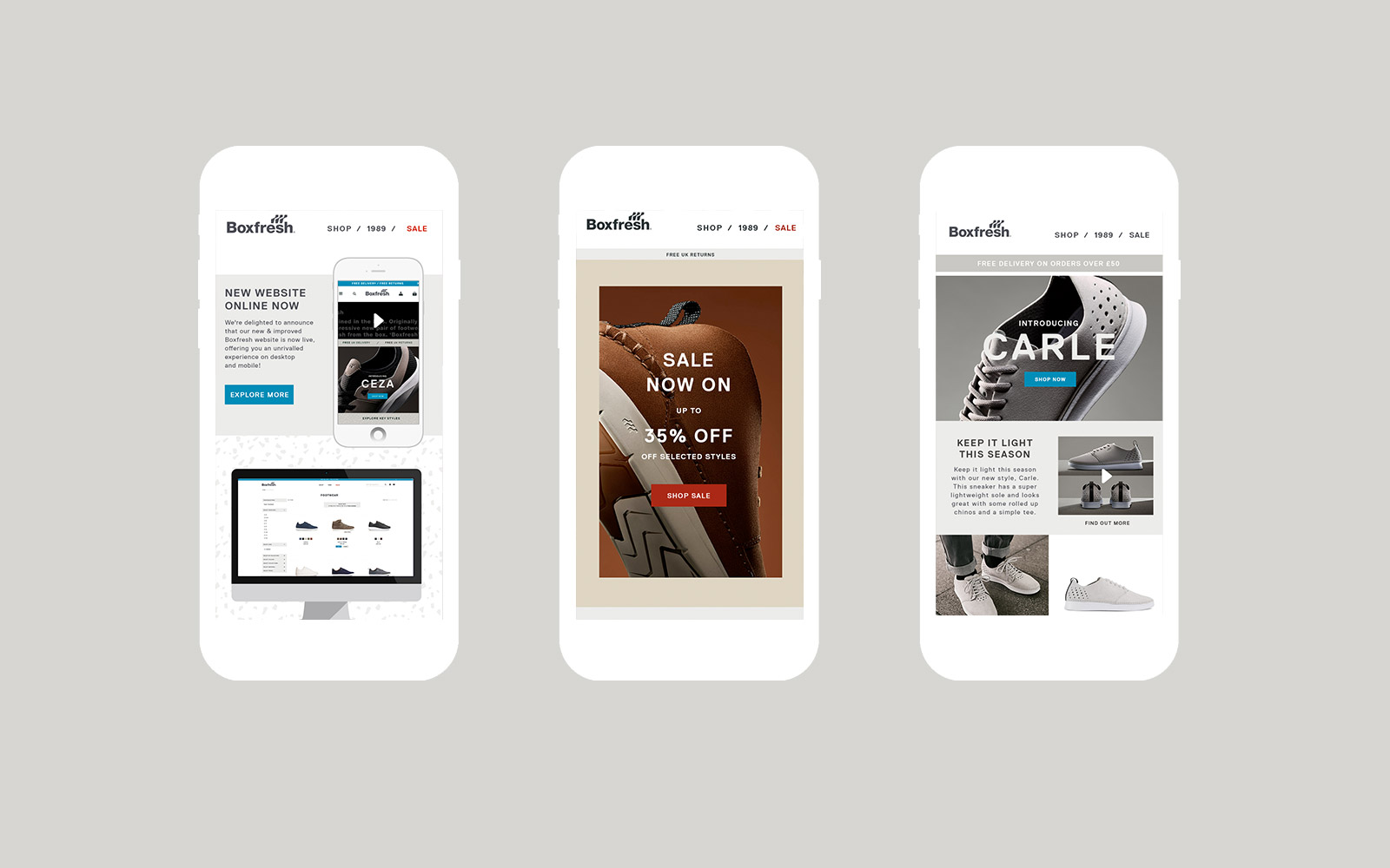
The email templates were designed in a similar way to the website homepage layout
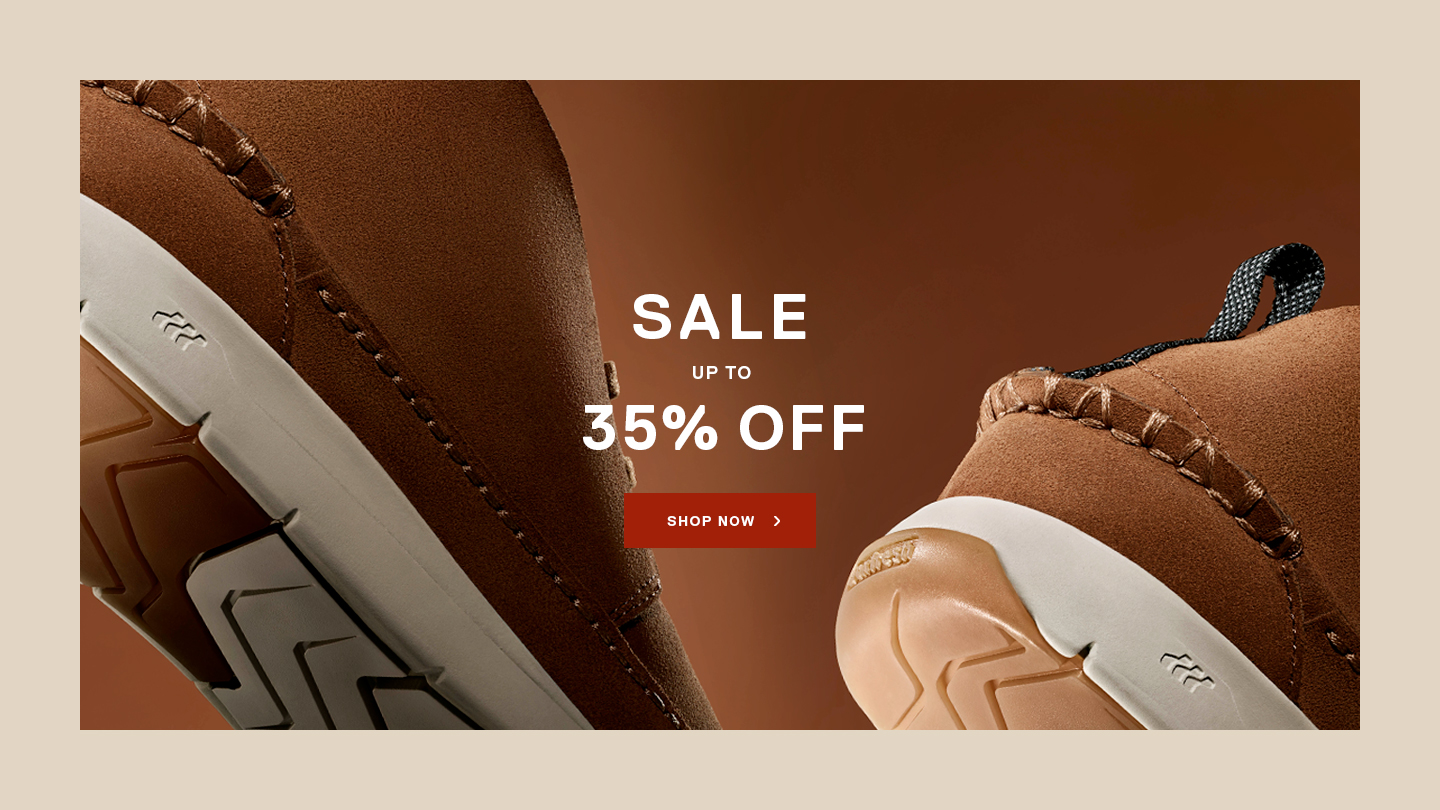
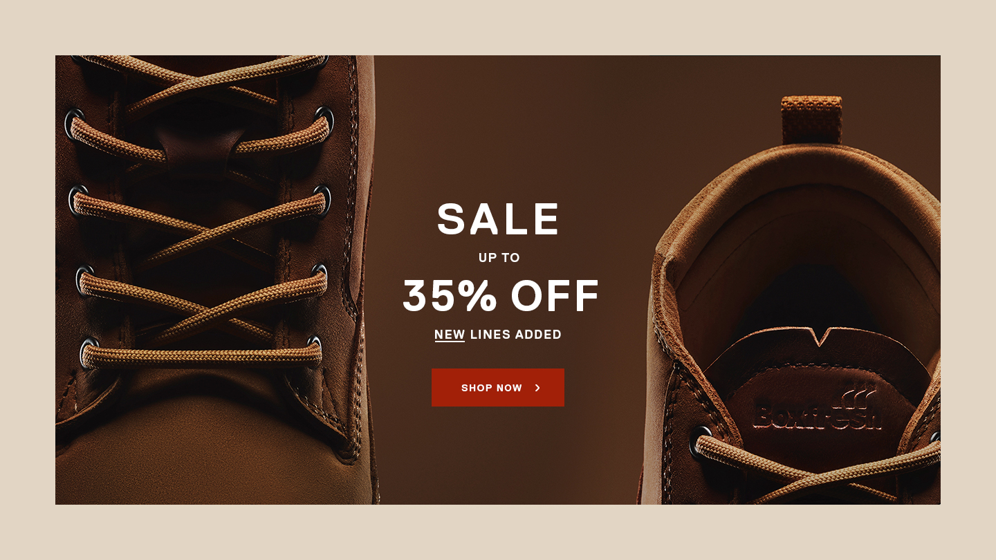
The promotional pages approach
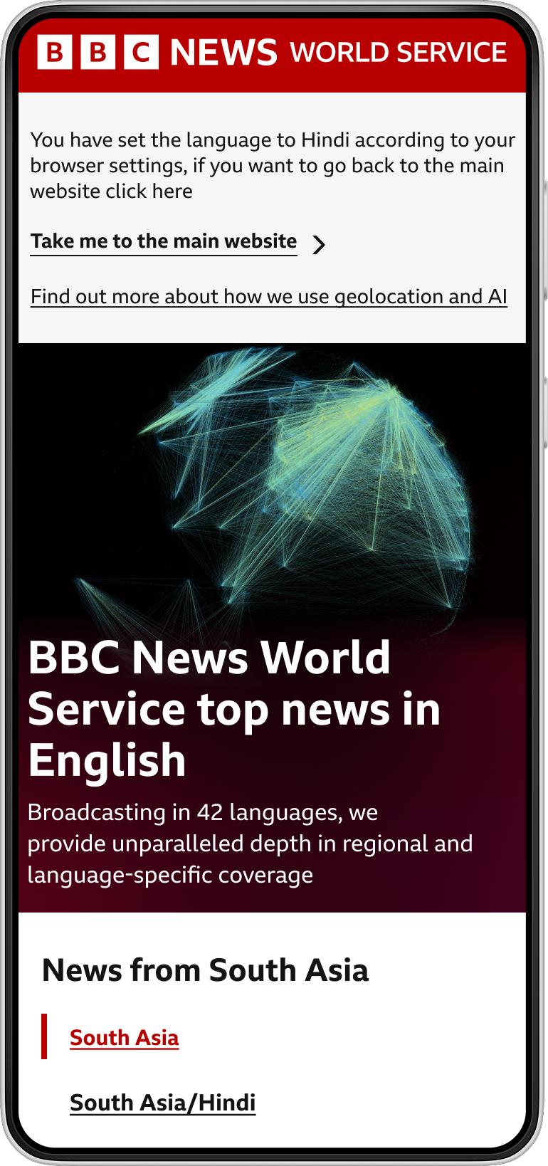
The BBC World Service
Reaching 320 million people weekly, the BBC World Service is globally trusted for its fact-based journalism, delivering independent, impartial, and accurate news in 42 languages across 60 countries.
Since 2022, I’ve been working as the Senior UX Designer for the BBC World Service team. In this role, I lead the user experience strategy for our global digital products, including 42 language websites and until recently, four World Service apps
My focus is on ensuring these platforms are intuitive, accessible, and engaging for our diverse global audience.
What makes the World Service truly unique is the breadth and diversity of our users. We design for audiences with different cultural backgrounds in varying socioeconomic contexts and with a wide range of digital literacy levels and linguistic needs.
This complexity makes our work both challenging and rewarding, as we strive to create inclusive experiences that resonate across the globe.

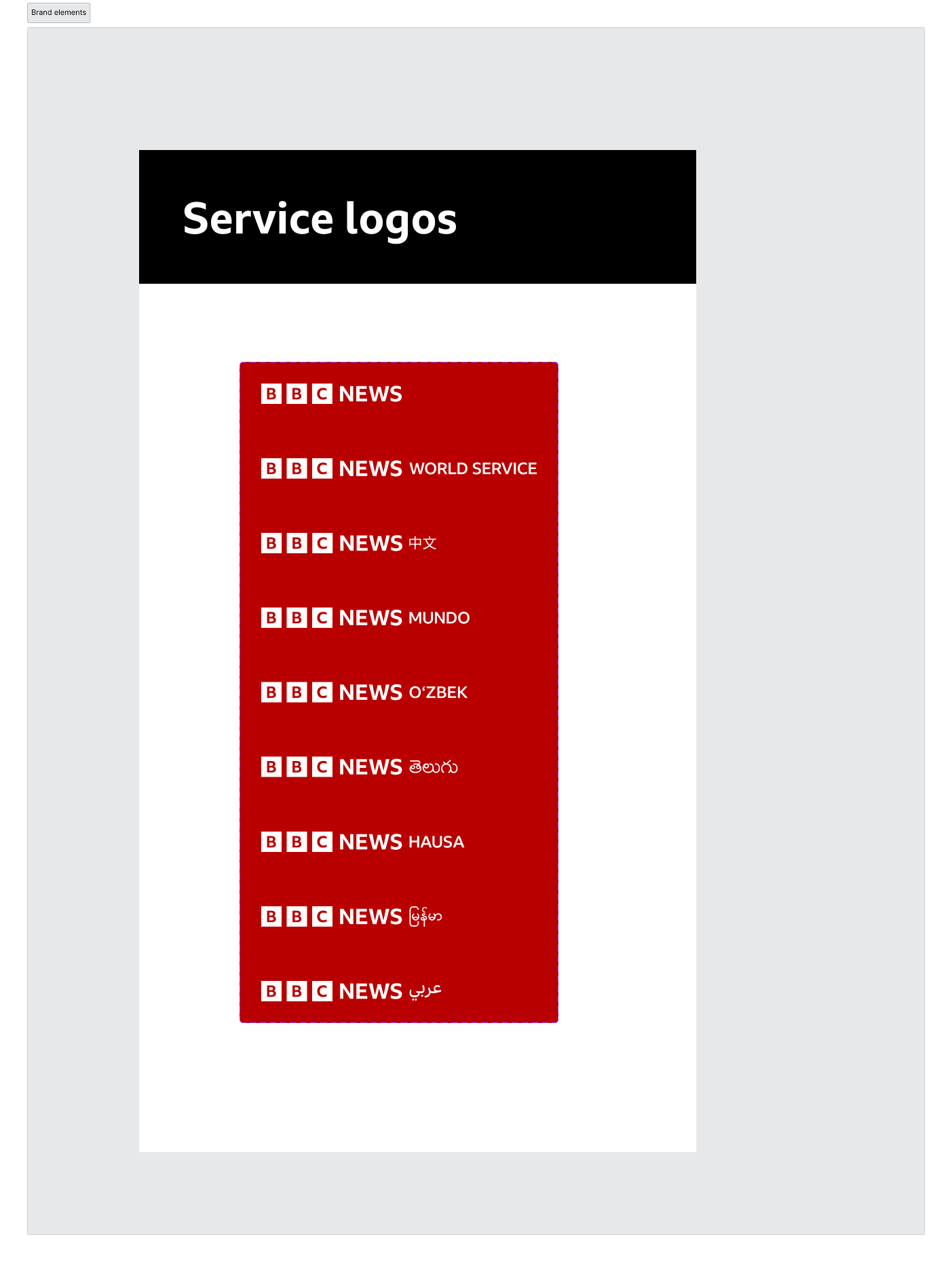
The BBC World Service Logos
1. Designing Consistency at Scale: The Chameleon
Project Across BBC Services
As part of our mission to create a consistent experience
across all BBC services, we were tasked with applying the new visual identity
across the World Service digital products. This was a collaborative effort with
the external agency Wolff Olins, and it marked a significant step in aligning
our platforms with the broader BBC brand.
In the early stages of the project, we conducted an in-depth
audit of our existing interfaces. This helped us identify key areas that
required further exploration, particularly where the new visual language
intersected with the unique needs of our multilingual and culturally diverse
audiences.
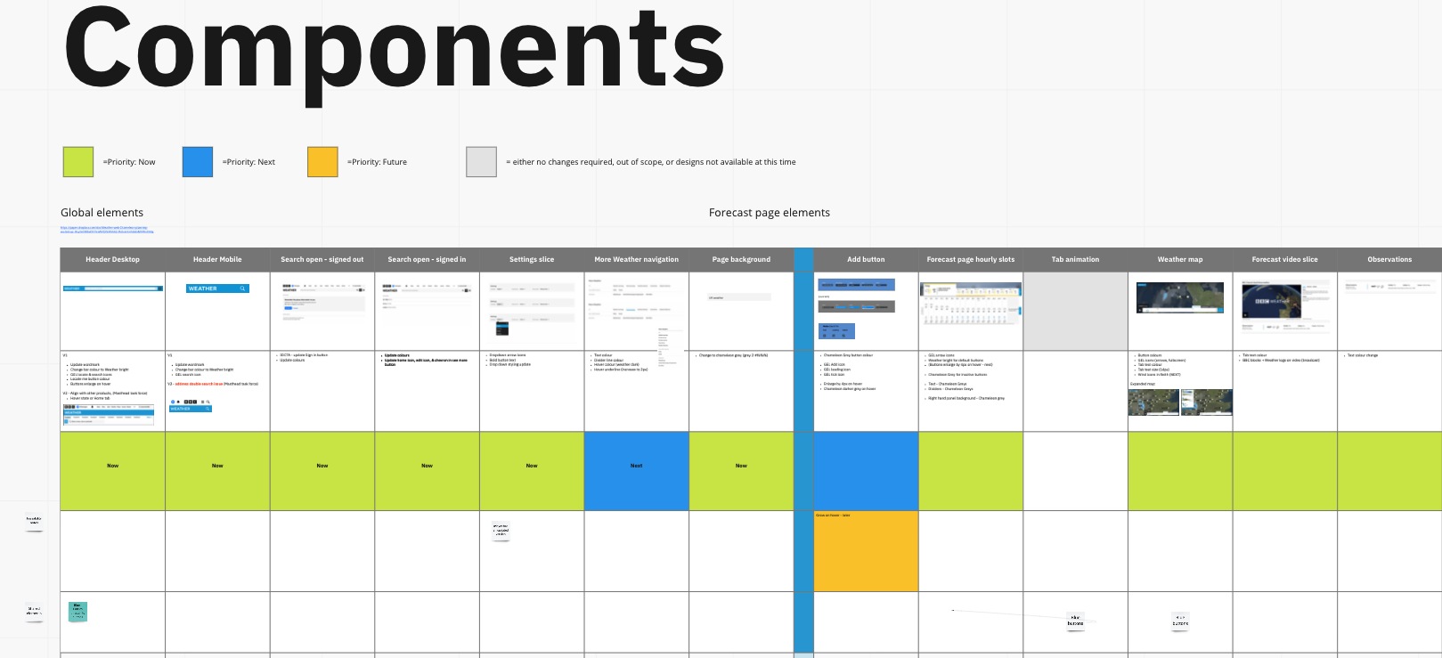
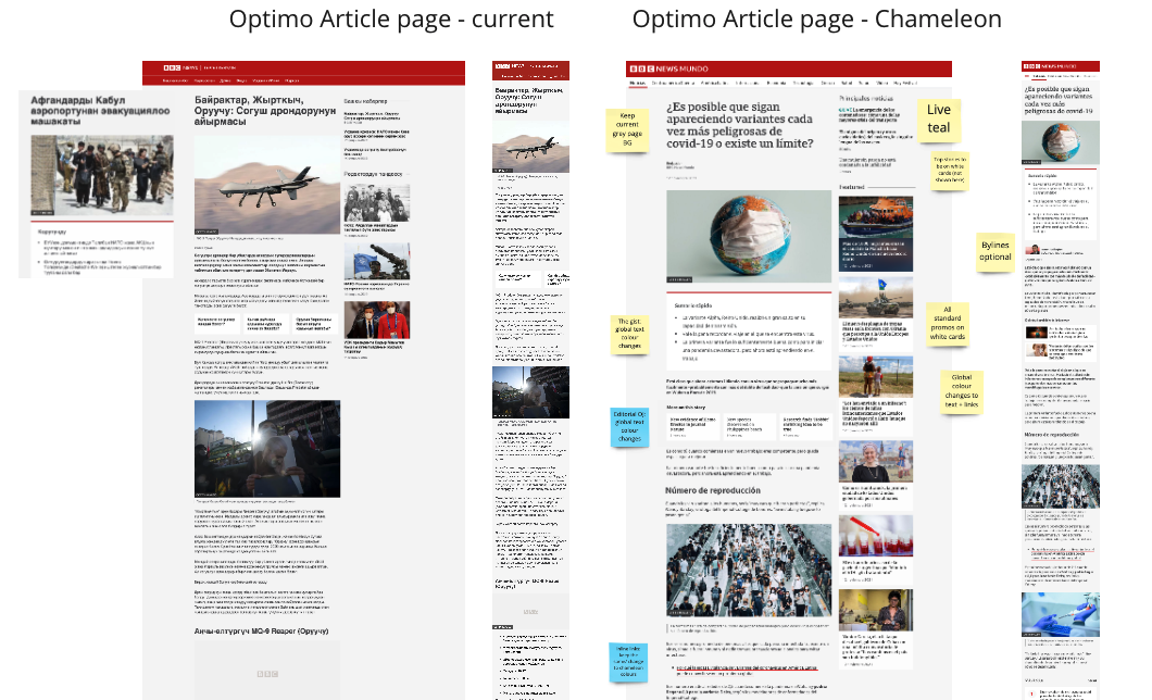
My role in this project was to coordinate the next phases of the work. I worked closely with product managers to plan and implement the visual updates, ensuring that the changes were not only aligned with the new identity but also sensitive to the nuances of our global user base.
Continuous Evolution: A Living Design System for the World
Service
While the initial
phase of the Chameleon Project focused on aligning the World Service with the
BBC’s new visual identity, our work didn’t stop there. Recognising the need for
long-term scalability and efficiency, I led the creation of a dedicated World
Service Design System—a foundational step toward consistent, accessible, and
culturally sensitive design across our 42 language services.
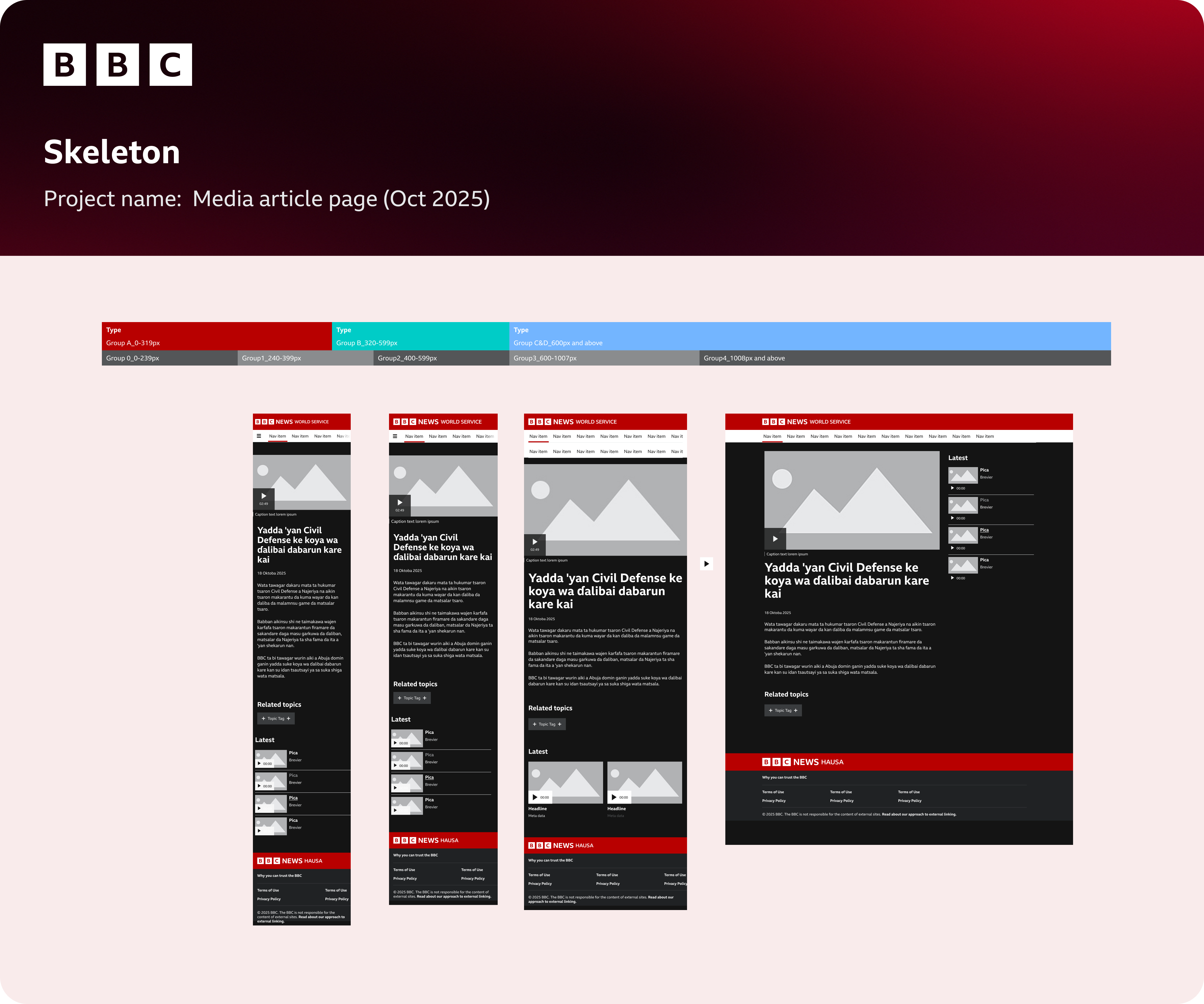
Our product team
is using a platform distinct from the UK site, yet we follow the same GEL
(Global Experience Language) principles. This means creating or adapting shared components
to meet the unique needs of global audiences—whether that’s accommodating right-to-left
scripts, non-Latin alphabets, or diacritic-rich languages.
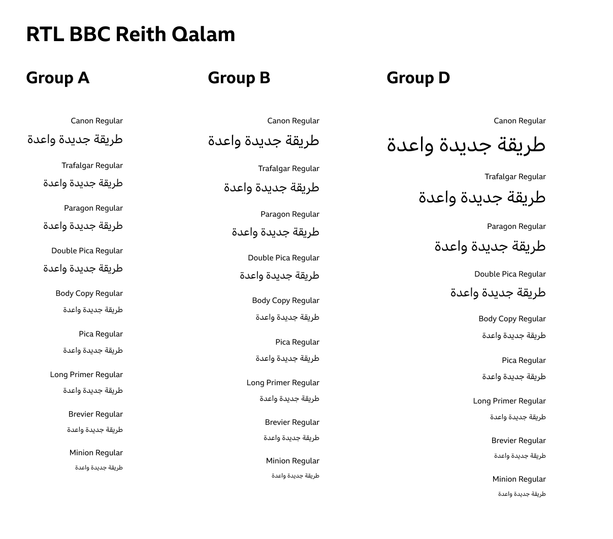
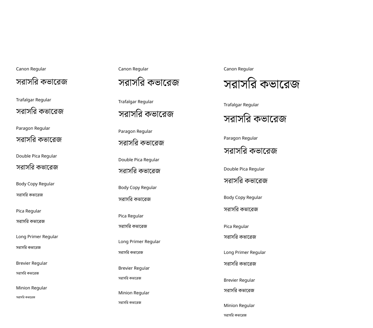
Example of the World Service scripts ( Arabic,Bengali)
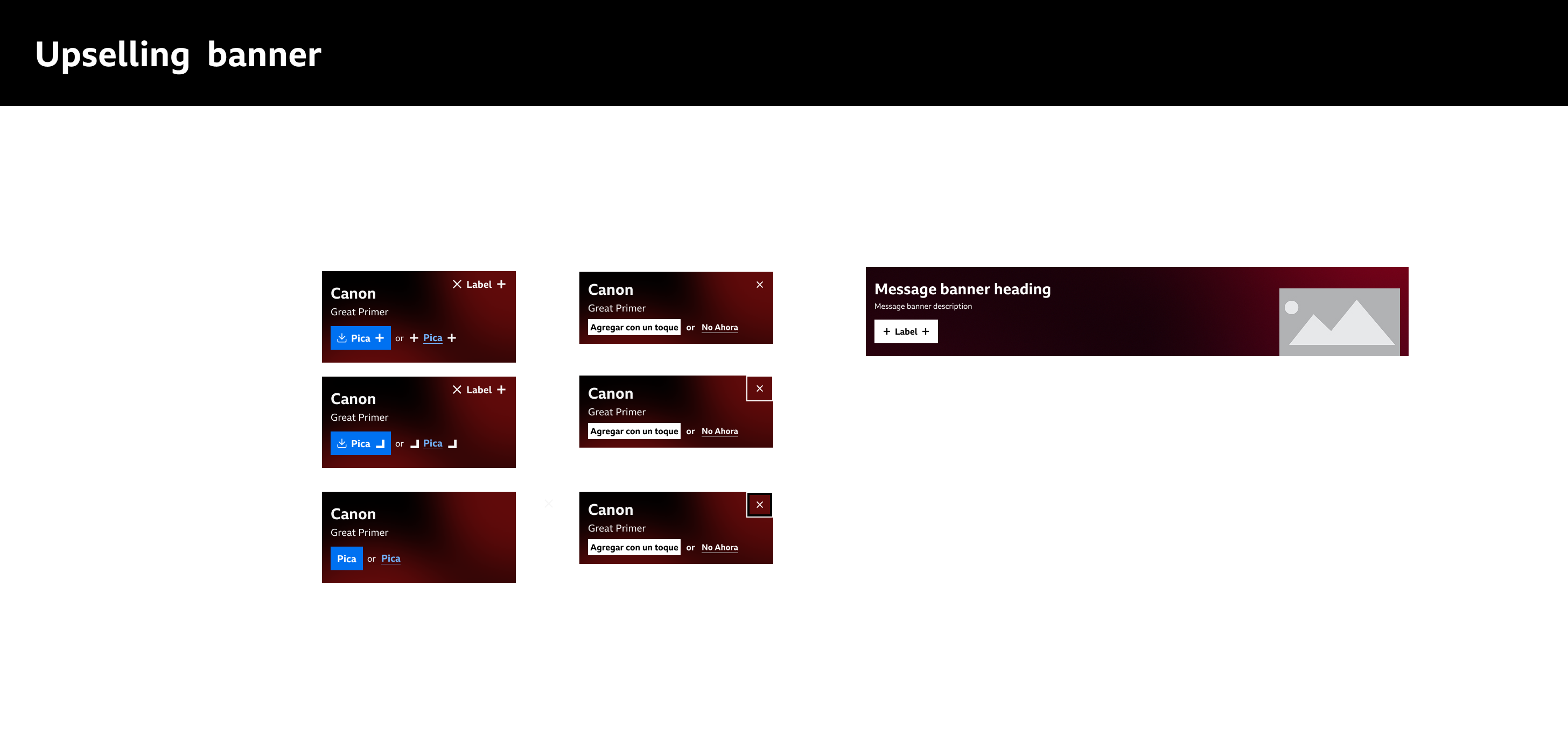
Initially, we faced
challenges: inconsistent implementations, duplicated efforts, and late-stage
accessibility fixes. To address this, I conducted a comprehensive audit of our
design elements and introduced an atomic design approach to structure our
components—from basic elements like buttons to full-page templates.
More recently, in
collaboration with an agency hired contractor, we’ve taken a significant leap forward by migrating
our design system to Figma. This included building a new design library that
leverages Figma Variables to support multilingual typography needs—ensuring
flexibility for scripts like Latin, Arabic, Chinese, and Devanagari. This work
is still evolving, but it’s already enabling faster iteration, better
documentation, and a more unified experience across our global products.
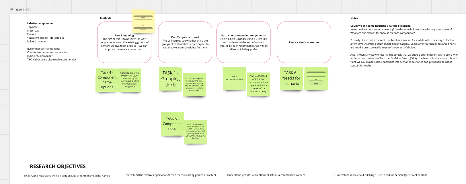
UX Research
A major challenge for the World Service UX team was the
limited understanding of user needs across our diverse global markets. With a
constrained research budget and a historic UK-centric focus, we often lacked
the tailored insights necessary to inform design decisions that truly reflected
the behaviours, constraints, and expectations of our international audiences.
This gap risked misaligned designs and missed opportunities to serve users
effectively.
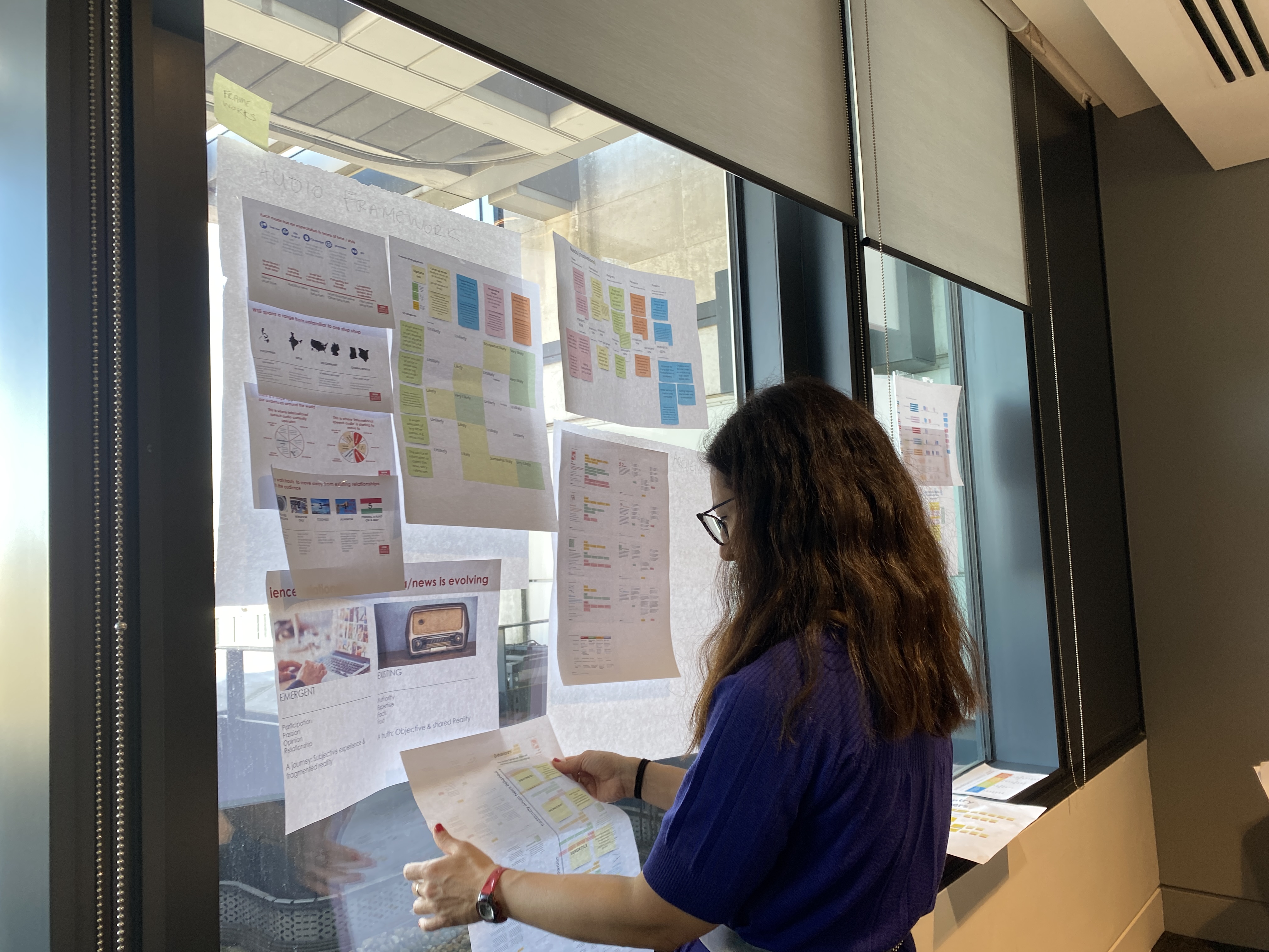
My Role
To address this, I took a strategic and hands-on role in scaling our UX research efforts. I began by consolidating existing insights into a centralised World Service research repository, making it easier for the team to access and build upon past findings. I led workshops with our UX team and researcher to prioritise 50 documented global user needs, and conducted a targeted survey in India—our largest market—using archetype models to identify the most critical needs with the highest satisfaction impact. These insights directly informed our design priorities.
To address this, I took a strategic and hands-on role in scaling our UX research efforts. I began by consolidating existing insights into a centralised World Service research repository, making it easier for the team to access and build upon past findings. I led workshops with our UX team and researcher to prioritise 50 documented global user needs, and conducted a targeted survey in India—our largest market—using archetype models to identify the most critical needs with the highest satisfaction impact. These insights directly informed our design priorities.
Disocvery Sprints and prioritising ideas to test
To foster innovation, I organised and facilitated design sprints focused on content discovery, mobile experiences, and multimedia consumption.
Read here about guiding a brand-new mixed-agency product team through their first discovery sprint, building shared understanding, confidence, and a clear roadmap for the next quarter.
I also developed a framework for UX experimentation, enabling structured A/B testing and iterative design improvements.
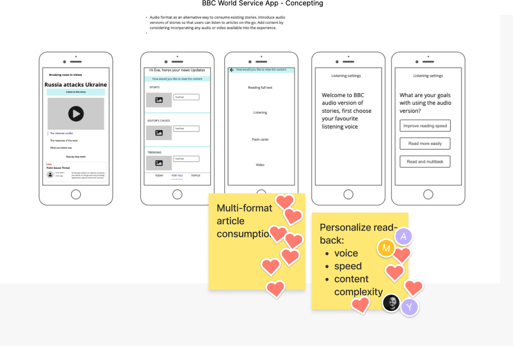
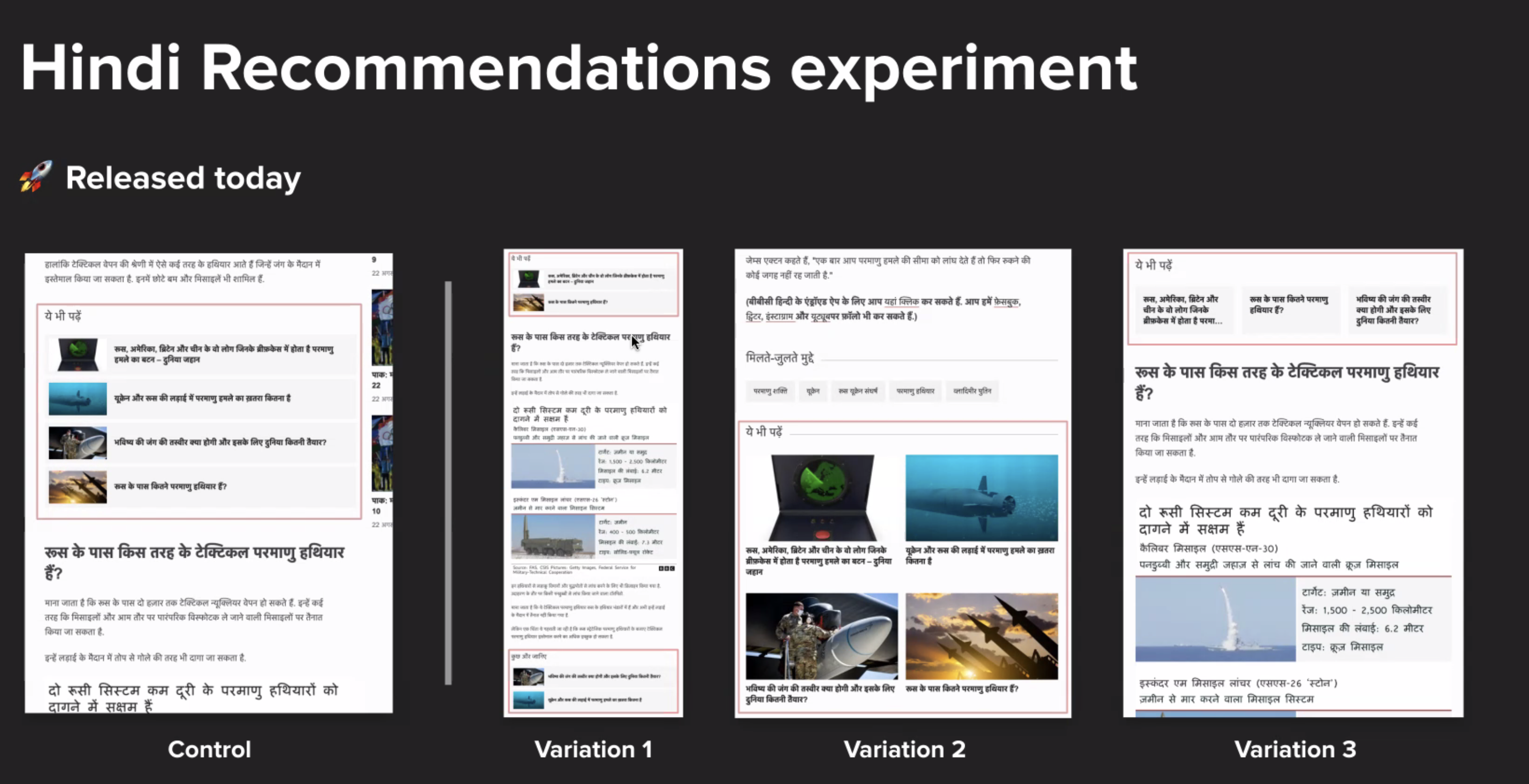
Read here about my work on runing a UserZoom study with Spanish Speaking audiences to explore awareness and adoption habits of Web Apps.
World Service Global Destination
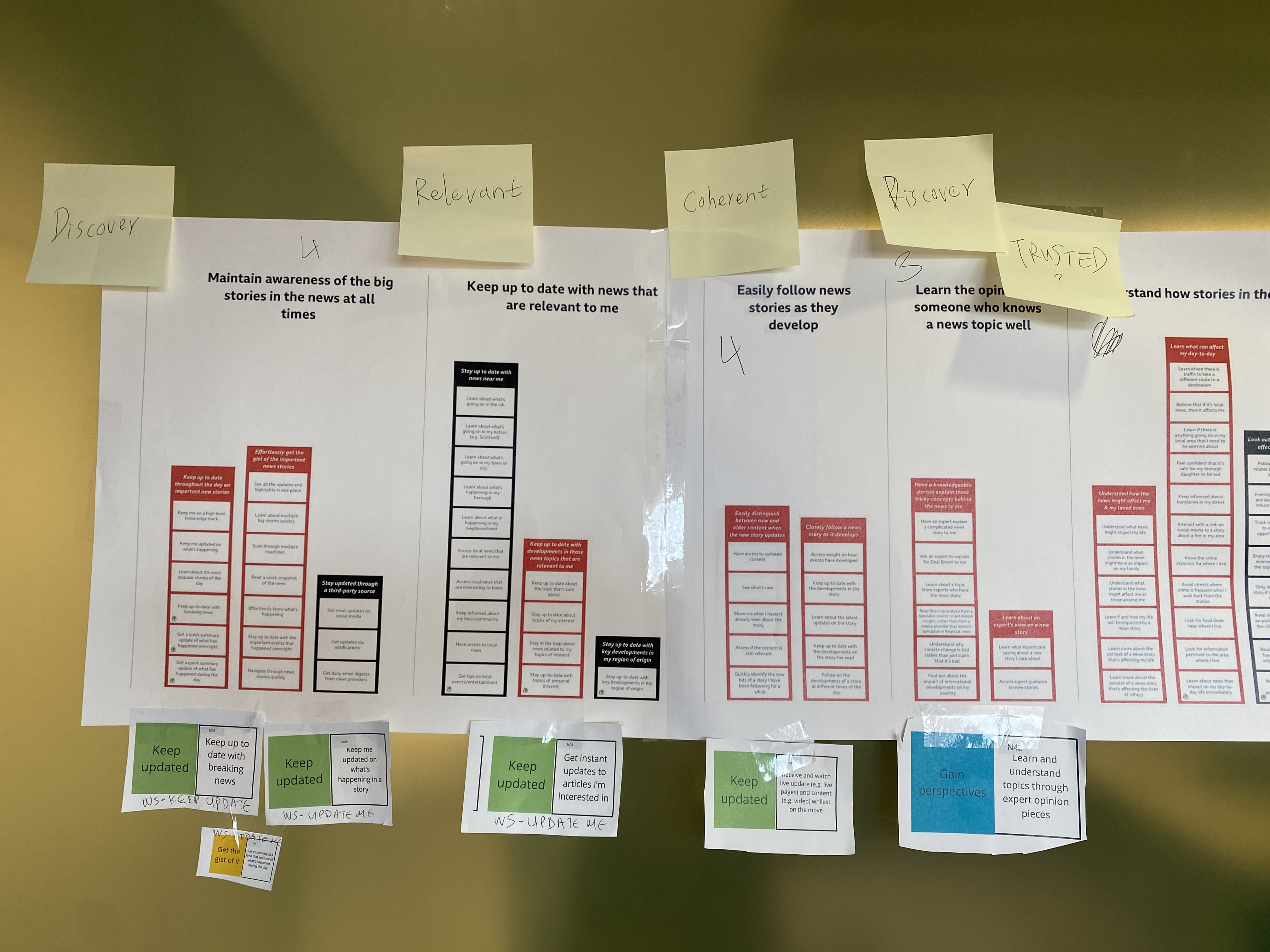
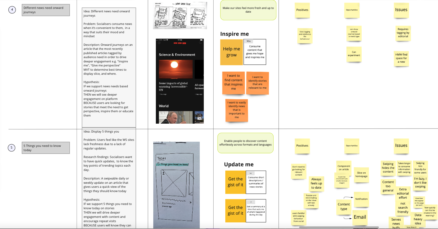
Ensuring all users can access and engage with relevant news and information.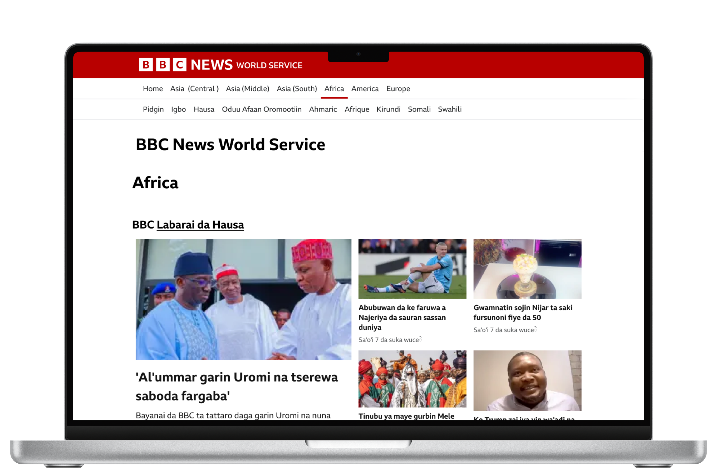
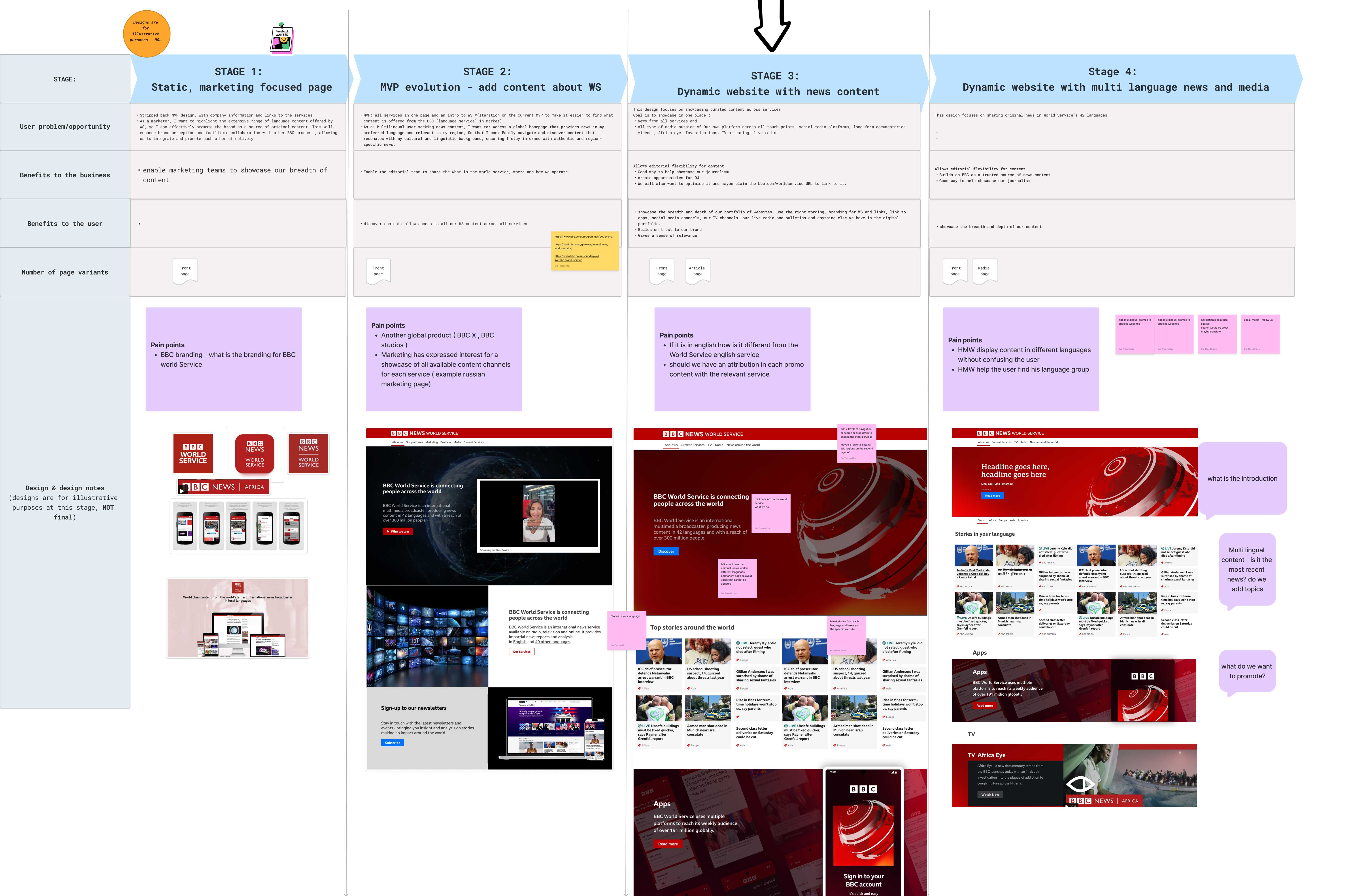
Early Concepts for a Dynamic Website with Topic-Based Pages
The World Service delivers news via various digital websites and media outlets serving the particular needs of audiences within each market. A centralised platform that showcases diverse content from various regions in multiple languages presents a valuable opportunity to expand the BBC World Service's global reach and attract users directly to our sites .
Challenge
The existing languages webpage is a basic, inflexible page that doesn’t support editorial or commercial goals.
My role was leading this strategic, research-led project for the World Service, driving the exploration, design, and development of a revamped global platform, while ensuring alignment with the BBC brand. I collaborated with senior stakeholders to define a phased approach based on user needs and designing scalable solutions to ensure accessibility, consistency, and discoverability.
Approach
To understand user needs, editorial ambitions, and technical constraints I collaborated with cross functional stakeholders and early on started documenting risks, dependencies and possible solutions.
To define the scope, design, and technical solution, I facilitated collaborative workshops and aligned stakeholders around key experience goals.
New feature: The regional navigation
From a user perspective, previous research indicated an interest in discovering and consuming content that resonates with their cultural and linguistic backgrounds.
To make the range of regions, we operate in, visible at a glance I designed a two-layer navigation system with multi language content. This was a key consideration from the start to help users quickly understand our geographical reach.
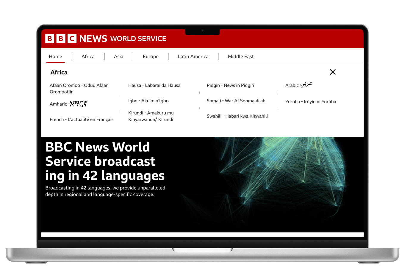
After a lot of trials we developed this innovative UX solution for the BBC’s global homepage that helps multilingual users easily locate their language group within relevant regions. This approach addresses complex challenges in language-region taxonomy and multilingual visual design. The solution will be contributed to the BBC Design System as part of the World Service’s commitment to inclusive, global accessibility.
Building on the MVP, I led stakeholder engagements across marketing, legal, business development, and brand teams to refine the vision. We explored content hierarchy, regional vs. topic-based navigation, and potential enhancements using third-party tools for interactive storytelling to enhance engagement.
A scalable solution with high impact and low effort
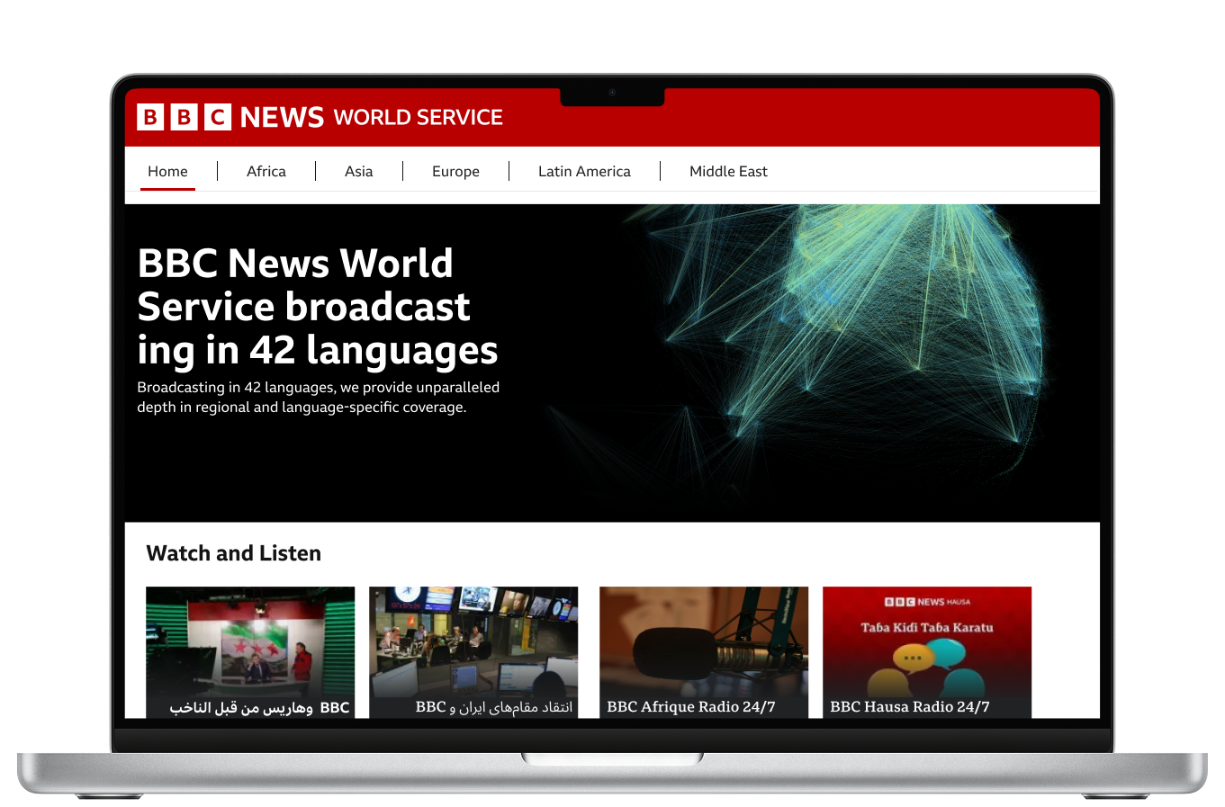
For the final concept I designed a modular, scalable homepage using reusable components and the latest publishing tools (TIPO) aiming to improve visual engagement and content discoverability across WS.
Future experiments
With no dedicated editorial team, leveraging existing content is a priority. Next, we aim to explore how BBC AI tools can aggregate top stories from all 42 World Service sites onto a central page, and automatically translate content into English or the user's preferred language based on browser settings or geolocation.
Outcome
The global homepage concept was well received across teams. Product owners saw potential for broader site application and SEO benefits. Engineers highlighted opportunities for future experiments. Marketing and leadership appreciated the branding potential and saw it as a step toward stronger digital brand control and campaign visibility. Editorial representatives are looking forward to use the upgraded features across all index pages.