The Relish Design System
System Design / Relish
Project overview
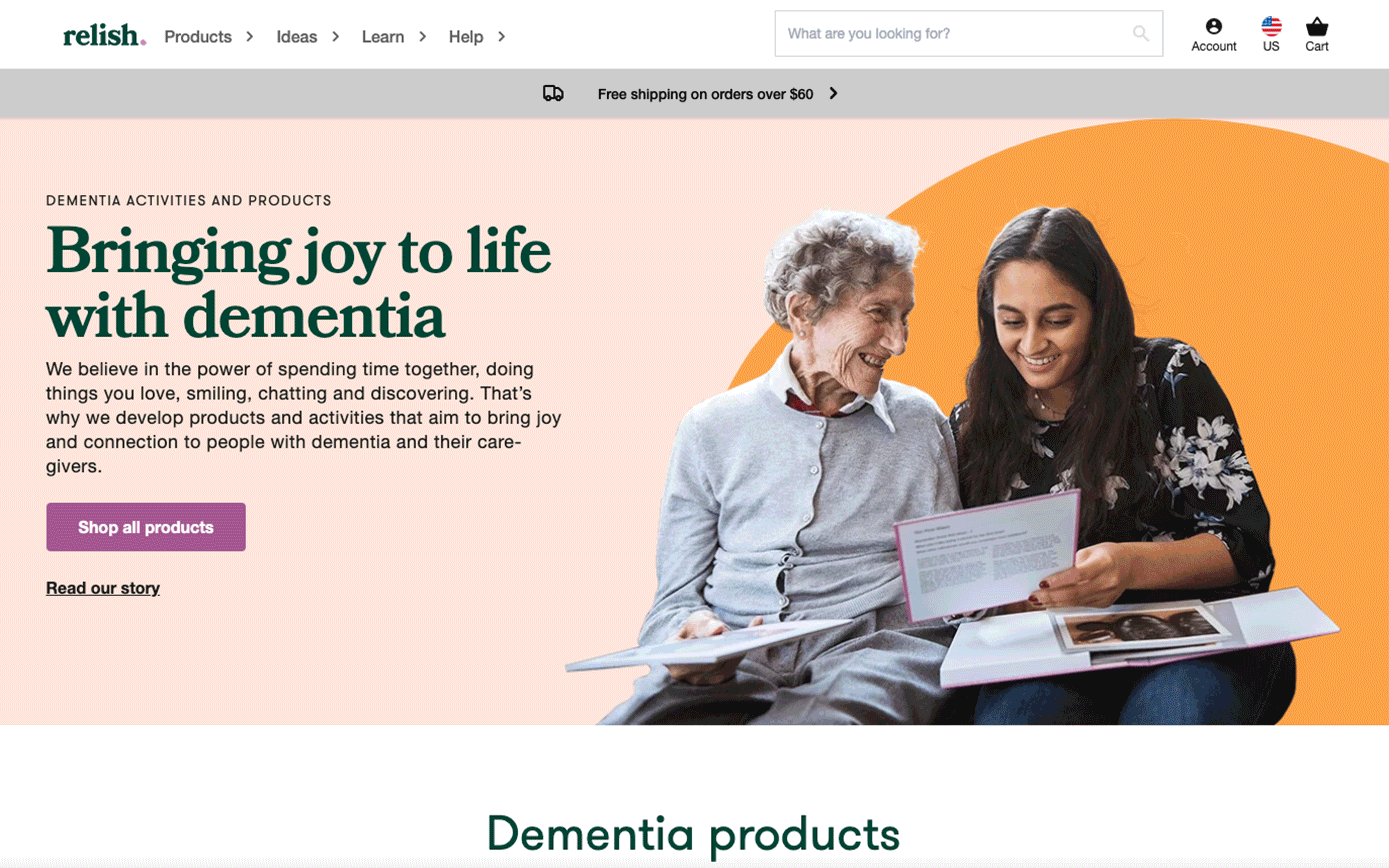
Active minds is a mental health care company creating innovative products specially designed for people living with dementia.
After 10 years of successfully establishing their name as the no1 provider of wellbeing products for dementia they changed their business strategy from a mainly B2B to a direct-to-consumer approach with a global reach. The went through a complete rebrand process, part of which was the launch of a new brand e-commerce website.
Translating the core visual language across the website and
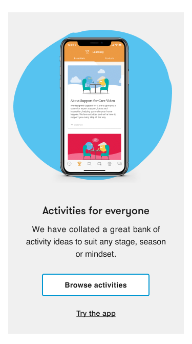
the app
Active Minds had hired an external agency to design their new visual identity. My role was to translate the core visual language across the website for start. The agency designed the new logo in many variations.
I did some changes to make sure that the visual identity
worked well on digital. From the research findings I knew that our main target
audience was 45+, and above. From the interviews and recordings, I discovered some
reoccurring behavioural patterns on how they used the interface.
There were also some significant accessibility issues. All these helped me make some informed decisions on changing the visual identity accordingly without missing out on the joyful and playfulness integral to the new brand messaging.
There were also some significant accessibility issues. All these helped me make some informed decisions on changing the visual identity accordingly without missing out on the joyful and playfulness integral to the new brand messaging.
The logo
The agency proposed a variation of logos a colour palette, and a combination of fonts.
The relish logo![]()
![]()

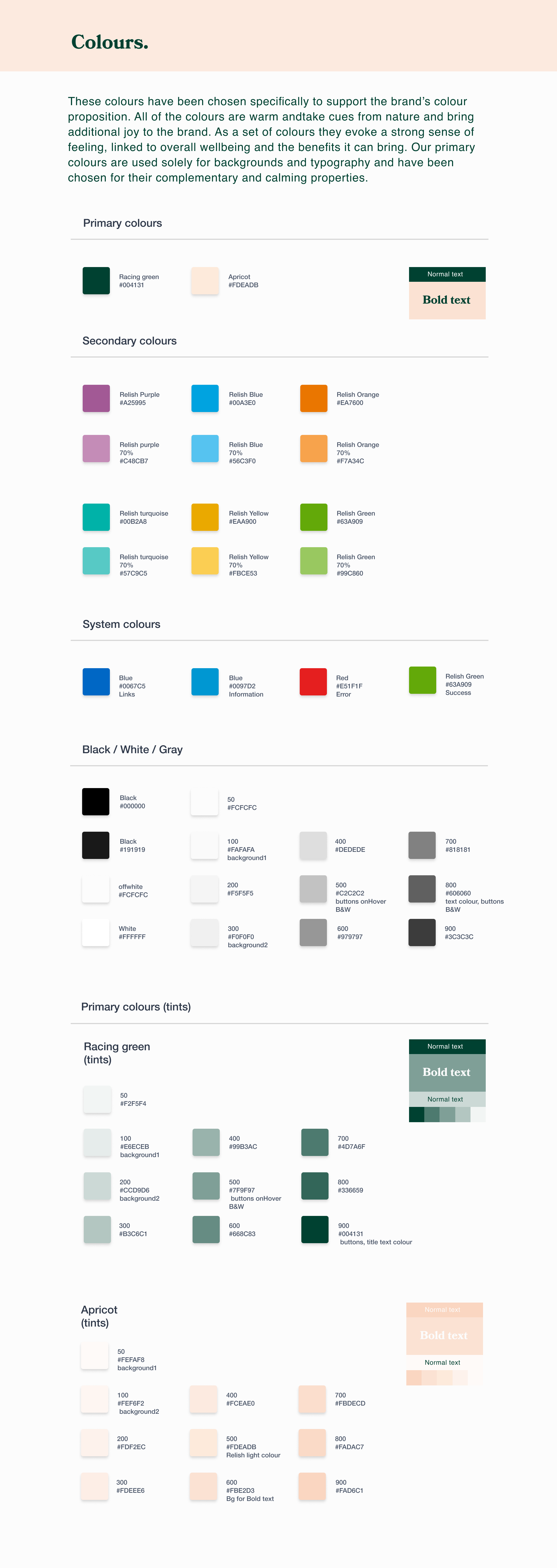
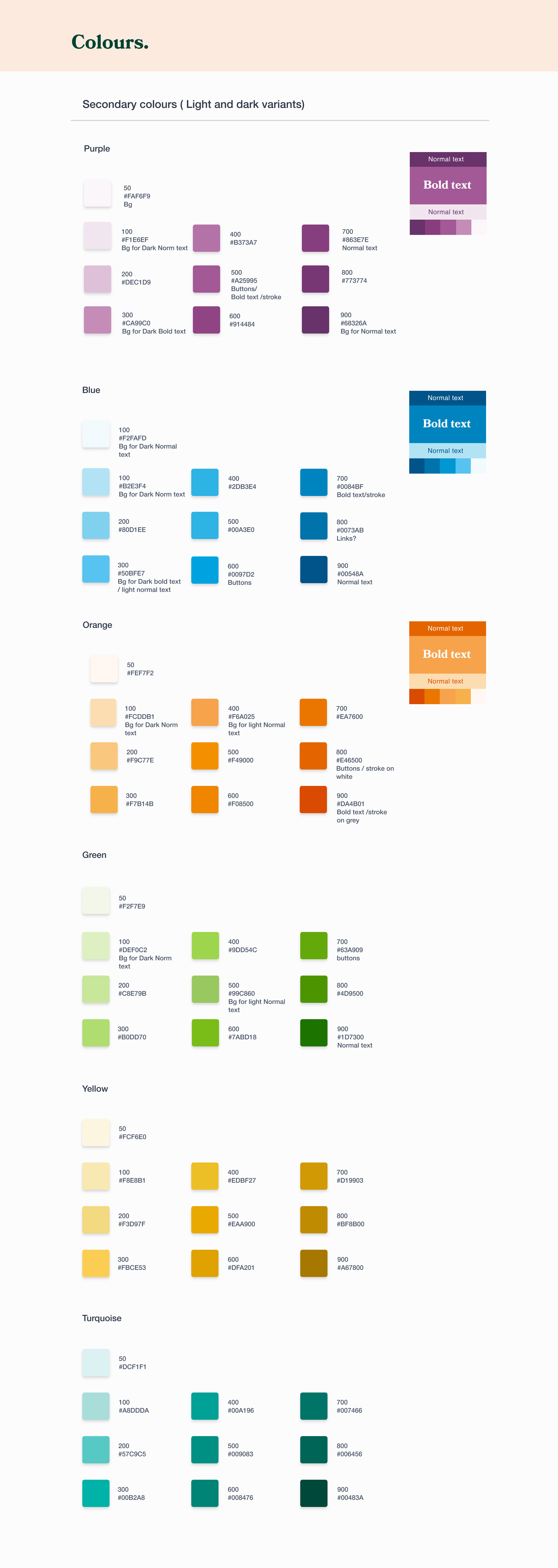
The agency proposed primary and secondary colours
![]()
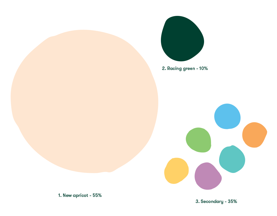
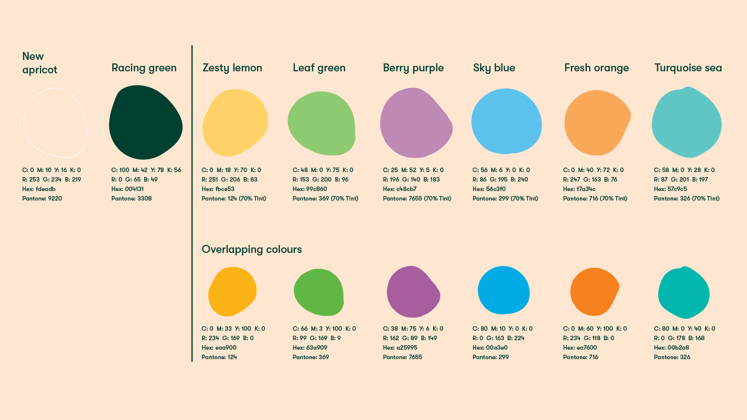
The colour palette
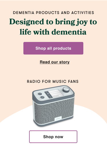
The usage of the Relish palette is important in creating a distinguishable look in the sector. All the colours play a vital role in Relish brand.
New apricot is dominant within the Relish brand, it creates a warm natural canvas for the brand to elevate itself.
Racing green is our colour choice for typography. It contrasts well against new apricot to give stand-out and legibility.
Lastly we have our secondary colours which add joy and positivity. For the website, I chose to use purple as the shopping experience colour because of its visual strength; it had a high contrast ratio and it worked well in combination with the primary colours, the racing green and apricot. To make the user’s way finding easier, I assigned different relish colours to the four content sections of the website. The ideas section was assigned the Relish blue, the learn section was orange and the help section was assigned a neutral grey.
I designed a new colour theme for digital products based on the brand’s colour palette. I added greys, a new relish black and an off-white, plus the secondary colours were reassessed to make sure they meet the accessibility standards.
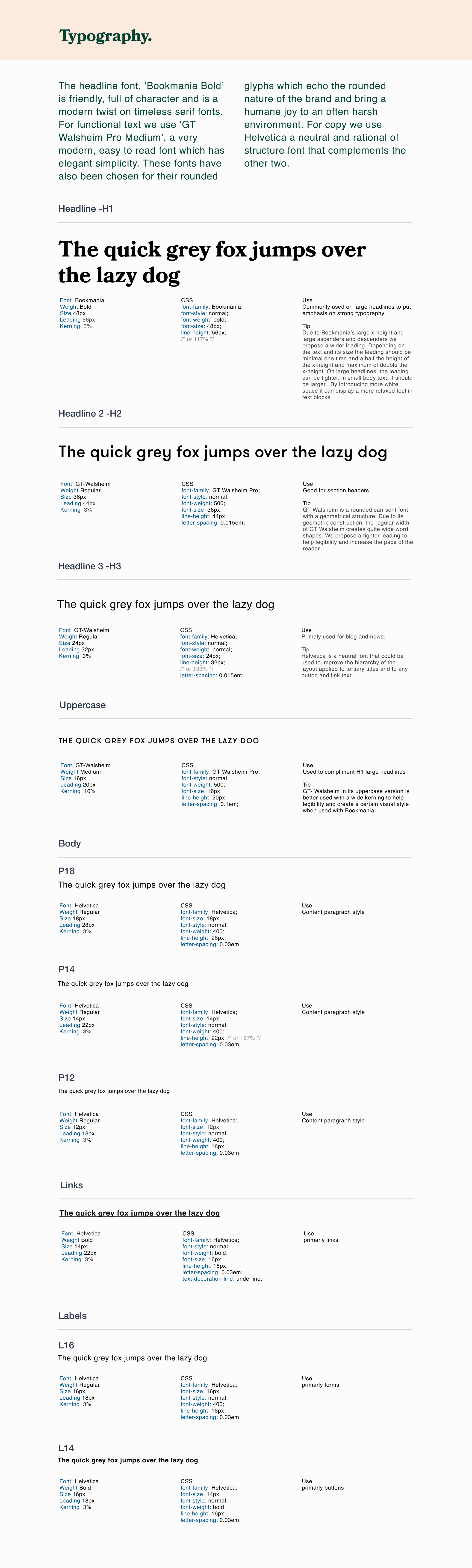
Typography
The two main fonts were embeded and the live text font was decided to be Helvetica. A sans serif modern but easy to read style combined well with the friendly, full of character headline serif font ‘Bookmania’ and the elegant and modern functional font,‘GT Walsheim Pro Medium’.

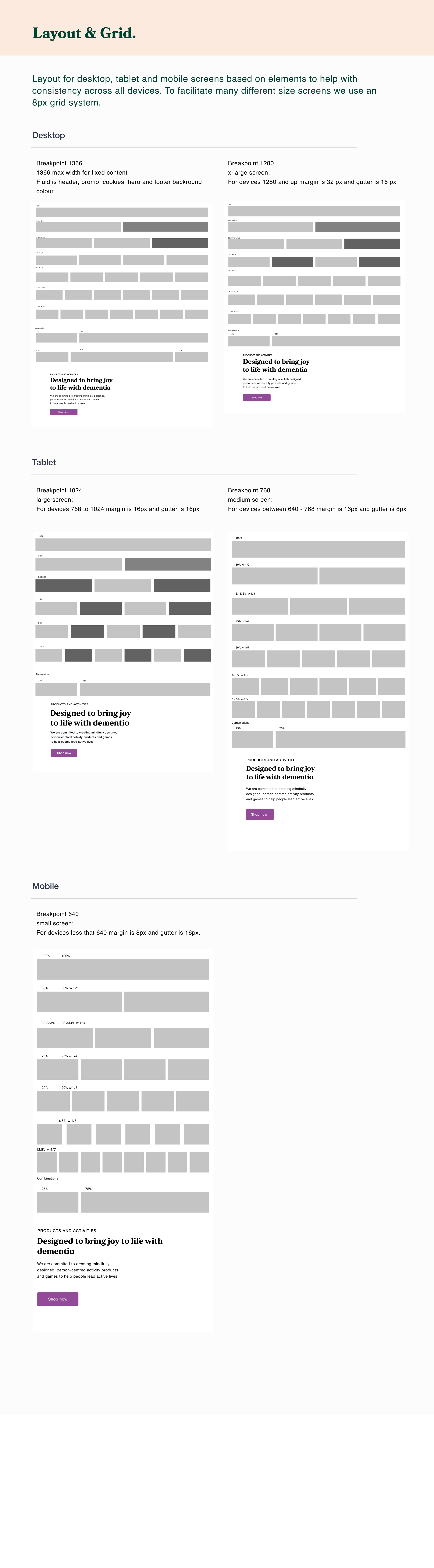
The grid and layout
Layout for desktop, tablet and mobile screens based on elements to help with consistency across all devices. To facilitate many different size screens we use an 8px grid system.
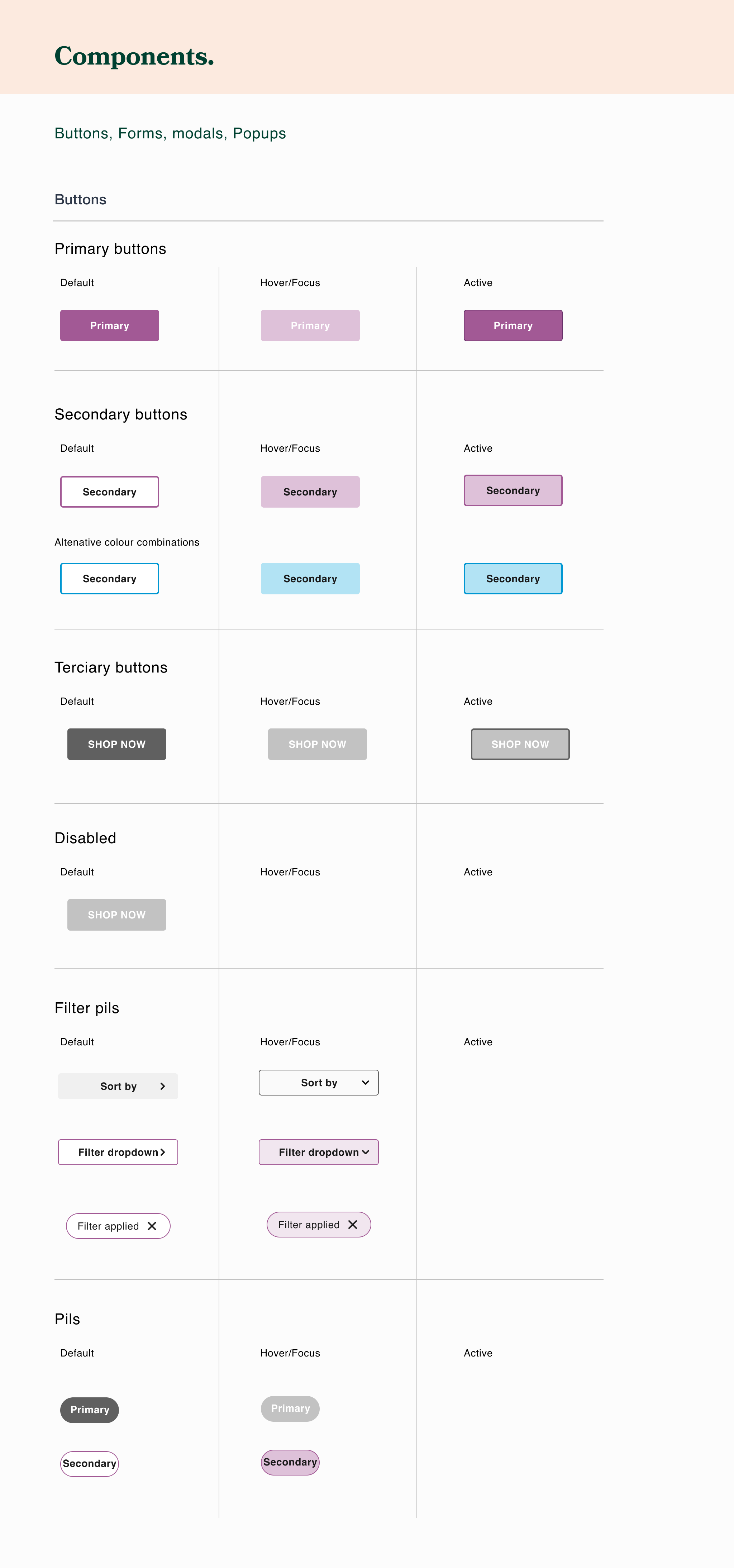
Buttons, forms, hierarchy of content
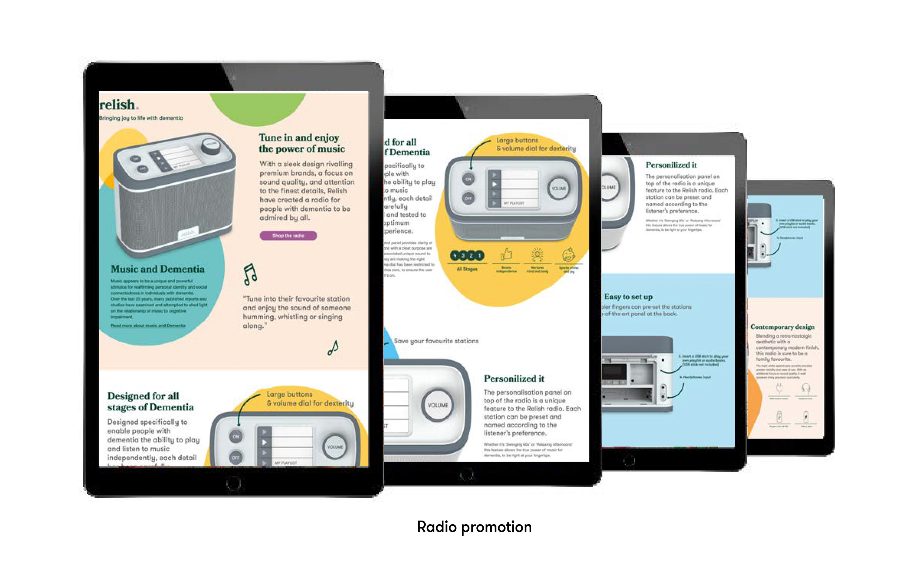
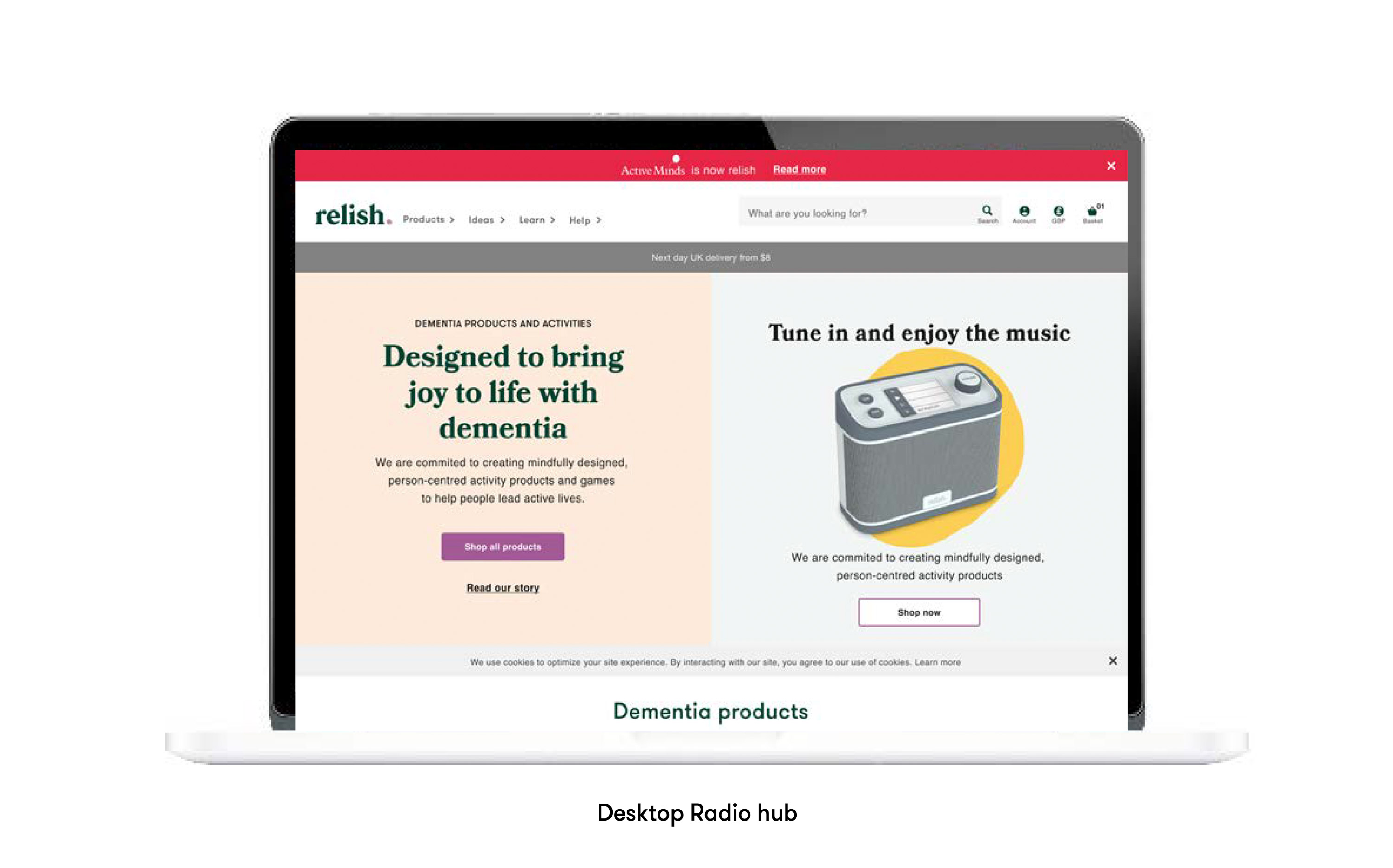
Digital campaigns