The Relish Website
Product Design / Relish
Project overview
After 10 years of successfully establishing their name as the no1 provider of wellbeing products for dementia they changed their business strategy from a mainly B2B to a direct-to-consumer approach with a global reach. The went through a complete rebrand process, part of which was the launch of a new brand e-commerce website.
Design Process
Working closely with a team of external developers I was responsible for the new website end to end design. The timeline was quite tight, I started working on November and the site was supposed to launch in June.
First I had to understand the product. Dementia wellbeing is new within healthcare; an uncharted territory. There is no real competition. I had to rely on the business insights and do a extended research on the existing audience which was mainly health care professionals.
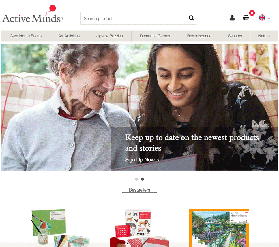
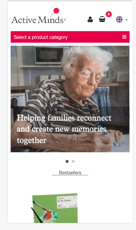
The Active Minds website content was primary addressing healthcare professionals needs.![]()
Research
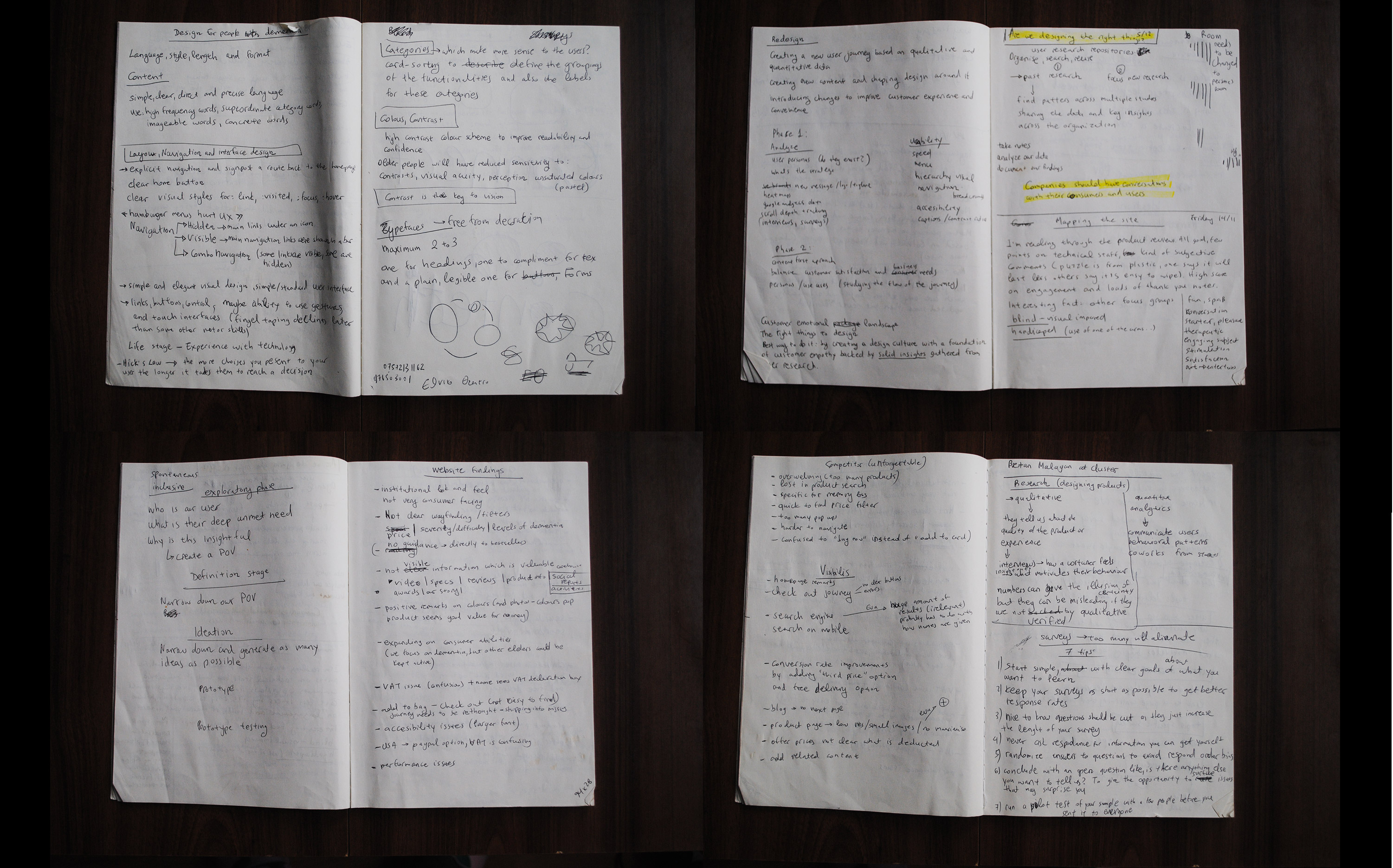
After analysing all the existing research findings, surveys, customer feedback, user interviews and the google analytics findings from the Active Minds website I started my own research. I had numerous workshops and meetings with the company’s key stakeholders and studied their new strategy and business goals. By observing the users’ behaviour on the excisting website I started forming the main audience target groups based on demographic data.
Uncharted territory: the discovery phase
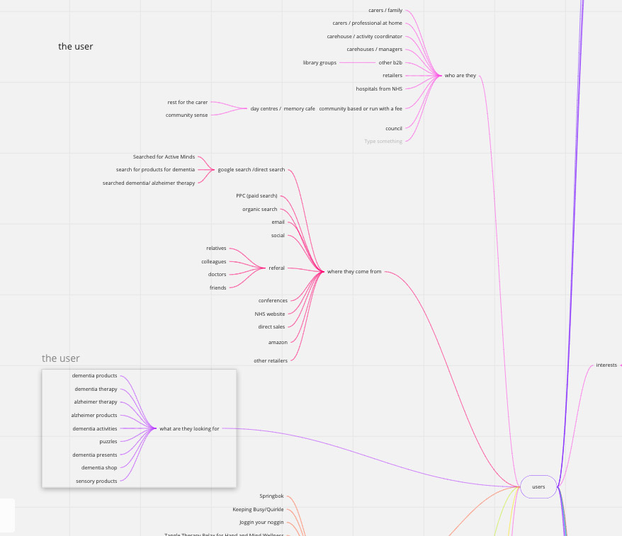
Who is the user, where does he come from![]()
Target Audience
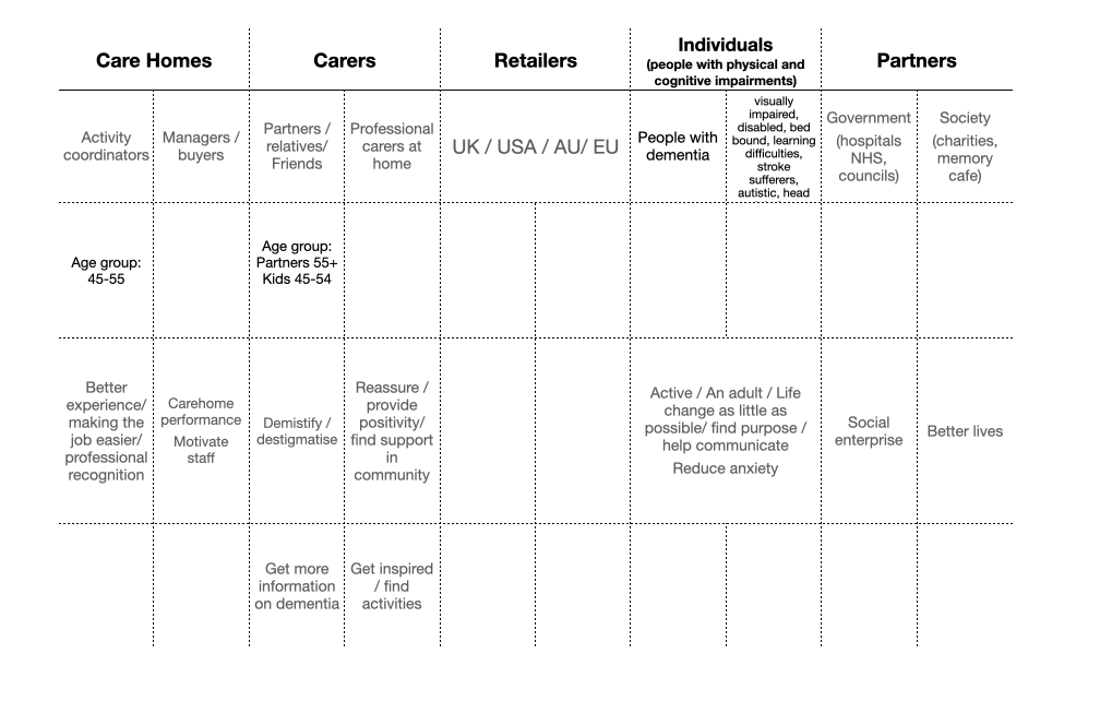
The target audience had to be rediscovered. Charities, family and professional carers outside of the care home environment, plus the possibility of people living with dementia visiting the website, were all considered.
To create the personas I looked at how carers and PWD currently interacted with Active Minds, understanding their relationship to the product, their views on what good customer service is, what technology they use, how they use the internet, what experience they have undertaking online transactions, and their attitudes; behaviours and goals in life.
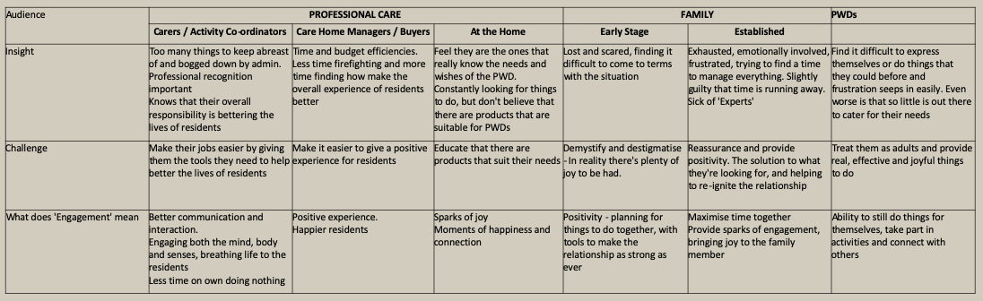
 The characteristics, age groups, needs and desires of the potential users were defined.
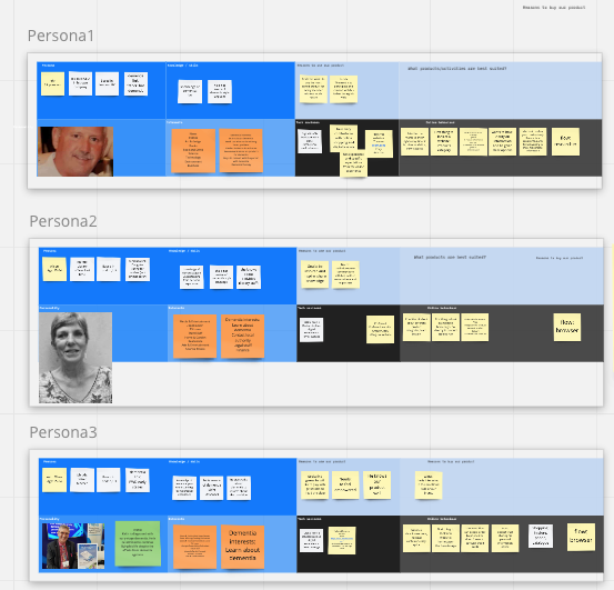
 People from each of the main target groups were recruited to take part in the interviews. In-depth face-to-face interviews were conducted. Six user personas, one for each of the main demographic groups, were constructed by analysing the information obtained through these interviews and building on the foundations of previous data driven segmentations.
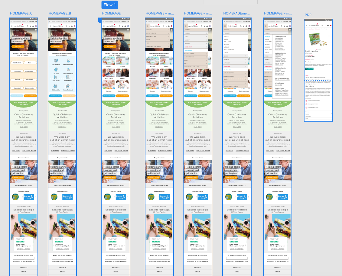
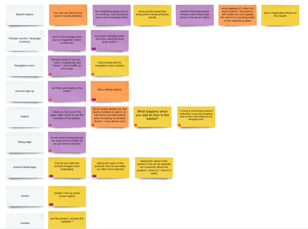
Phase 2: User interviews and testing
Based on the feedback from the stage 1 interviews I created prototypes with existing Active Minds content in a new order and tested with users. The aim was to see how they performed specific tasks.
Usability test scenarios![]()
![]()
![]()
The findings helped me form the main principles.
The consumer had no awareness of the product breadth and how to use them. They wanted to be able to find what they needed when they needed it, regardless of age or ability. They also had a difficulty understanding the language used on the website and were put off by the institutional tone of voice. They asked for easy to understand and relevant content. Information that was tailored based on services was important to them. Safe transactions.
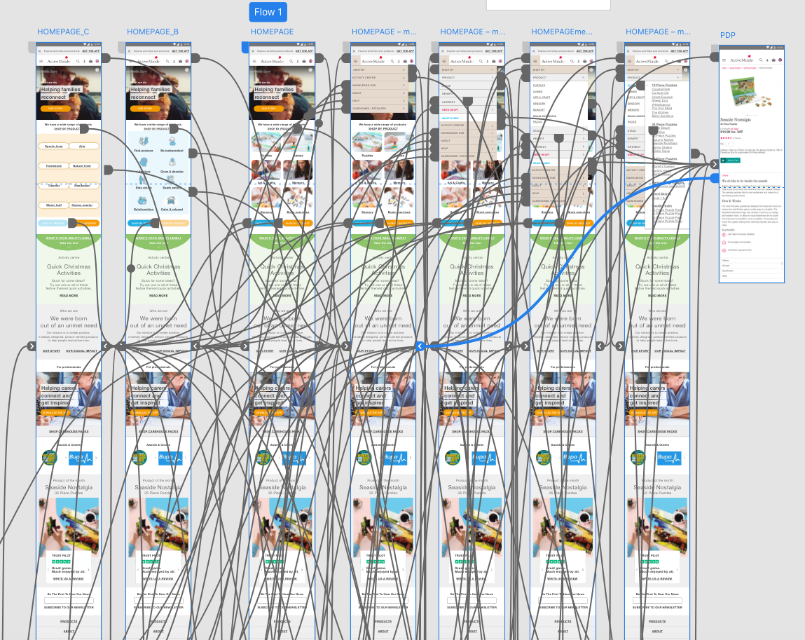
The data was analysed and a point of view was created. Another set of prototypes was created with three alternative scenarios of content structure and tested with representatives of all consumer types in real surroundings.
The website ecosystem and information structure are defined.
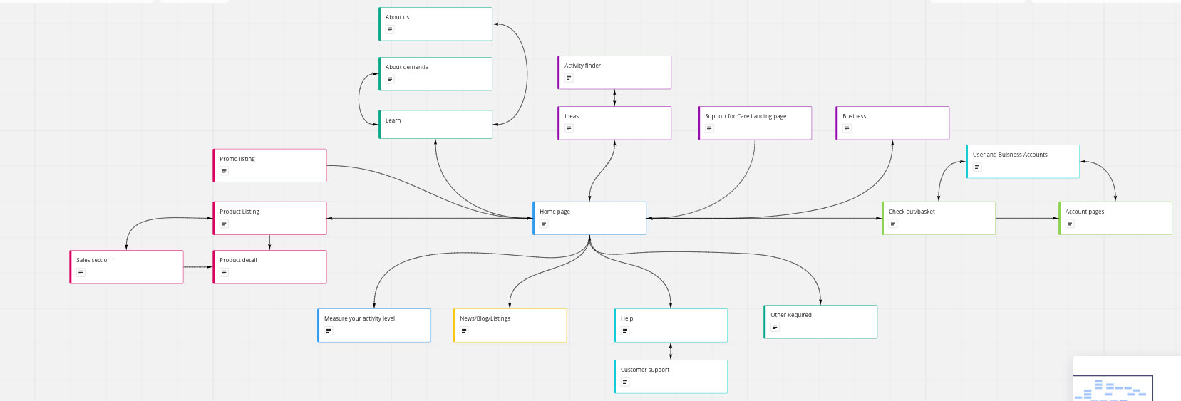
The results helped me generate multiple solution ideas and structure them. The behavioural personas and first user flows were created. We had already started talking with the developers’ team and defined the big requirements and the overall direction for the development of the site ecosystem. After studying the research results and to meet the users’ needs, we decided to add some new features. A series of workshops with the Relish team key stakeholders followed to explain the design thinking process and present the findings and solutions. After ensuring that we were meeting the business objectives we agreed to move forward with the proposed new structure.
Different solutions for the information structure were presented in workshops to the Relish team
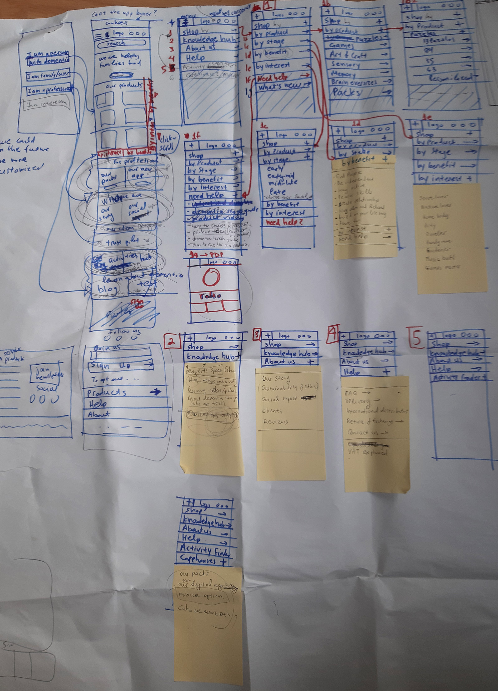
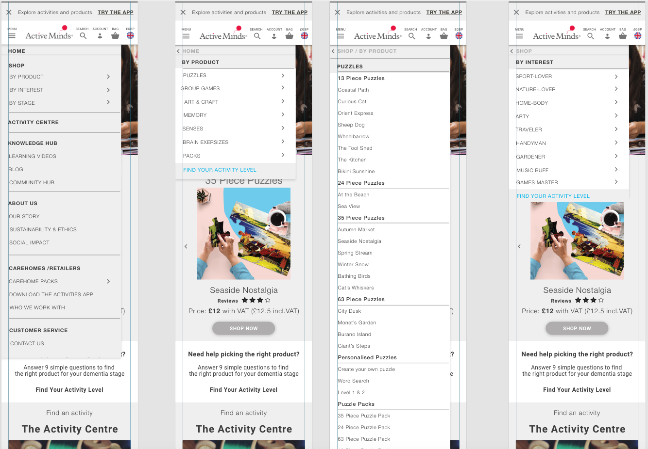
A card sorting test was conducted to verify that the new information structure made sense to the user. The language was simplified and action verbs were used to explain the category names, for example “remembering the past” substituted the “reminiscence” category name.
Much attention was placed on the wayfinding system. The
user recordings from the previous site showed confusion on how they moved on the
site and there were many dead-end journeys.
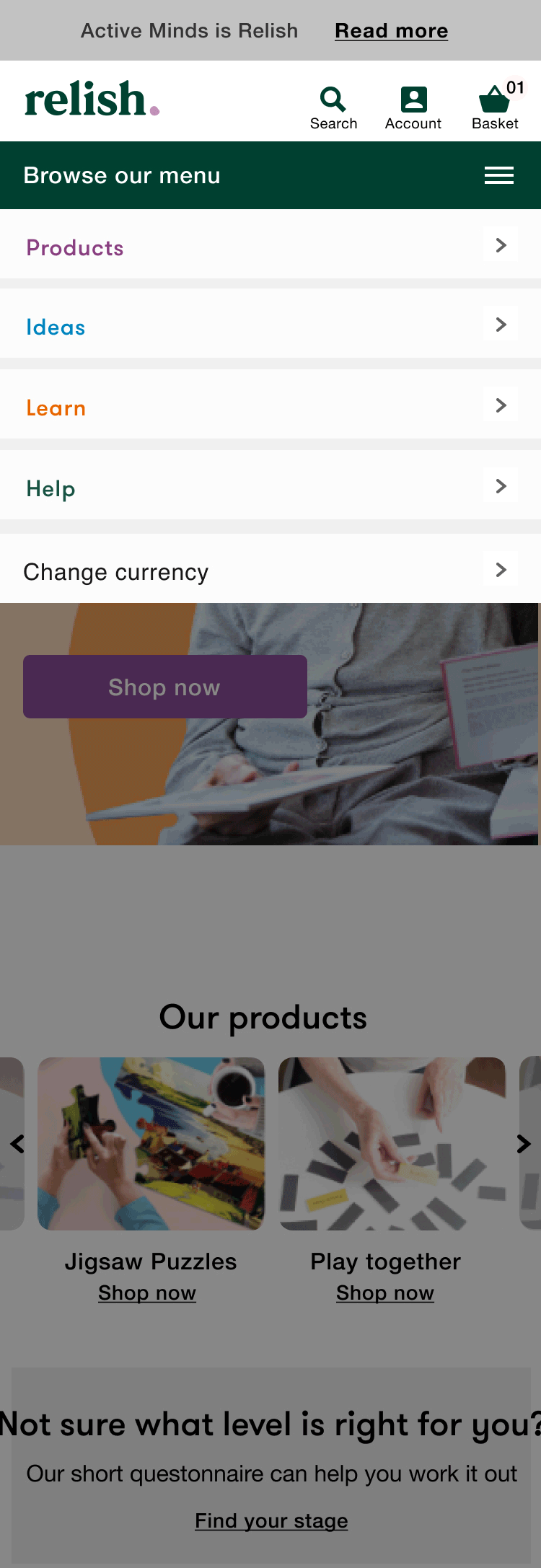
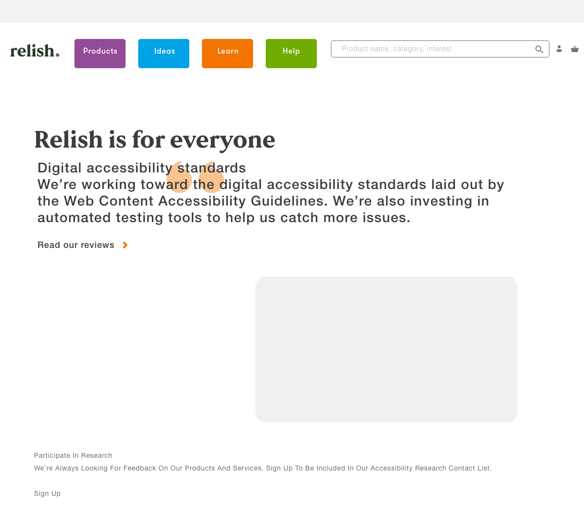
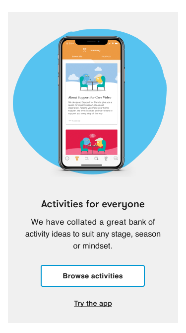
In the new site the content was all visual from the homepage. There was an easy to use menu that separated the content into four different sections; the “shopping section” where all products were categorised based on activity, stage of difficulty and interest; the “ideas section” where we would bring in all the creative support from the wellbeing app, the “learn section” where we added all the material that could educate and support the carers of people with dementia and the “help section” with all the contact details, FAQ’s, VAT and distributors.
![]()
In the new site the content was all visual from the homepage. There was an easy to use menu that separated the content into four different sections; the “shopping section” where all products were categorised based on activity, stage of difficulty and interest; the “ideas section” where we would bring in all the creative support from the wellbeing app, the “learn section” where we added all the material that could educate and support the carers of people with dementia and the “help section” with all the contact details, FAQ’s, VAT and distributors.
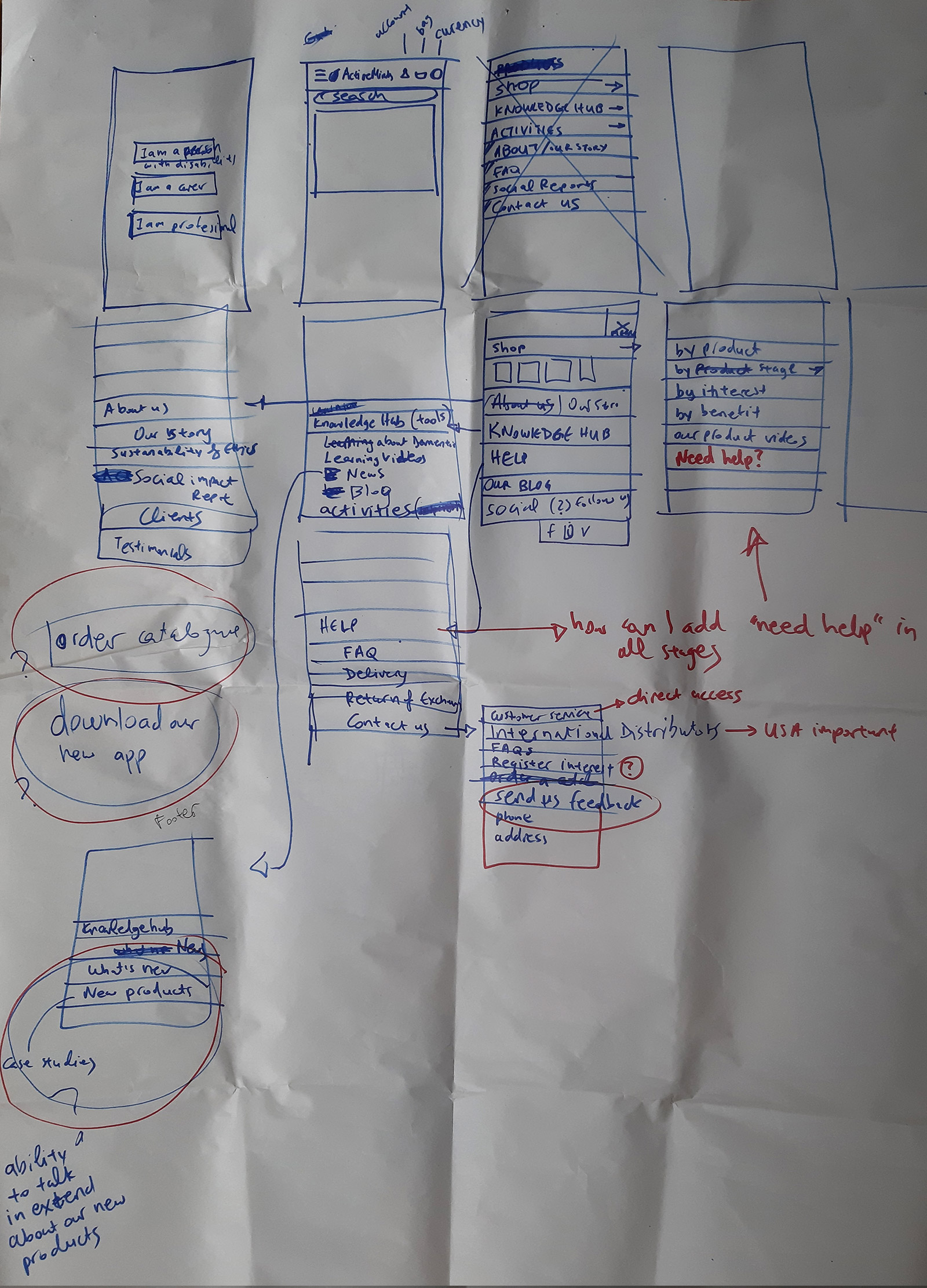
Key interactivity was placed in specific places across the website to guide the users. From the usability tests, I discovered some reoccuring patterns among the users, including scrolling to the footer to find info or not recognising the burger menu in mobile.
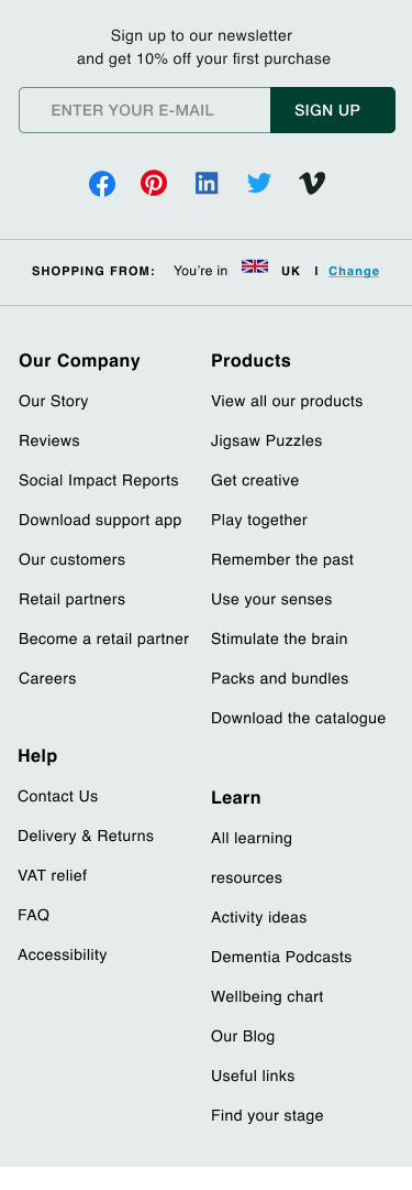
To enhance the navigation I added a footer with all the information, breadcrumbs and header sub-links under each page. On the product pages we introduced related and bestselling products as an upsell opportunity but mostly to help the user discover more.
![]()
To enhance the navigation I added a footer with all the information, breadcrumbs and header sub-links under each page. On the product pages we introduced related and bestselling products as an upsell opportunity but mostly to help the user discover more.
The checkout process userflow
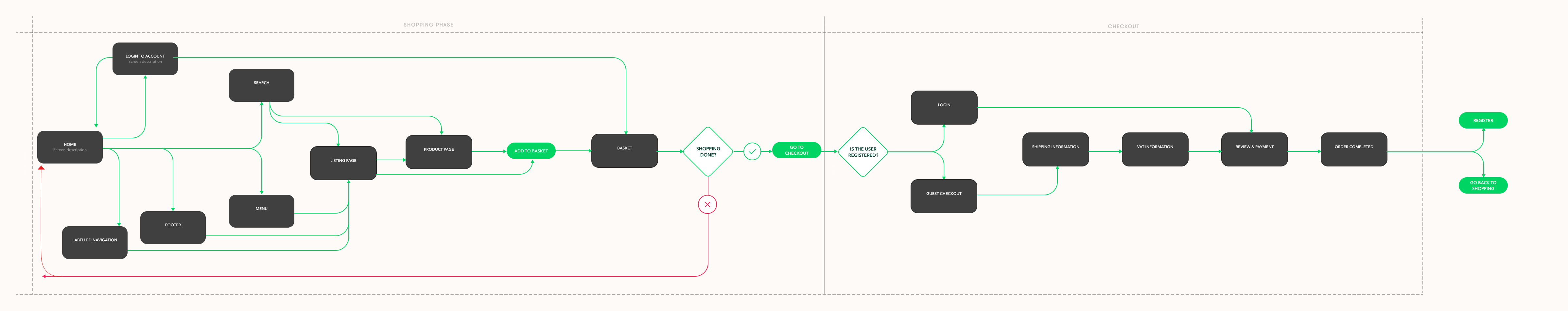
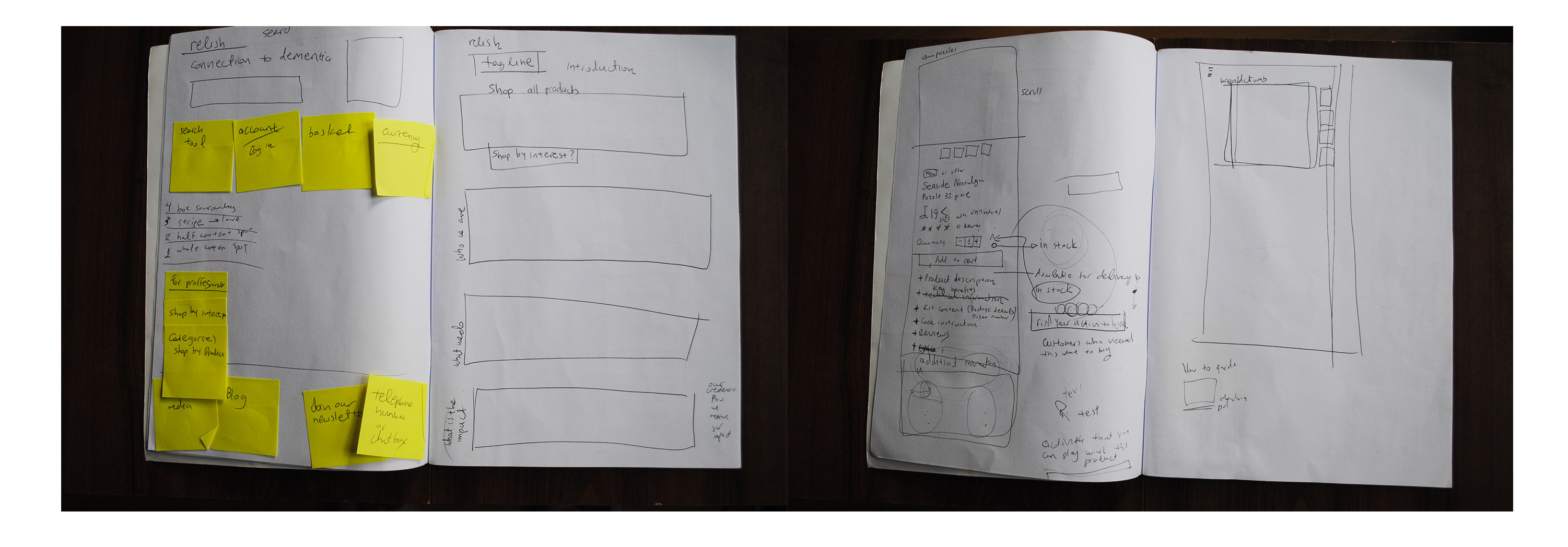
New prototypes were designed and I run another round of usability tests. By that time all user flows were created and I started working on the high-fidelity prototypes.
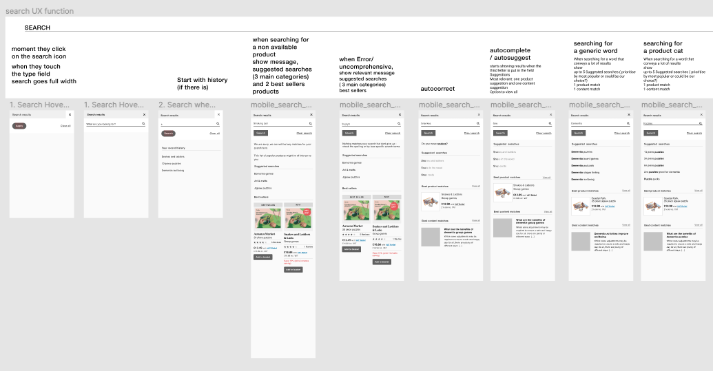
The search function protoypes with anotations for the developer’s team
Translating the core visual language across the website and
the app
Active Minds had hired an external agency to design their new visual identity. My role was to translate the core visual language across all digital channels.
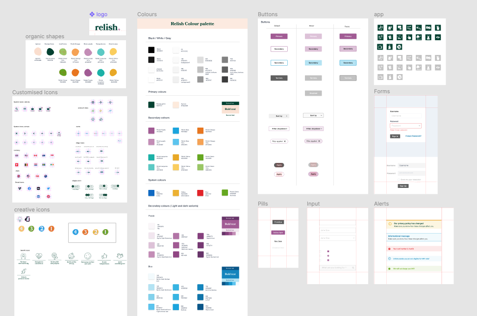
Following the main concept of the new identity I designed the digital design system.
See more on the Relish design system here
Age and accesibility issues
From the research findings I knew that our main target audience was 45+, and above. From the interviews and recordings, I discovered some reoccurring behavioural patterns on how they used the interface.
See more on the Relish design system here
Age and accesibility issues
From the research findings I knew that our main target audience was 45+, and above. From the interviews and recordings, I discovered some reoccurring behavioural patterns on how they used the interface.
There were also some significant accessibility issues. All these helped me make some informed decisions on changing the visual identity accordingly without missing out on the joyful and playfulness integral to the new brand messaging.
The logo
The agency proposed a variation of logos a colour palette, and a combination of fonts.
The relish logo![]()
![]()

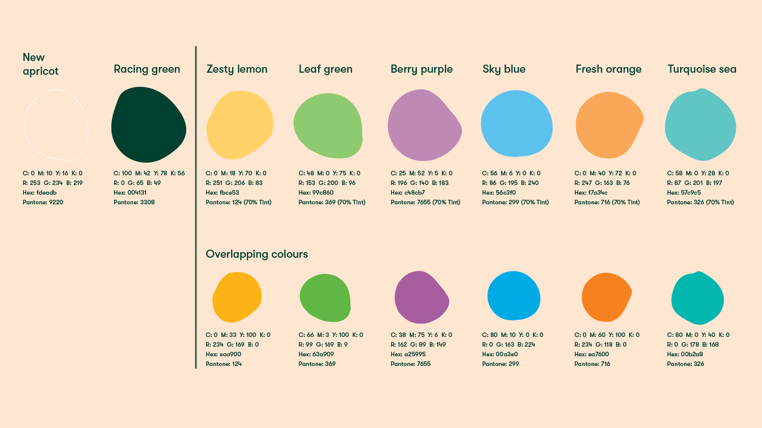
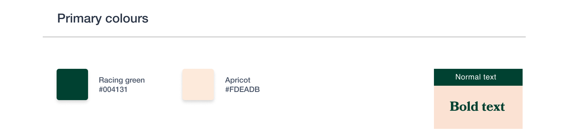
The agency proposed primary and secondary colours
![]()
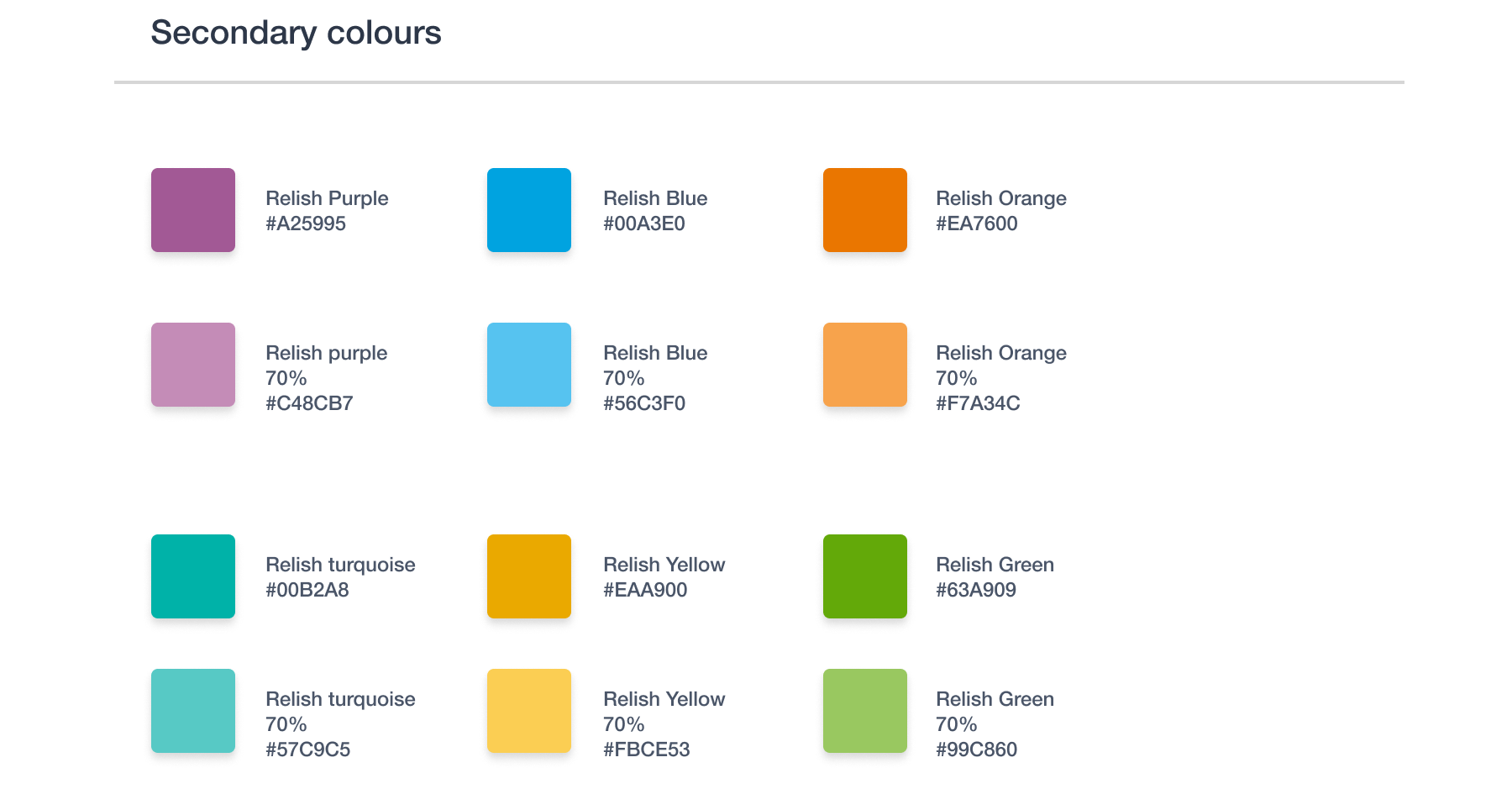
For the website, I chose to use as a primary colour the purple one because of its visual strength; it had a high contrast ratio and it worked well in combination with the primary colours, the racing green and apricot. This was going to be the colour of the shopping experience. To make the user’s way finding easier, I assigned different relish colours to the four content sections of the website. The ideas section was assigned the Relish blue, the learn section was orange and the help section was assigned a neutral grey. A set of icons were also added to improve discoverability.
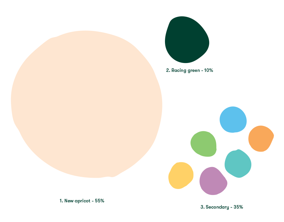
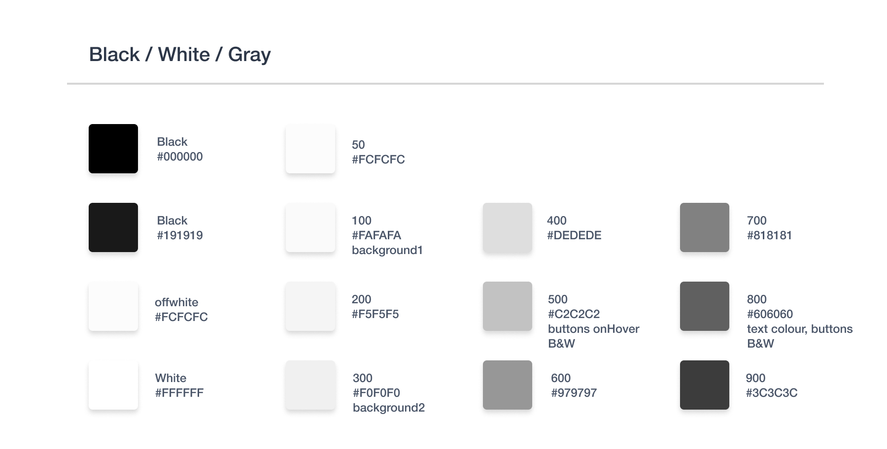
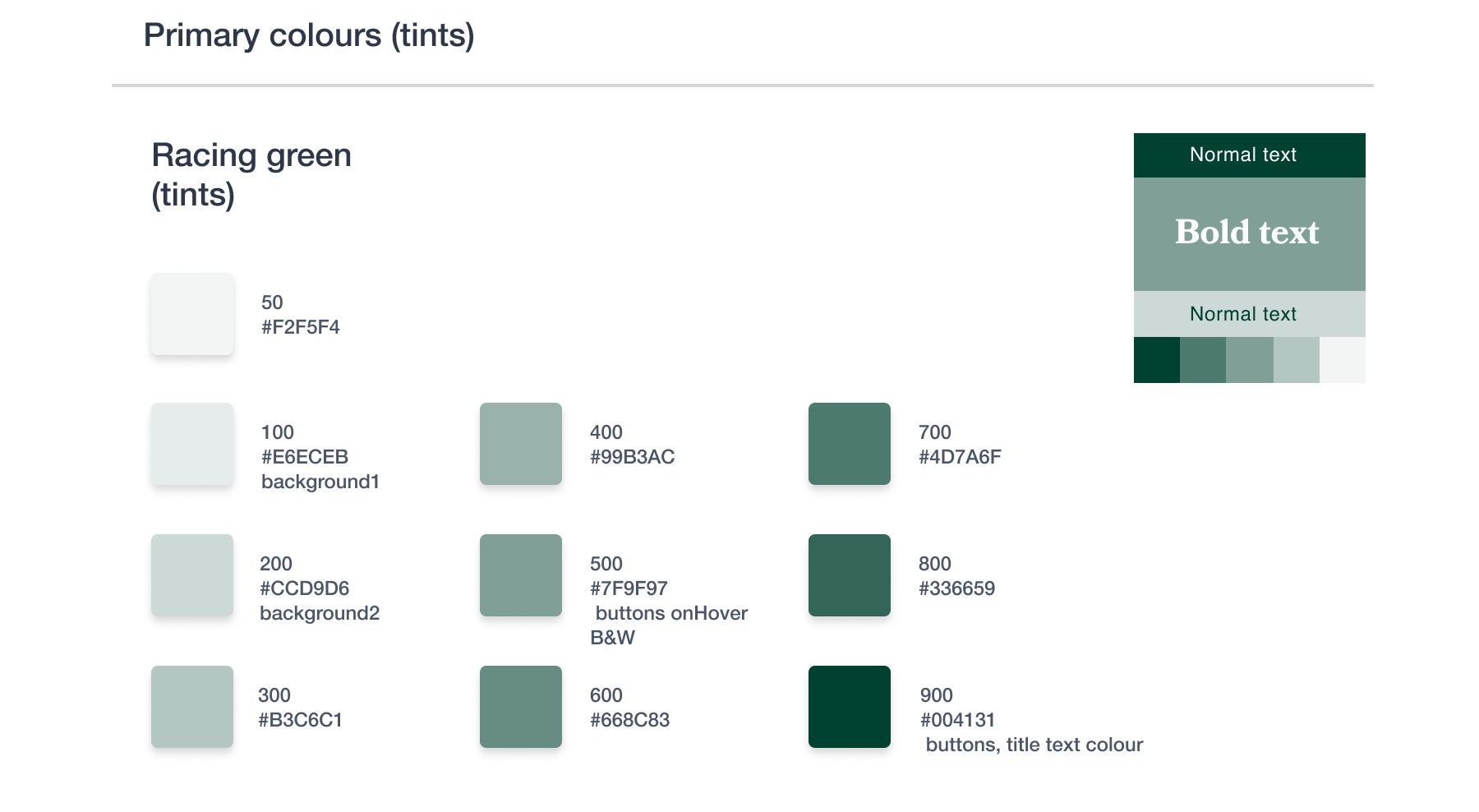
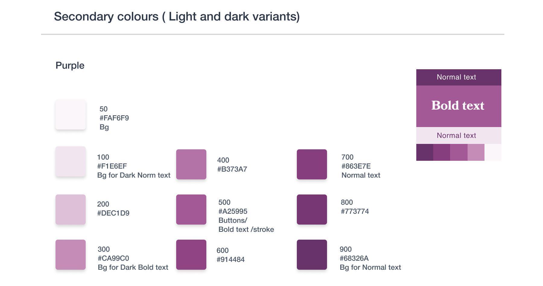
The colour palette
I designed a new colour theme for digital products based on the brand’s colour palette. I added greys, a new relish black and an off-white, plus the secondary colours were reassessed to make sure they meet the accessibility standards.
the typography
The two main fonts were embeded and the live text font was decided to be Helvetica. Its sans serif modern but easy to read style combined well with the friendly, full of character headline serif font ‘Bookmania’ and the elegant and modern functional font, ‘GT Walsheim Pro Medium’.

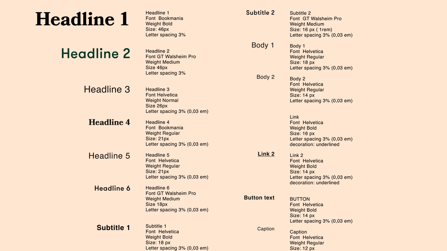
The syle guide
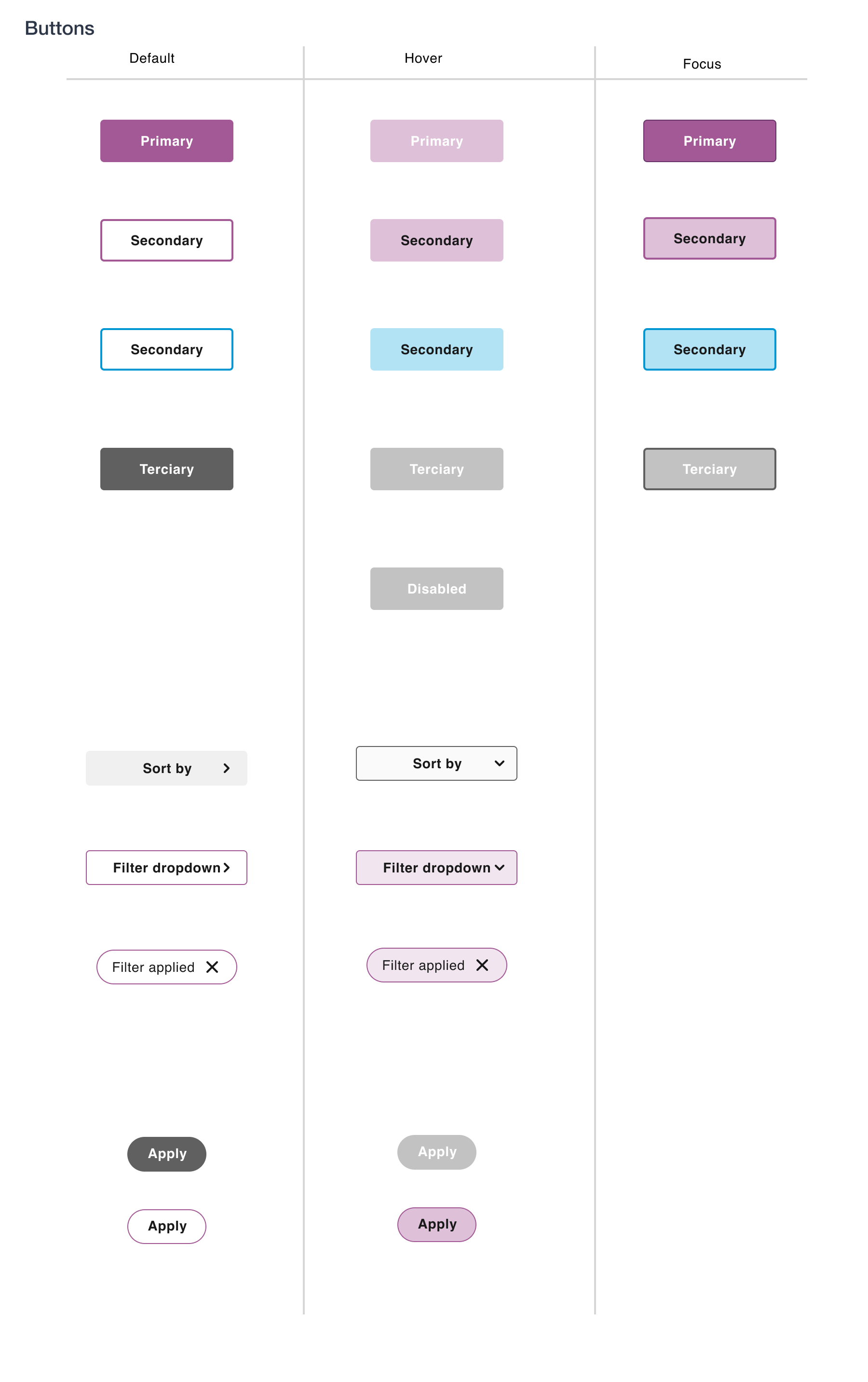
Buttons, forms, hierarchy of content
Final Designs
We had a tight deadline to meet, so we decided with the developers’ team to find the most flexible way of working together. We had no project manager or QA, it was myself and the developers’ team organisisng the project . I proposed weekly meetings , to go through each user flow and final designs with the devs then another weekly meeting with the Relish key stakeholders to make sure they were infomred of any changes that would come up.
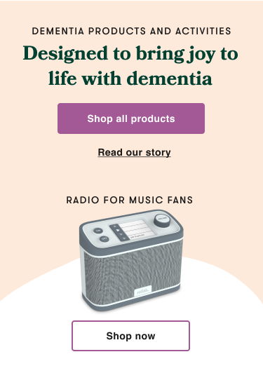
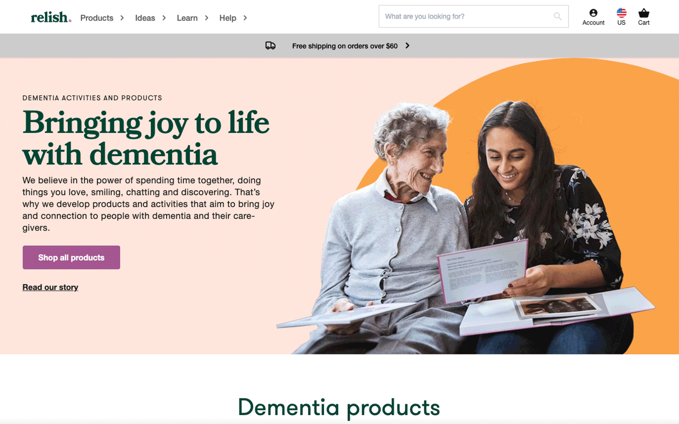
The Homepage content strategy
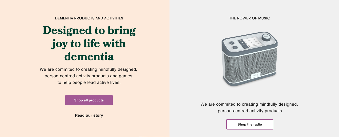
The hero banner was designed to give Relish flexibility; adding more content and CTA’s and changing on different stores would help them increase their marketing promotions.
![]()
![]()
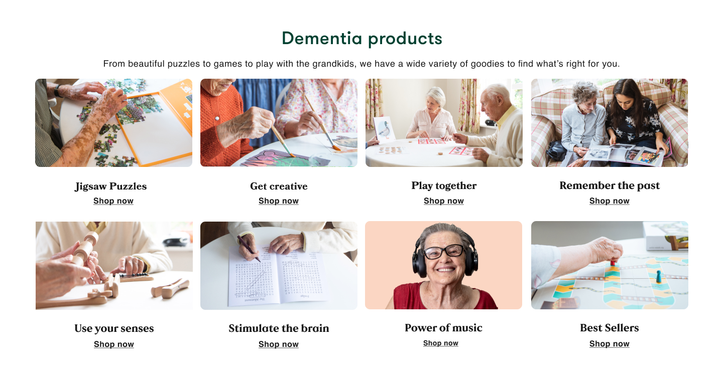
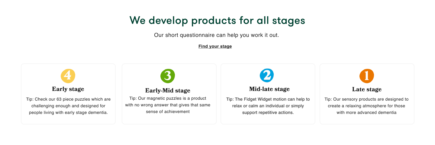
Research showed that users were more enganged when seeing a visual representation of the main categories.
![]()
![]()

Research showed that users were more enganged when seeing a visual representation of the main categories.
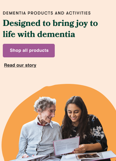
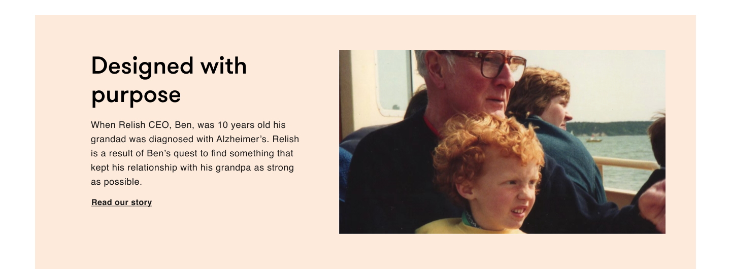
Relish was seen as a new brand although they had a great following before the rebrand. It was imperative to build trust. The Owner’s story was a key point ot create empathy with thebrand.![]()
![]()
![]()
Product Delivery
The website was launched September 2020, 10 months after I started working on the project. Some features were not completed on time but we decided to go ahead with the launch and continue improving the UX and adding content while it was live.
A few months later we had to redesign the whole checkout process, disable the “choose currency” feature and introduce a choice for store. There was an ongoing conversation with the developers; I would check regularly the users’ recordings, spot any errors and provide solutions to the devs team. Working closely with the QA after launch we managed to fix most of the bug issues that had an impact on convertion by using a clear submission system and testing continuisly to improve the UX of the site.
The results
The google analytics and recording sessions confirmed that the consumer was engaging more and for longer. The conversion rate went up, as did the AOV. There was a jump in user retention and also a better google ranking which helped increase our organic traffic. The “more like this” addition of upselling products on the product page helped to bring down the drop-offs. The duration and depth of visit increased.