Leading the brand’s digital transformation
Digital Design
BURTON UK / ARCADIA GROUP
In a nutshell:
the concept
Time for change! Presenting the new website, part of a digital transformation project running across all Arcadiagroup brands. Based on a mobile first approach, the new responsive website gave us the opportunity to rethink and redesign the burton ecommerce site from scratch.
my participation
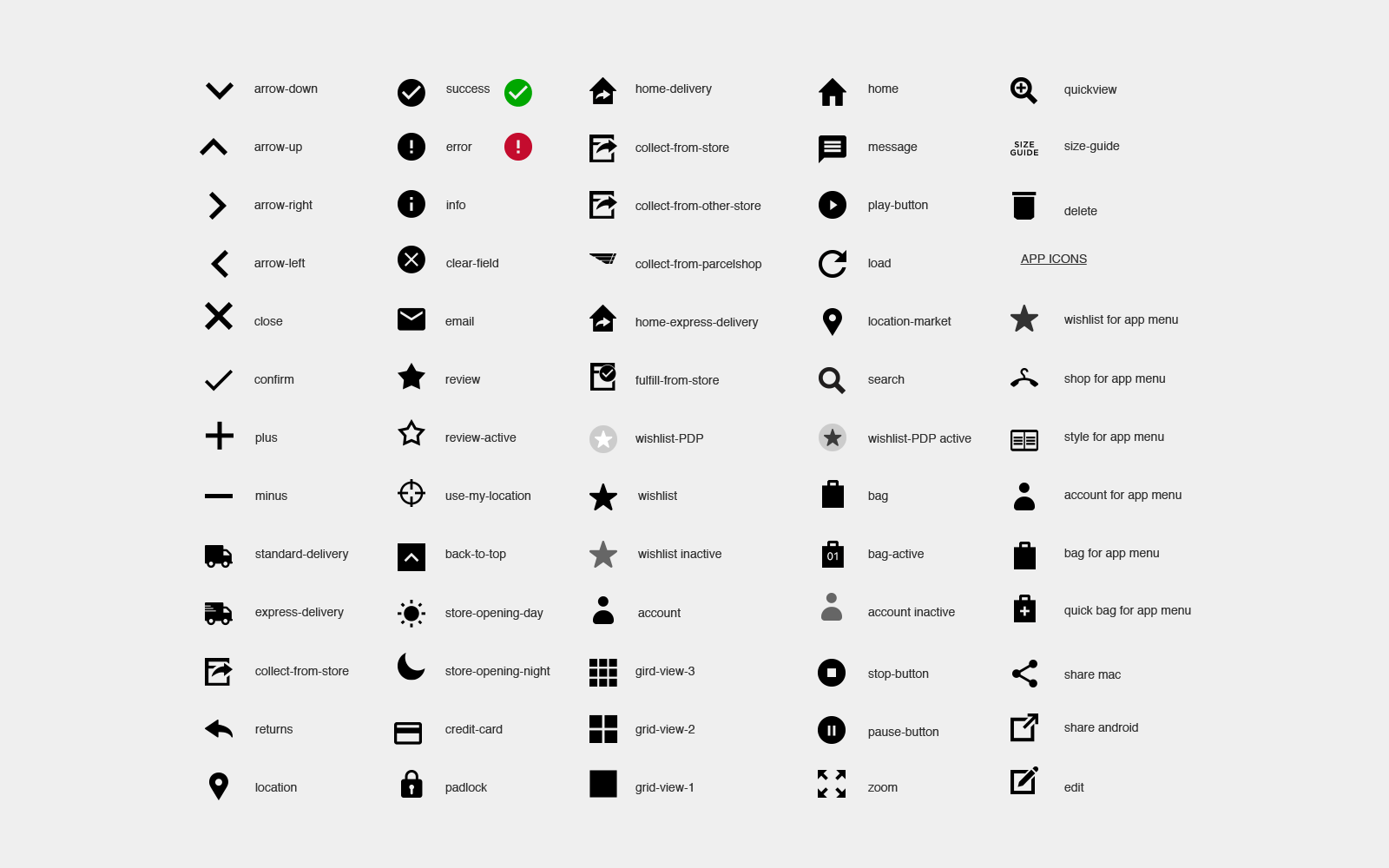
Digital guidelines
Applying the Burton brand and values across all digital channels. Creating the new digital tone of voice and design the UI design guidelines, icons, interactive elements, typography and colour scheme.
Transition to a new website
Leading the transition of the Burton website to a responsive site. While collaborating with developers and UX designers to define a new user journey, my role was to redesign and wireframe the transactional pages and create a new layout for the homepage using a fluid setting that allows content to span as wide as the user’s browser.
the team
Working in an agile way with various stakeholders, including product owners, project management teams, UX designers and developers. Participating in all arcadiagroup meetings representing the Burton brand.
the case study
Configuring the visual language
In order to avoid disjointed user experience, make the system easier to maintain and increase consistency, my role was to adapt the brand’s tone of voice to all digital channels and design the systems that would be the solid foundation of the new website.
I’ve started with a basic style guide that worked as the foundation. Colours, icons, typography, buttons, forms and check boxes were designed first; meanwhile collective meetings would happen across brands and within each brand’s team; all components were reviewed and redesigned accordingly. The guide helped, also, as a design direction when adding new features later on to the site, i.e. the DDP delivery option.
see more on designing systems here >
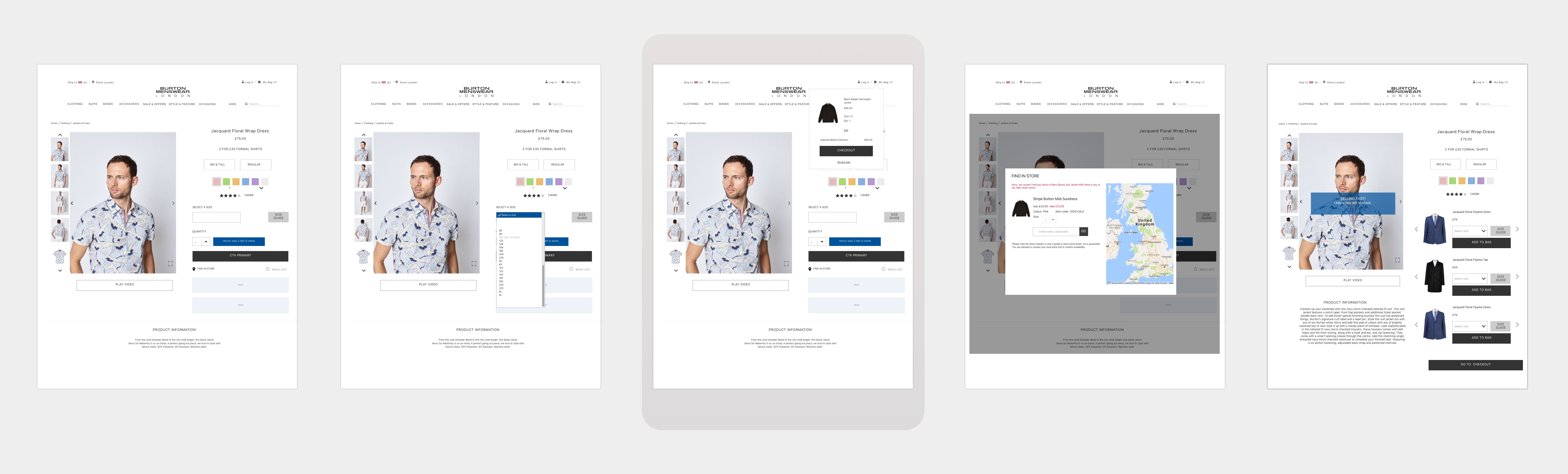
The structure: transactional pages and new features
Part of the digital refresh was to improve the user experience. All transactional pages of the website were redesigned. Also with the new platform we were able to add new features, i.e the wishlist.
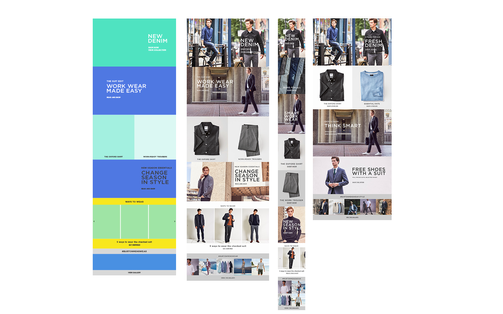
Revisiting the homepage
We used a 12 column grid and live text to make the ecommerce website more accessible and easily adapted to different devices. On some occasions we decided to curate the content differently, i.e. when designing the mobile homepage. The reason was to address the needs of various departments that were involved and would benefit from a variety of content on the homepage and, also, from results of data gathered from users’ feedback and interaction.
Responsive layout - the breakpoints
Evolving the homepage layout
After six months we decided to readdress the design of the homepage layout. The results from tests plus an increase on sales of products displayed on the homepage showed that our consumer was engaging with the new story telling layout. The need to expand more on our stories was visually solved by designing the homepage with an editorial approach.
By using the white space and with the introduction of a second font we were able to draw attention to the narrative and create hierarchies. Similar layout and content disrtibution was followed on the email templates and the social posts.
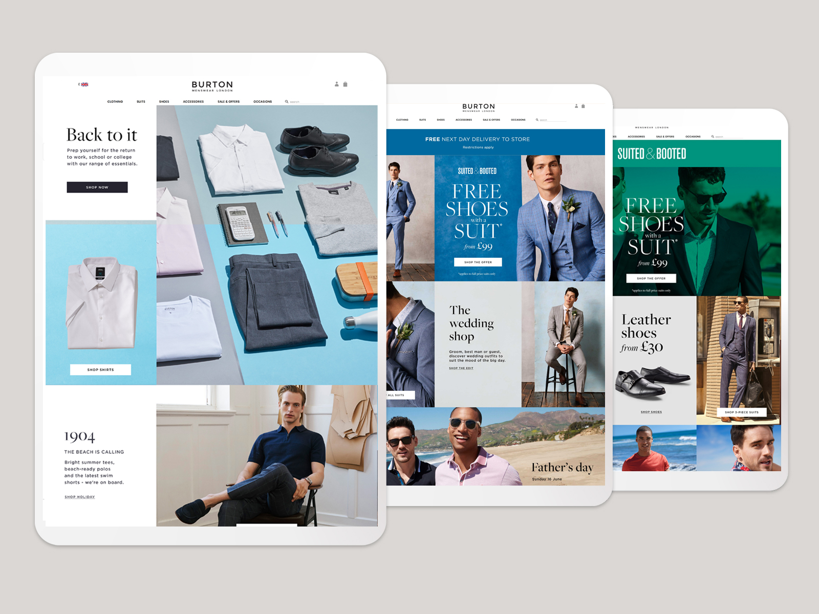
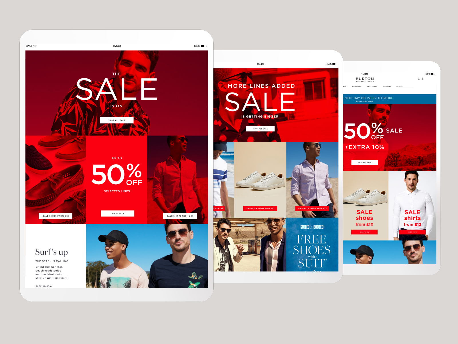
Promotional approach: During heavy trade periods we visually separated the homepage with the use of overlays and coloured CTAs