The Boxfresh brand transformation
When starting on a big, complicated process, like a brand refresh there is a lot to consider. One needs to be able to step back and see the whole picture and at the same time dive in and focus on the details.
In the case of the Boxfresh refresh, the brand was set to get a whole new approach on how we engage with the consumers across all channels.
In the case of the Boxfresh refresh, the brand was set to get a whole new approach on how we engage with the consumers across all channels.
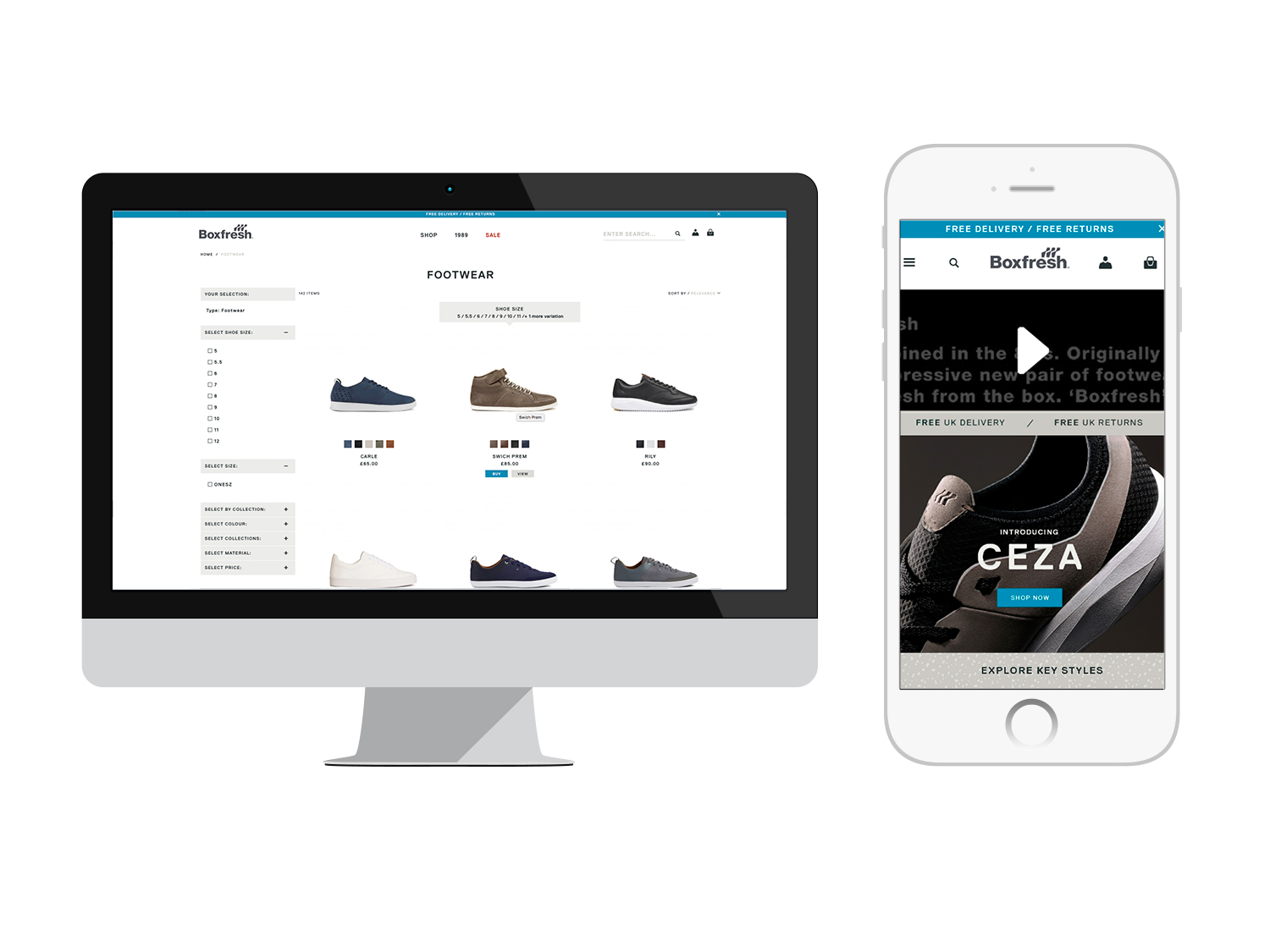
The main focus was on the digital ones and with a new campaign in place, that served as the foundation, the new site was about to launch.
The Boxfresh campaign
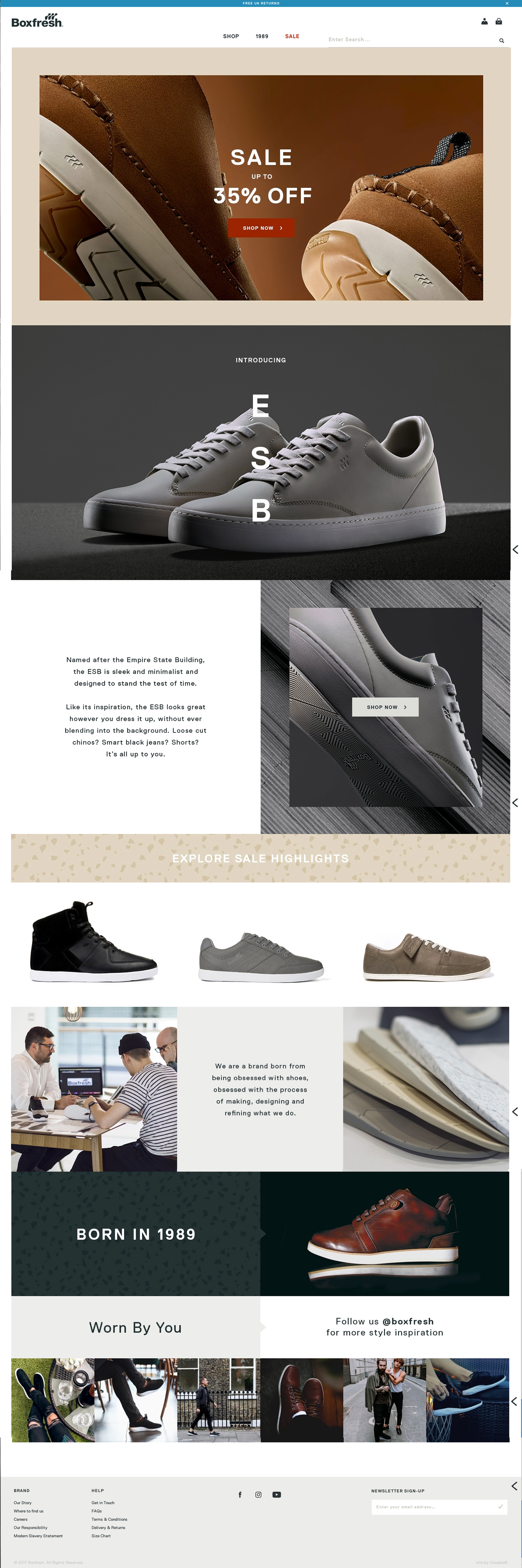
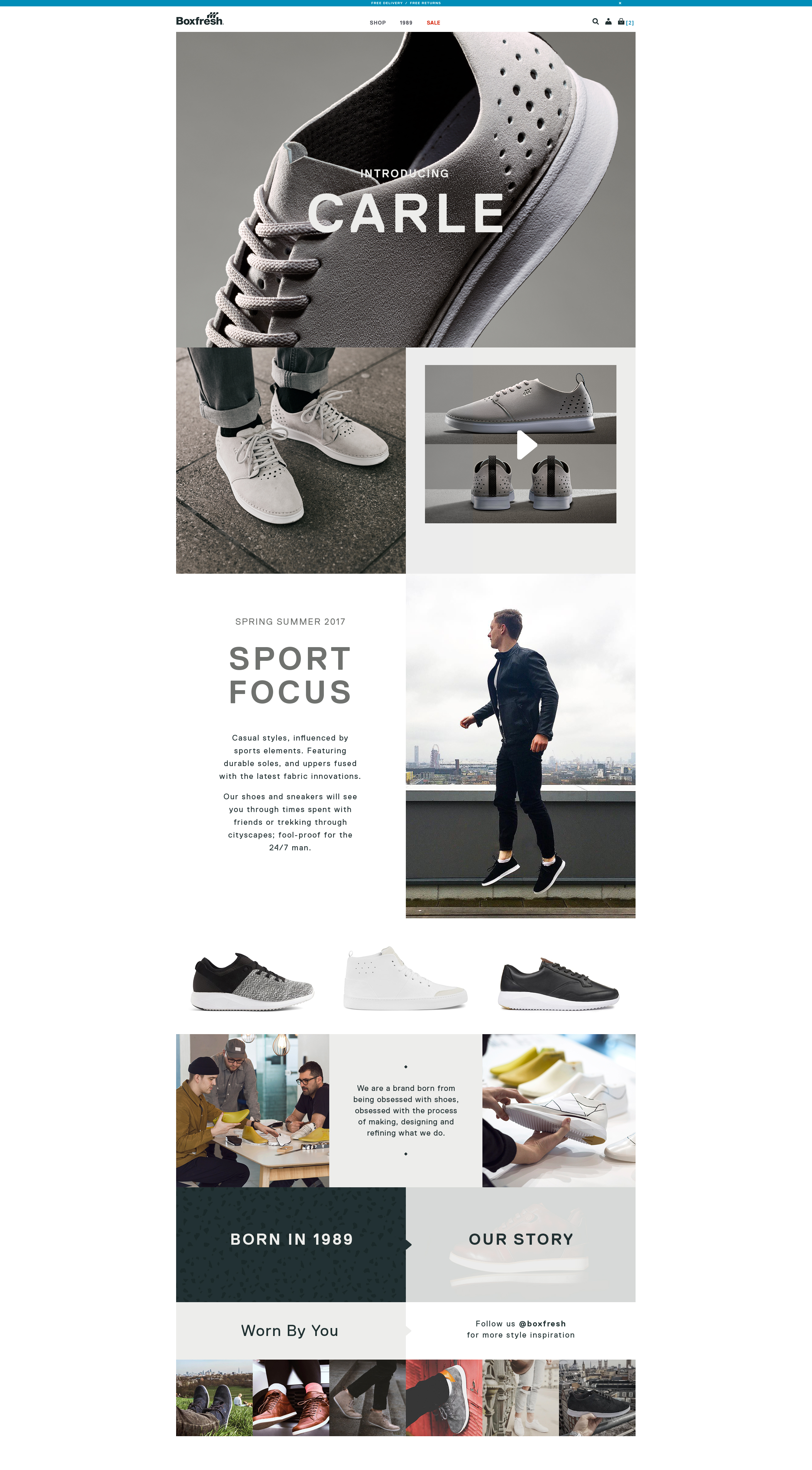
Introducing one of the products
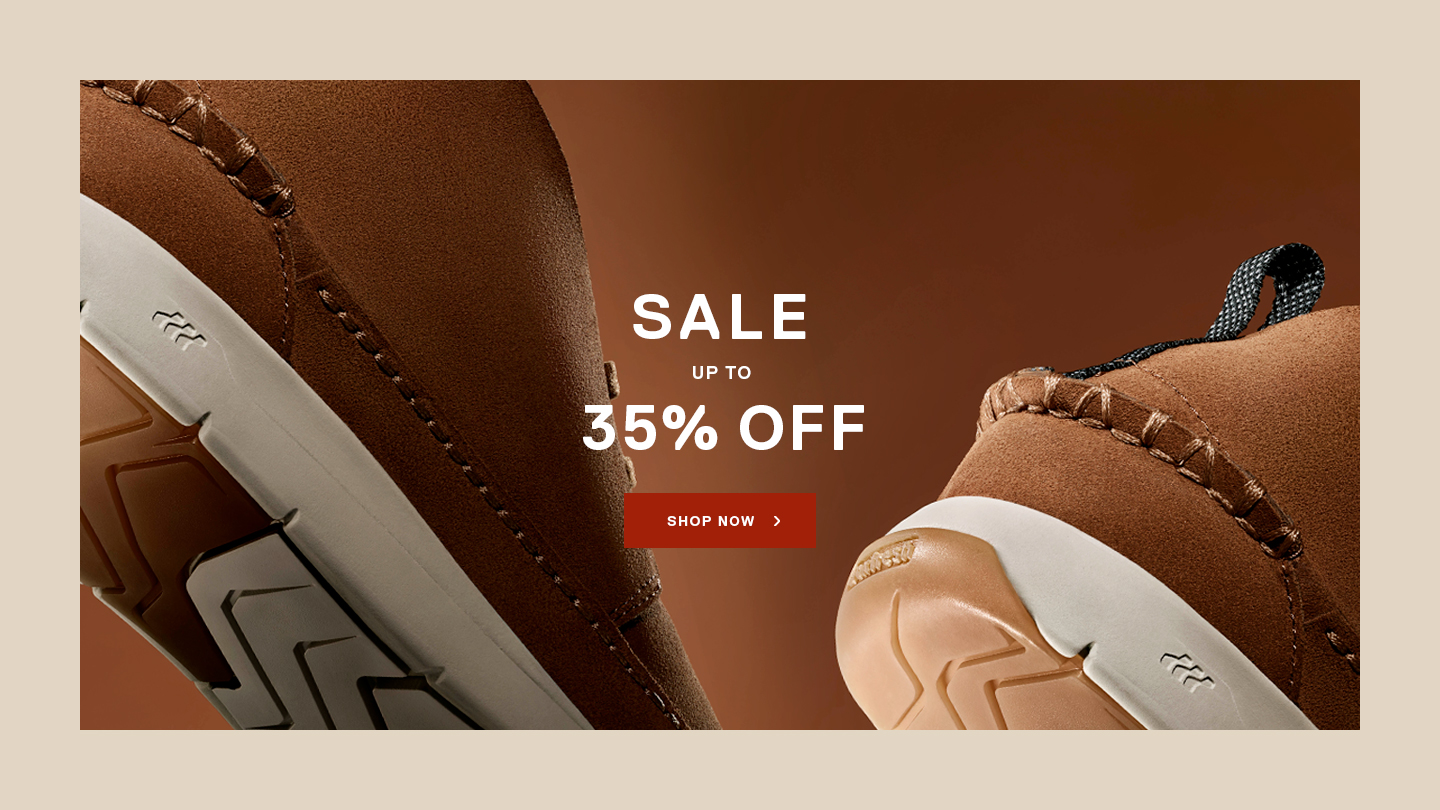
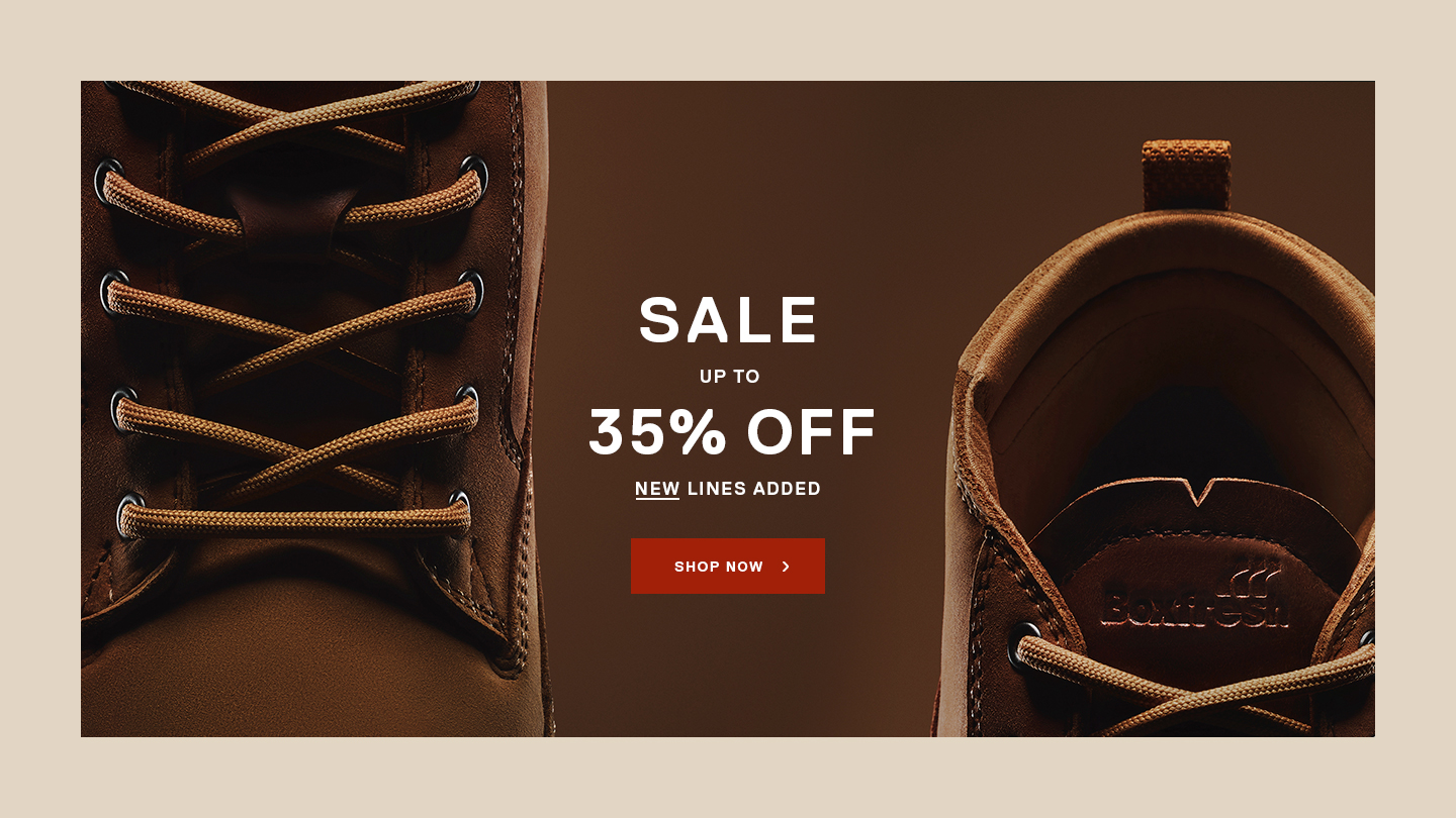
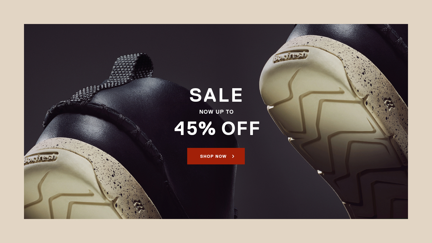
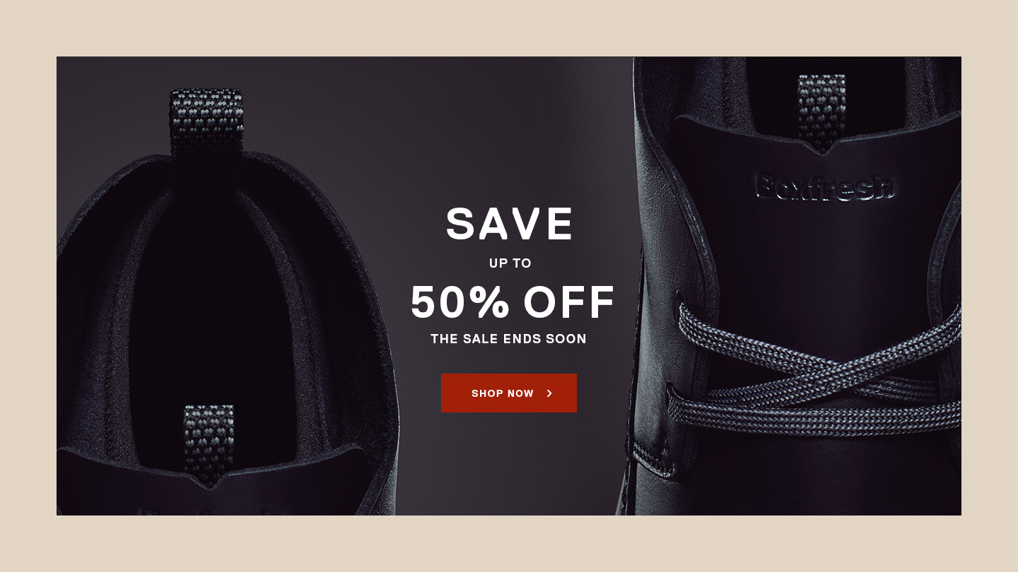
The concept for the new campaign was based on the idea that each product was a hero on itself. Each pair of the new trainers were designed with references from urban architectural styles.
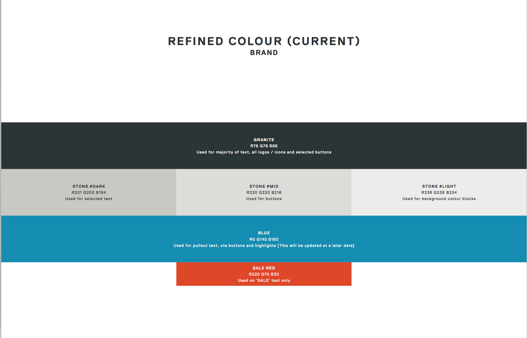
The photography presented each product as the hero, giving them monumental attributes. The colour palette was created based on shades found on a cityscape and we designed patterns referencing concrete, sand and stone materials.
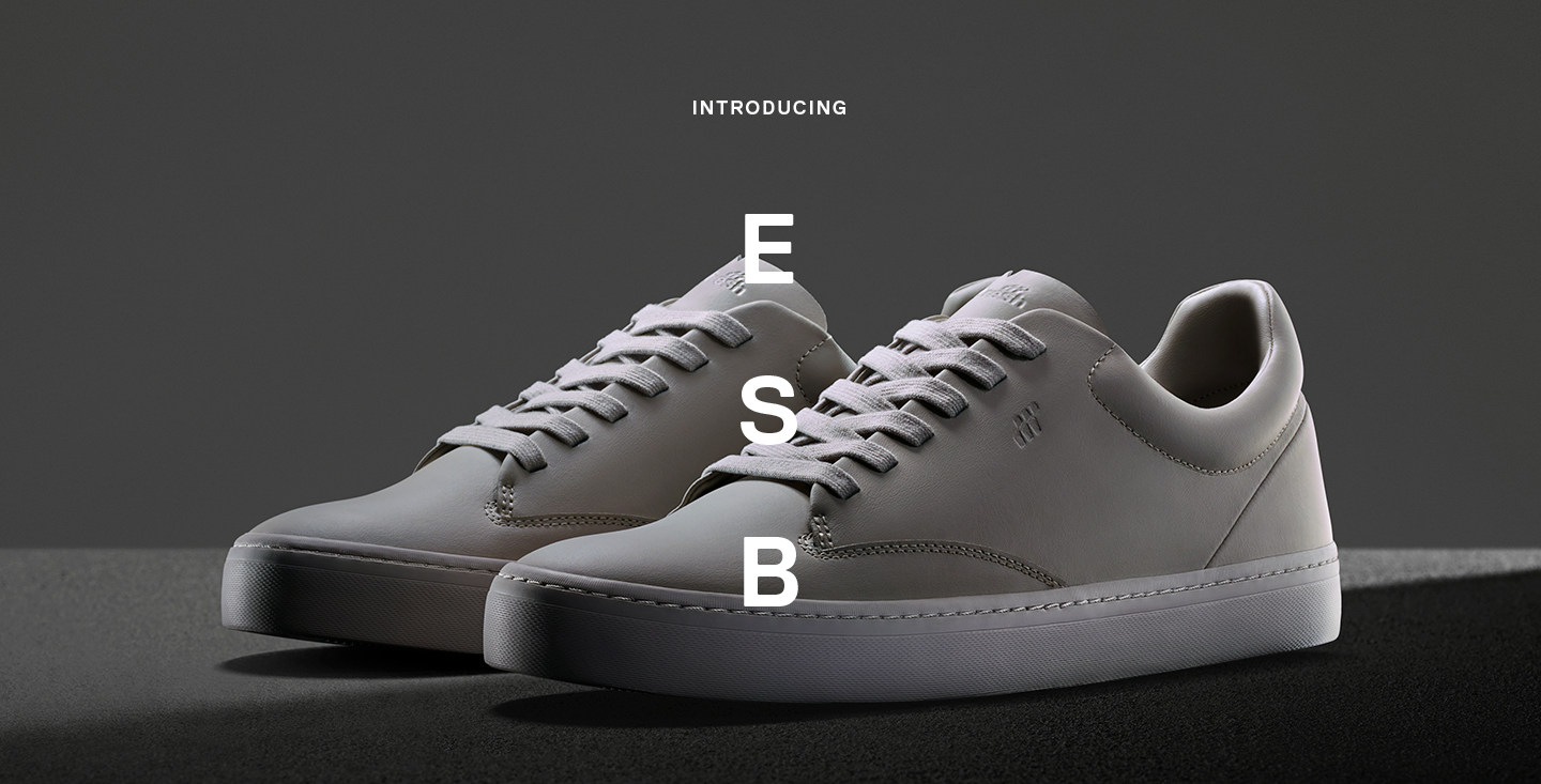
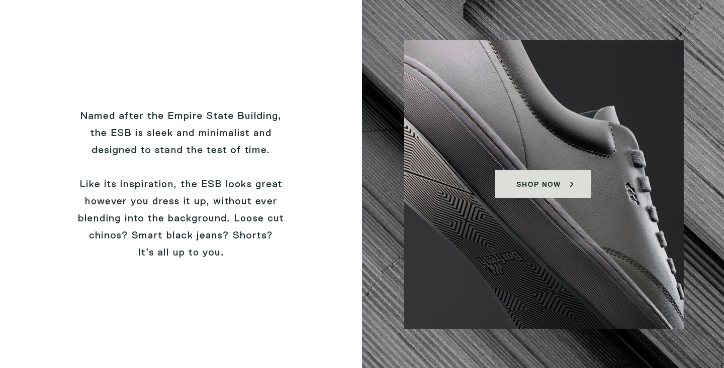
A new e-commerce website was designed from scratch based on this visual identity; in contrast with previous versions where offers and sale was the main focus, now the aim was to make the brand signature more prominent.
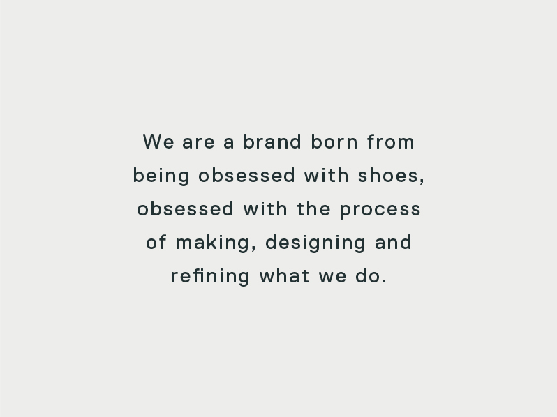
There was dedicated space on the new homepage to the origins and history of the Boxfresh brand, the craftsmanship and its social appearance.
There was dedicated space on the new homepage to the origins and history of the Boxfresh brand, the craftsmanship and its social appearance.
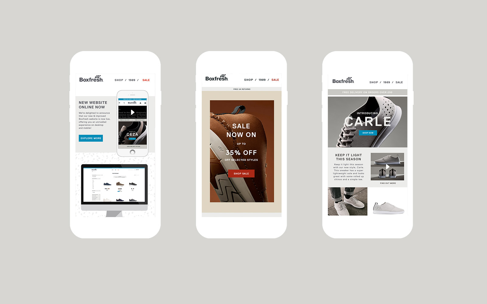
The email templates were designed in a similar way to the website homepage layout
The promotional pages approach