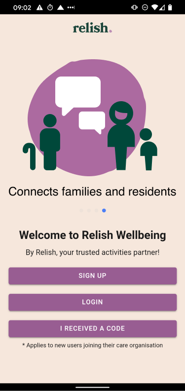
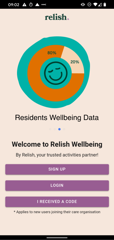
The Relish Wellbeing App
Product Design / Relish
the brief
The app was designed to support the lifestyle and activity coordinators within care settings. It helps the carers save time by using the easy reporting tool and activity planner, plus it gives them creative support with the library of activities carefully customised for people living with dementia. Since its launch it has been receiving positive feedback.
my participationWhen I joined Relish they already had an Active Minds wellbeing app designed for the health care professionals. After rebranding, the “support for care app” had to follow up to the "Active Minds to Relish” change. I was responsible for the redesign of the app and for connecting it to the new website.
As I was building the website architecture I envisioned the app to be hosted on its own section, under the ideas tab, where users could look for inspiration; this need for creative support came up often during the research phase; most carers, professionals and family members, wanted to be inspired and connect creatively with the people living with dementia.
At the same time I was tasked to get insights on the current use of the app and improve the user experience.
Please contact me for more information on the app project.
the research
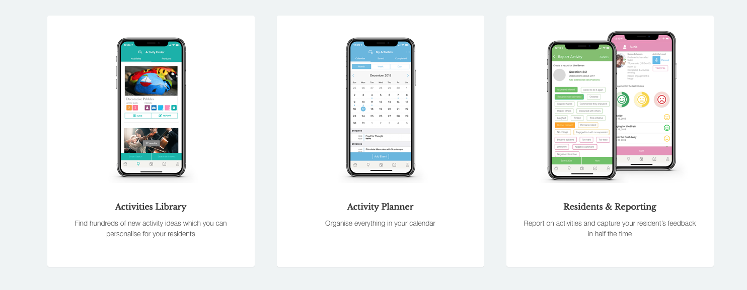
The new features
The “support of care “ app had three main functions; to inspire with a library of activity ideas, to help carers organise their activities with the activity planner and to generate reports for the managers consideration. The problem
After months of use we realised that the reports
were not accurate. The activities were not logged in correctly, sometimes there
were duplicates of the same activity and the managers complained that the
generated graphs were too complicated to read. They, also, wanted to get
statistics not only from the creative but all the activities that were booked
with the residents, for example 1to1’s. The carers wanted more flexibility when
filling the reports, for example adding a wider spectrum of emotions, the
duration of the residents’ participation or the reason for declining an invitation.
The solution
After weeks of interviews with the top management, the
regional managers and the activities coordinators we discovered the reasons of underreporting.
With a careful analysis and a thorough study of the insights we managed to find
solutions and design new features that catered to everyone’s needs.The result
A big jump in retention and a great positive feedback from the carers and families who were also happy to see how their loved ones were doing during lockdown.The new style guide
We wanted to make the language, visuals and signage of the app easily comprehended by different care home professionals. To connect the dots we had to go and listen to everyone involved, understand the way they talk, and look at type of signage and imagery they are familiar with.
After collecting all the information, there were already some
visual patterns emerging. The tone of voice and language was easy to get
but the visual identity had to be tested to make sure it is easily
recognisable. After testing them we decided to go with the icons below.
Each
icon represents a type of activity (cooking, meditation, family call, outdoors
activity and so on). Each activity type was assigned a colour to make it easier
to read when seen on a graph (the statistics were a major concern for
the management team; the colour attribution helped simplifying
the generated data charts).
The new look
The graphs
The graphs show you the actual statistics for the activities happening within each carehome; they show the number of activities delivered by day, the overall resident feedback (responses from the residents regarding the activities you have on offer), the engagement of residents (active/inactive). A clear way to see how well received some activities are.
We had to find a way to make the stats easier to read!
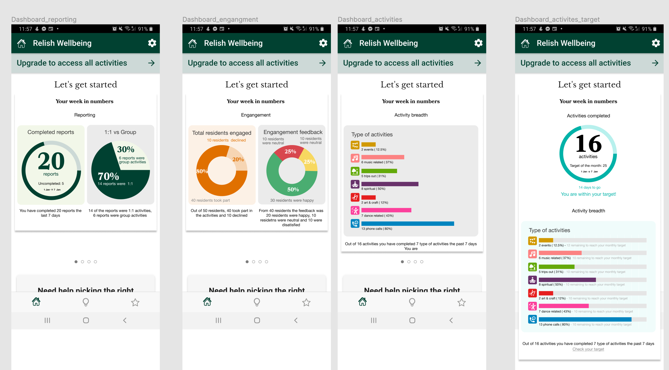 By distributing the activities into types and with the newly brought colour attribution element we managed to simplify them.